Focal Point Introduces TM-30 Based “Preferred Light”

Today Focal Point Lights of Chicago, IL introduced a series of fixtures that feature what they call Preferred Light.  Preferred Light is based on recent studies at PNNL and Penn State, plus their own study, and uses TM-30’s Rf, Rg, and Hue Bin 16 values to establish a balance of fidelity, saturation, and red rendering that is “visually appealing to humans.”

The overall idea is that people seem to prefer a light source that slightly over saturated most colors, especially red.  “Using a custom LED mix, Focal Point defines Preferred Light using TM-30-15 metrics as having a fidelity (Rf) of 89, a gamut (Rg) of 107, and over-saturating Hue Bin 16, deep red content, by 9% at a [Correlated] Color Temperature of 3500K.”  So, by using the statistical measures of TM-30 and applying them to the related topic of color preference Focal Point has identified an optimized set of LED products to meet their customers’ needs.

I’ll be the first to admit that it may be risky to base all of this on only three studies, but other studies have shown that the TM-30 results can be applied in this way, and are also showing us the relative importance of the various calculated values.  I’m excited to see the industry using the tools, and am looking forward to seeing the Preferred Light for myself.

Design Guide for Color and Illumination

As the co-chair of the IES Color Committee I am delighted (pun intended) to announce the publication of the Design Guide for Color and Illumination.  The guide is the result of over five years of work by more than a dozen researchers, engineers, manufacturers, and designers from across the globe.  Here’s part of the description on the IES site.

Color can be described using concrete values such as chromaticity coordinates, spectral power distribution, or others discussed later in this guide. However, one’s response to color can be much more personal and emotional—and therefore more difficult to quantify. This guide takes the reader from basic vision and color vocabulary, through methods of measuring and quantifying color, and culminates in the practical use of commercially available white light and colored lights. The definitions, metrics, and references discussed will assist in building a critical understanding of the use and application of color in lighting.

It is probably the best, most thorough discussion of light and color available today.  Everyone interested in color, color perception, color rendering, and their relationship to light should read it.  It will be available at the IES booth at Lightfair.

How Bright Are Colored LEDs?

Measuring and describing the brightness of colored LEDs is an increasingly important part of a lighting designer’s practice. They are used more often, and in more types of projects, than ever before. Yet, we don’t have an accurate method for understanding exactly how much light is being produced and how bright it will appear. It’s a problem that the lighting industry needs to solve, and soon.

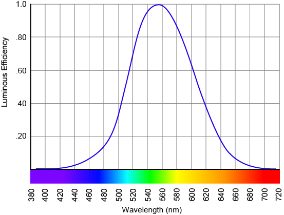
The human eye does not respond to all wavelengths of light equally. We have the greatest response to the yellow-green light of 555 nm. Our response falls off considerably in both directions.  That is, wavelengths of light do not contribute equally to our perception of brightness. The sensitivity curve of the human eye is called V(λ) (pronounced vee lambda) and is shown below.

The definition of a lumen, the measurement of brightness of a light source, is weighted using V(λ) and essentially assumes that the light source emits light across the visible spectrum – in other words, it produces a version of white light.

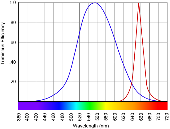
Light meters are calibrated to measure white light using V(λ) so that their measurement of brightness corresponds with our perception. Individual colored LEDs emit only a fraction of the visible spectrum, as shown below in the graph of V(λ) and the SPD of a red LED, and that’s the problem.

V(λ) and the SPD of a red LED.

Light meters measure the light that the colored LEDs provide, of course, and this information is included on an LED fixture manufacturer’s cut sheets, but it often makes no sense. For example, an RGBW fixture I’ve arbitrarily selected reports the following output in lumens: Red 388, Green 1,039, Blue 85, White 1,498. Since brightness is additive, the output when all LEDs are at full should be 3,010 lumens. However the Full RGBW output is given as 2,805 lumens! That’s 7% lower than what we expect.

The essential problem is that the colored LEDs give the light meter only a fraction of the spectrum it’s designed to measure. The meter provides a result based on its programming and calibration, but the results are often nonsensical or at odds with our perception. This problem doesn’t affect only architectural lighting designers. Film and TV directors of photography and lighting directors also rely on a light meter’s accurate measurement of brightness in their work, and when using colored LED fixtures the light meter is likely to be wrong. In fact, even white light LEDs can be difficult to measure accurately because of the blue spike in their SPD.

For now, the only way to accurately assess the brightness of colored LEDs is to see them in use. Lighting professionals need to let manufacturers and others know that the current situation is not acceptable, and that an accurate method of measuring and reporting the brightness of colored LEDs is a high priority. Talk to fixture and lamp sales reps, fixture and lamp manufacturers, and decision makers at IES, CIE, NIST and other research and standards setting organizations. There’s a solution out there. We need to urge those with the skills and resources to find it to get going!

IES Symposium Summary

If you missed IES Research Symposium III Light + Color you missed an exciting (for color geeks) few days. It would take too long to relate everything that was discussed, but here are some key highlights.

  • TM-30-15 is seeing broader acceptance throughout the industry. In an exciting development, it seems that the CIE is going to endorse TM-30 Rf after a few changes are made. The expectation is that the industry will then begin a rapid movement toward using Rf instead of CRI Ra, and that eventually CRI will be withdrawn. Unfortunately, the CIE is notoriously slow, so there is no timeline for their formal endorsement of TM-30. Maybe next year?
  • Manufacturers are resolving the spectral deficiencies that result from using a limited number of LEDs in both color mixing and color temperature tuning products. Their solution is to move from two and three color systems to systems using four or five independently controlled colors of LEDs.
  • Color preference was a big topic with no resolution. One complaint of both CRI and TM-30 is that they penalize light sources that deviate from the reference source even if many people prefer the deviation. Of course, Ra and Rf are both fidelity metrics, so they must penalize such deviations.   We have strong evidence that people prefer light sources that slightly increase the saturation of objects, and that people prefer light sources that include somewhat more red than the reference sources. However, because the amount of deviation that is preferred is application dependent, a single, all-purpose metric for rating color preference seems to be unattainable.

Who Needs A Lighting Designer? Museums and Galleries!

A few weeks ago I gave a three-hour seminar on lighting museums and galleries to the graduate students in an art curating program at a university here in New York. Condensing everything I’d like to say into less than three hours was tough. The two big questions were what to include and what to leave out. I started with a quick overview of how to think about light and lighting before moving on to basic vocabulary and some common lighting techniques. Then, since LEDs are clearly the future, even when lighting art, I moved on to an overview of both color temperature and color rendering. I talked about reference materials such as the IES Lighting Handbook, intensity and brightness ratios, and other considerations before we moved into their gallery space to use their track light system for some demonstrations.

After the whole affair a faculty member, who sat in on most of the seminar, said he had hoped I would have spent much more time talking about how to use track lights and less time on unimportant issues like design, color temperature, and color rendering (!). I was respectful, but stunned. Focusing track lights is so complex that it requires extensive demonstrations? Understanding that with LEDs the color qualities of the light vary widely, and can only be properly selected when they are understood is unimportant information? Uhh…NO. Or, as my 20 month old niece says, “no no no no.”

Yes, five or ten years ago the default light source in museums was an incandescent or halogen lamp. The color temperature difference was minor and the color rendering of both was excellent. That’s not true today. Look at the cut sheet for any museum grade track light and you’ll see that you have a choice of several color temperatures and CRI values. If ANYONE needs to understand the qualities of light that must be selected when using LED fixtures, if anyone needs to understand the affect that color temperature and CRI have on how colors are perceived, it’s certainly people involved in displaying and lighting art. To me, that means the curators of exhibits and the lighting designers they hire.

As I’ve discussed earlier, changing the color temperature of the light changes the color appearance of objects, as shown below.

Illuminated with Warm White Fluorescent Lamp
Illuminated with 3000 K light
Illuminated with Cool White Fluorescent Lamp
Illuminated with 4000 K light

The phenomenon of color consistency means that the shift in color appearance isn’t as great as one might expect or as these photos suggest, but the shifts are real. If you’ve ever bought a black garment only to discover later that it was actually dark blue you’ve experienced this shift. A similar thing happens when we compare a high CRI light source and a low CRI light source. If your work involves color perception this is basic and critical information.

Curators can be forgiven for not knowing much about this, but if they know nothing how can they collaborate with their lighting designer to show the art as they intend? Administrators and curators of museums and galleries – educate yourselves, then hire a lighting designer!

Light + Color Symposium Registration is Open

Registration is now open for the IES Research Symposium III, Light + Color.  I’m on one subcommittee that’s coordinating the symposium and have sat in on organizing meetings, and I can assure you that it will be a very informative three days.  The IES describes the symposium, saying “This international lighting research and application symposium will draw on the talents and expertise of the researcher, the technologist and the design professional to better understand the growing role of color in lighting from the standpoints of color vision, color perception, color preference, color metrics and color technology.”  The symposium will be April 3-5 in Gaithersburg, MD and will include tour of the color labs at NIST.  Register here.  See you there!