Color Rendering, Whiteness, and TM-30

I know I often write about color rendering.  It’s because most lighting manufacturers and specifiers treat color rendering as a check box item (80 or 90?).  I see color rendering as a powerful, valuable design choice that impacts the appearance of a space.  This is especially true when using TM-30’s suite of measurements.  So, here I go again…

I recently came across an ad from a luminaire manufacturer that described three versions of a new product line that focuses on color rendering. One version is supposed to “enhance the contrast between colors and whites”.  Another is supposed to “accent wood, bronze, textiles and darker accents” (so, warm colors, all colors, and dark colors?).  The third is supposed to “enhance white surfaces”.  All three versions are described having a CCT of 3000 K and a CRI of 90, and that’s all we’re told.  There is no other color rendering information presented in the ad, on the web site, or on the cut sheets.  It’s as though somehow 3000 K and 90 CRI are supposed to clearly describe all three color rendering effects.  CRI – it’s a hair gel, it’s a toothpaste, and it’s a floor polish!  Obviously, this is nonsense.  So, let’s talk about what’s really going on here.

Over the years CRI has been erroneously described as measuring the naturalness of a light source, the naturalness of colors, a comparison to daylight, and even a percentage of colors that are rendered (whatever that’s supposed to mean).  All of those are wrong.  CRI is a fidelity measurement.  That is, it compares a light source to its reference source (a black body radiator below 5000 K and a model of daylight at 5000 K and above, and at the exact CCT as the light source in question) and describes how well they match. The reference light source isn’t meant to be considered perfect – it’s meant to be a light source with well understood color rendering properties.  A poor match in color rendering results in a low CRI.  A better match results in a higher CRI.  A CRI of 90 indicates a pretty good, but not exact match.  What is the mismatch?  What specific colors or color ranges are affected?  Are some colors shifted in hue, made less saturated, made more saturated, some combination?  We don’t know the answers because the CRI calculation gives us one number, Ra, not a suite of numbers and/or graphics that supplement the top line result.

So, a light source that is 3000 K and 90 CRI might have one of the three color rendering properties described by this manufacturer, and other versions of 3000 K and 90 CRI could have the other characteristics, but the numbers presented don’t describe or confirm those properties or characteristics at all.  For that we need to look at TM-30 and beyond.

Two of the three descriptions reference the color rendering of white, but there’s no explanation of how this is determined, and that’s a problem.  Neither CRI nor TM-30 specifically evaluate white surfaces or materials.  There have been several whiteness metrics proposed over the years, beginning in the 1930s.  As far as I know, only one has been adopted by a standards setting organization (the CIE whiteness formula from 1986).  However, this manufacturer can’t be using the CIE formula because it only uses D65 (a standardized spectra at 6500 K) and the LEDs here are all 3000 K.

Neither CRI nor TM-30’s Rf (the fidelity index) say anything about the impact of the spectrum on specific color ranges, such as warm colors.  Rg doesn’t either since it gives us an average shift in saturation across all 99 color samples.  To see what color ranges are affected, and how, we need to look at the local hue and chroma shifts (“local” meaning the color samples falling within each of the 16 hue bins shown in the Color Vector Graphic or CVG).  As shown below, a TM-30 intermediate report gives us the CVG and bar graphs of the hue shift (Rhs) and chroma shift (Rcs) for each hue bin.  The bar graph information is included in the Color Vector Graphic, of course, but some may find the bar graphs easier to read.
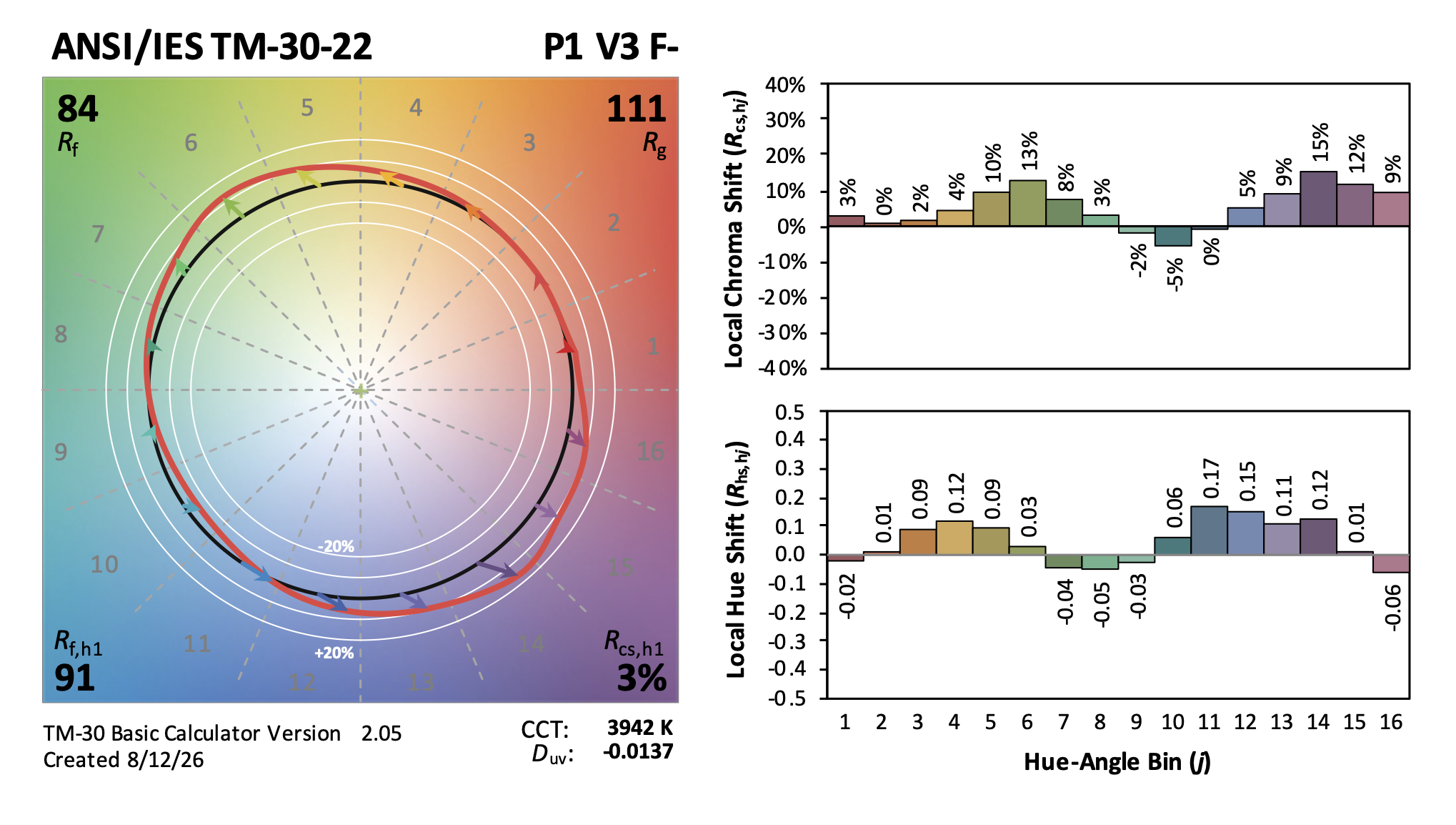
TM-30 Intermediate Report

So, if the question is, “What colors are enhanced by this spectrum?”, and if “enhanced” means made more vivid, the answer is found in the chroma shift bar graph.  For any spectra, the color ranges that have a positive chroma shift would be enhanced, while those with a negative chroma shift might be described as being muted, dulled, or grayed.  This is true regardless of the material because color rendering is about an object’s color, not its material composition.  “Textiles and darker accents” don’t describe a color range, so there’s no way of knowing the impact of a spectra on those materials without also knowing their color.  As with whiteness, though, the manufacturer gives us no detailed information, just assurances that these lights are great.

Proceed with caution.  Don’t accept any of these claims without proof.  Get your lighting reps to bring you samples to evaluate before specifying these products. CCT and CRI cannot explain and back up a claim about a light source’s impact on the appearance of specific color ranges and white materials.  To do so, a manufacturer should provide specifiers with a description of the impact, a TM-30 report that supports that claim, and perhaps additional metrics for claims that can’t be verified or validated with TM-30.
CRI Has One Job. That’s the Problem.

Below is a slightly expanded version of an article I wrote for this month’s IES NYC newsletter.

Color rendering should be an intentional design decision, not a specification checkbox.  I was recently in what should have been a beautiful hotel bar.  The interior was relatively new and skillfully conceived and executed, the materials were luxurious, and the lighting design should have been beautiful. Unfortunately, the overall look of the space was flat and dull.  It didn’t take me long to figure out why – poor color rendering was muting the colors in the space.

I could tell that the SPD, while warm (roughly 2400 K) was still deficient in red and probably had a CRI in the low 80s.  The lighting designer probably relied on CRI, which isn’t up to the job in this application.  CRI only tells you one thing about a light source: fidelity, or how closely it matches the reference light source.  This means the designer can have only one color rendering goal.  TM-30, on the other hand, supports a broad range of possibly overlapping color rendering goals.  The lighting designer then balances the metrics, evaluating of preference, vividness, and fidelity to achieve specific goals.

Start with Blue to Make Red

Most of us know that white light LEDs start with a blue LED as the “pump”.  Phosphors packed on top of the blue LED convert a large portion of that blue light to longer wavelengths.  Converting high energy, short wavelength blue light to lower energy, longer wavelength light comes at the expense of efficacy.  The more blue light converted to green, yellow, orange, and red, the lower the LED’s lumens per watt.  Since most manufacturers prize efficacy over color rendering, the skimp on red compared to the reference light source, resulting in low CRI.

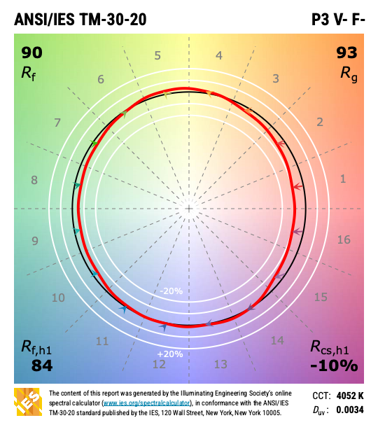
Figure 1 is a TM-30 report for a typical 80 CRI LED.  At the top right hand corner the P3 V- F- means its color rendering meets Priority Level 3 for Color Preference (P3) so it is slightly preferred over a high CRI source, that it doesn’t increase the vividness of colors (V-), and that the color rendering is not very close to its reference source (F-).  In the graphic, the red arrows pointing toward the center of the circle indicate less energy in those color ranges than in the reference source.  This results in the muting or graying of all object colors in those ranges, including the skin of the people in the room.

TM-30 report of a typical CRI 80 light source
Figure 1 – TM-30 report of a typical 80 CRI light source.


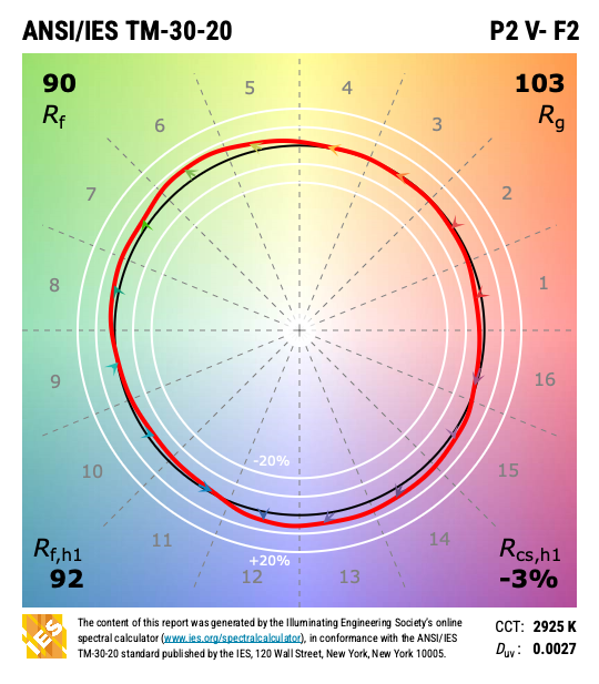
Figure 2 is a TM-30 Simple Report of a typical 90 CRI LED.  Even here, there’s slightly less red than in the reference light source. P2 indicates that it is broadly preferred over a high CRI source and F2 indicates that it has good color fidelity.


TM-30 report of a typical 90 CRI light source
Figure 2 – TM-30 report of a typical 90 CRI light source


Use the Tools

So, using a 90 CRI LED instead of an 80 CRI LED would improve things, and many designers and manufacturers are defaulting to 90 CRI these days.  However, there’s another problem – the Hunt effect, which tells us that as illuminance decreases, so does perceived object colorfulness.  The bar was lit to somewhere between 5 and 10 fc, so even under a high CRI source the colors in the room would be muted compared to their appearance at, say, 50 fc.  CRI leaves us powerless to do anything about this, but TM-30 gives us the tools.

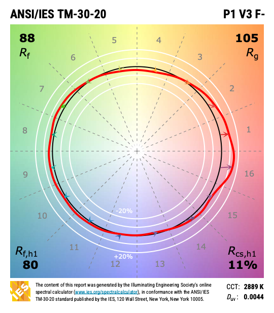
Instead of looking for a high CRI source, the designer could have used the PVF measures from TM-30 to find a high preference source, as shown in Figure 3.  A light source that measures P1 (highly preferred compared to the reference source) has a spectrum that increases red saturation, which would enhance the colors of materials in a way that people prefer over high fidelity – and possibly somewhat negate the Hunt effect.


TM-30 report for a typical high preference light source
Figure 3 – TM-30 report for a typical high preference light source


When attempting to counter the Hunt effect, a light source that also increases the overall vividness of colors (V3 or V2) would do an even better job.  This is just one example of how switching to TM-30 and broadening your color rendering goals can enhance your lighting designs.

Don’t Trade One-for-One

One final note.  In January of 2025 the CIE recommended the lighting industry transition from CRI to Rf, which is a much more accurate measure of fidelity.  My position, and that of the IES Color Committee, is it makes no sense to swap out one fidelity measure for another.  Designers would still be limited to a single color rendering goal.  We’d like the industry to adopt the full TM-30 suite.  Designers can ignore the 149 calculated values and focus on the PVF categories as I’ve done here.

For a full explanation of the color rendering goals possible with TM-30 and Preference, Vividness, and Fidelity, see ANSI/IES LP-30 Lighting Practice: A Comprehensive Guide to Specifying Color Rendition – Concepts, Criteria, and Implementation in the IES Online Store or the Online Lighting Library.  Despite its long title it is an easy to read, phase-by-phase user’s guide to TM-30. From schematic design to construction documentation, this TM-30 user’s guide outlines important color quality considerations and how to incorporate them into your workflow.

ArchLIGHT Summit Preview at Lightovations

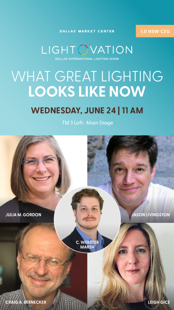
On June 24th I’ll be joining Webster Marsh at Lightovation as he moderates What Great Lighting Looks Like Now, a preview of seminars that will be given at September’s ArchLIGHT Summit.  In September I’ll be giving a presentation titled LP-30: A Phase-By-Phase Approach to TM-30.  Others on the Lightovation panel and at ArchLight Summit will be Craig Bernecker on A Proposed Two-Parameter Approach to Recommended Light Levels, and Julia Gordon and Leight Gice presenting Now You See Me – Now You Don’t.  Hope to see you at both events!

Lightovation June 2026 Poster

A Brief History of TM-30

Next Wednesday I’ll be giving a presentation on LP-30 at LEDucation (hope to see you there!), and in preparing for it I’ve been reflecting on how far we’ve come in our understanding and evaluation of color rendering.


The Color Rendering Index (CRI) was published by the International Commission on Illumination (Commission Internationale de l’Eclairage or CIE) in 1965, primarily to deal with the problem of poor color rendering by early fluorescent lamps.  It was a rather simple system that evaluated a light source by mathematically comparing the appearance of eight colors under the test light in question to their appearance under a standardized reference light source of the same correlated color temperature (CCT).  It used the latest models of human vision, returned a single value that was easy to understand, and was quickly adopted by the industry.


CRI is a fidelity metric, meaning that the CRI value represents how closely the test light matches the reference light.  Since this was the only system endorsed by a standards setting body, and became ubiquitous in our industry, many people came to believe that color rendering and fidelity were the same thing.


Perhaps unsurprisingly for a new system, errors were found and corrected in the 1974 update.  The next update, in 1995, made only typographical corrections to the document.  Science has, of course, progressed since then with many components of the CRI calculation being withdrawn from use by the CIE as improved components were developed.  The problems were well known and documented.  For example, the IES Lighting Handbook 9th Edition, published in 2000, included a brief discussion about this, and the 10th Edition, published in 2011, included a table describing nine limitations of CRI.  Unfortunately, for what seem to be political, not scientific, reasons CRI hasn’t been updated since.  In fact, as late as 2017 CIE 224:2017 continued to recommend CRI for general use.


The “limitations” of CRI were exacerbated by LEDs, whose distinctive spectral shape frequently resulted in CRI values at odds with observed color rendering.  By the mid-2010s the mismatch between CRI values and observations, combined with the clear trajectory LEDs were on to exceed the efficacy of other light sources and become the dominant source, meant something had to change.  Since it was clear that CIE wasn’t going to update CRI, members of the IES Color Committee formed a Task Group to evaluate the issue and develop a completely up to date, color rendering metric drawing on the best ideas other researchers had proposed over the years.  The result, in 2015, was ANSI/IES TM-30 Technical Memorandum: IES Method for Evaluating Light Source Color Rendition, or TM-30.


Initially, we thought that TM-30’s Rf (Fidelity Index) and Rg (Gamut Index) would be the key metrics, because they were similar to the CRI-GAI (Gamut Area Index) system developed at Rensselear Polytechnic Institute as an improvement on CRI alone.  Light sources that met certain values were described as Class A under this system.  TM-30 produces many more measurements, 149 in fact. We didn’t know what they would mean or how they could be used, but thought the additional information would, at a minimum, be useful to researchers.


However, by 2018 several studies had been published with exciting results showing that by using four metrics instead of two (Rf, Rg, Rf,h1 (fidelity of red), and Rcs,h1 (chroma shift of red) TM-30 would allow users to evaluate a light source not only for fidelity, but for preference and vividness as well.  The analysis of the studies became TM-30’s Annex F, with the explanation of Preference (P), Vividness (V), and Fidelity (F) provided in Annex E, and the TM-30 reports were modified in 2020 to display the four key metrics and the PVF results.  This was a huge improvement over CRI and gave designers the ability to tailor their color rendering goals to the needs of the project and the occupants.  For example, projects such as hospitality benefit from a light source that renders colors in a way that is preferred vs high fidelity.


In the meantime, CIE did a more thorough evaluation of Rf (specifically their version of Rf as defined in CIE 224:2017) and in January of 2025 CIE PS 002:2025 recommended the industry transition away from CRI to Rf.  The IES, on the other hand, takes the position that it doesn’t make sense to simply replace one fidelity metric with another.  Instead, they recommend the industry adopt the entire suite of TM-30 metrics, including the evaluation of PVF.


The problem for specifiers, at that point, was how to use this information.  What are preference, vividness and fidelity?  How do I find a preferred source, and how do I specify it?  What TM-30 information do I collect/need at each phase of the design?  What language can I put in my specification?  While many of us on the Color Committee (and others) gave seminars and webinars over the years, there are still many who aren’t certain how to use TM-30.


To provide a clear answer to those questions the Color Committee formed a Task Group to write a user’s guide to TM-30.  For more than three years a half dozen people wrote, illustrated, re-wrote and re-illustrated ANSI/IES LP-30 Lighting Practice: A Comprehensive Guide to Specifying Color Rendition — Concepts, Criteria, and Implementation.  LP-30 provides the industry with a guide to specifying color rendition with TM-30 by expanding on the framework of TM-30 Annex E. The goal of this document is to help lighting specifiers understand color rendition considerations for a project and appropriately gather, interpret, and apply TM-30 metrics. It provides a thorough description of how color rendition may be considered in each phase of design, explains color rendition goals and color rendition related steps in the design process, related activities that occur during those steps, and examples of the deliverables in each design phase.


LP-30 is available in the IES Online Lighting Library and the IES Store.


For those of you not able to make it to LEDucation, I will also be giving a presentation on LP-30 at ArchLIGHT Summit in September.  There, we hope to have a color rendering demonstration to illustrate the ideas discussed during the presentation.

TM-30 Users Guide Now Available

I’m delighted to announce that ANSI/IES LP-30 Lighting Practice: A Comprehensive Guide to Specifying Color Rendition — Concepts, Criteria, and Implementation is now available in the IES Online Lighting Library and the IES Store.

For more than three years, a half dozen IES Color Committee members worked to create a clear, concise, easy to understand document.  LP-30 provides the industry with a guide to specifying color rendition with TM-30 by expanding on the framework of TM-30 Annex E. The goal of this document is to help lighting specifiers understand color rendition considerations for a project and appropriately gather and apply TM-30 metrics. It provides a thorough description of how color rendition may be considered in a given phase of design, explains color rendition goals and color rendition related steps in the design process, related activities that occur during those steps, and examples of the deliverables in each design phase.

Get your copy today!

IES LP-30

Equity In Light at PS166Q

I have the great pleasure in joining other leading NYC lighting professionals in working with Equity in Lighting’s enrichment program at PS166Q in Queens.  The program brings an exciting, hands-on STEAM learning experience to 4th grade students through the world of lighting.  Over 8 weeks it introduces students to the science, technology, engineering, art, and math (STEAM) behind lighting — a subject they encounter every day, but may never have explored as a powerful tool for creativity, innovation, and problem-solving. Through interactive lessons, experiments, and creative projects, students will learn how lighting shapes the world around us — from classrooms and homes to theaters, cities, and nature.

I’ve participated in two sessions so far.  In the first session we introduced and demonstrated primary and secondary colors, shadows, and reflection.  In the second we discussed light’s role in various societies, celebrations, and rituals and the student’s decorated a luminairia.  The students have been wonderfully engaged and seem to have a great time.  If you have the ability to get involved in this kind of program, or donate to one, please do.

Color mixing
Color mixing and colored shadows at PS166Q

TM-30 and LP-30 at Lightovation

The IES is about to publish ANSI/IES LP-30 Lighting Practice:  A Comprehensive Guide to Specifying Color Rendition –  Concepts, Criteria, and Implementation, which is essentially a user’s guide to TM-30.  The IES Color Committee worked on it for over two years to create an easy to read, comprehensive, phase-by-phase guide to integrating TM-30 into a designer’s work flow.

On January 11th I’ll be giving a presentation on TM-30 and LP-30 at Lightovation at the Dallas Market Center.  There will be a book signing afterward, with the first 40 attendees receiving a free copy of my Designing with Light, 2nd Edition.  Hope to see you there!

Lightovations 2026 Logo

False TM-30 Reports

I recently received a set of lighting submittals.  In them, one manufacturer had included TM-30 Full Reports.  At first I was delighted, thinking, “Finally, a manufacturer who’s made TM-30 a default part of their documentation!”  Here’s the report.

false tm-30 report


My excitement was followed, a few seconds later, by a sinking feeling as I realized that the report was falsified and was a composite of at least two SPDs.  Can you spot the errors?

  1.  The first odd item is the gray boxes around each graphic. Neither the Excel calculator nor the online calculator have those boxes as part of their graphics.  Something’s wrong.
  2. Look at the CVG and notice that the red shape, which represents the color rendering of the test source, very closely matches the black circle, which is the reference light source.  This is the hallmark of a high fidelity light source, and we would expect both Rf and Rg to be near 100.  Why is Rf 91?  Should it be higher?
  3. Look at Hue Bin 1 (red).  Notice that it’s almost touching the reference source circle.  There’s almost no hue shift or chroma shift.  But…
  4. Look at the graph of Local Chroma Shift.  Hue Bin 1 has a chroma shift of -12%, yet the red shape in the CVG is nearly touching the reference light source and is nowhere near the -10% white ring.  These two graphics are not from the same SPD.
  5. Likewise, the Local Color Fidelity of Hue Bin 1 is 80.  Again, the CVG shows almost no hue or chroma shift, so the Rf should be much higher than 80.  These are not from the same SPD.

What’s happened?  I honesty don’t know.  Obviously, someone cut and pasted TM-30 report components from at least two SPDs to create a false report – there’s simply no way the calculator created this from a single SPD.  Was it done out of ignorance or for a purpose?  Well, there’s no reason to cut and paste elements of a report because they’re generated automatically by the calculator.  I don’t know why this one was edited.  I do know that I rejected all fixtures by this manufacturer in this submittal.  I noted that if I they’re falsifying the spectral data I have no reason to believe they’re not doing the same elsewhere – driver into, housing dimensions, CCT, beam angle…who knows what they’re going to ship?

ArchLIGHT Summit Registration Now Open

ArchLIGHT Summit 2025 Banner Registration has opened for this year’s ArchLIGHT Summit at the Dallas Market Center on September 16th and 17th. I’ll be speaking twice.

The first session on the 16th at 3 pm is titled  The Language of Light. I’ll be discussing how designing with light involves much more than understanding applications and footcandles. This seminar explores the many ways designers think about light as a design medium, describe light to themselves and others, and use light to create engaging environments. It explains how designers use qualities of light, light interacting with architecture and interior design, and lighting concepts.  There will be a book signing for both of my books at the end of the seminar.

The second session is on the 17th at 1 pm and is titled 10 Years of Better Color Rendering where I’ll be introducing and discussing the upcoming ANSI/IES LP-30.  It’s a users guide to TM-30 although the formal title is A Comprehensive Guide to Specifying Color Rendition – Concepts, Criteria, and Implementation.

I hope to see you there!