Color Rendering, Whiteness, and TM-30

I know I often write about color rendering.  It’s because most lighting manufacturers and specifiers treat color rendering as a check box item (80 or 90?).  I see color rendering as a powerful, valuable design choice that impacts the appearance of a space.  This is especially true when using TM-30’s suite of measurements.  So, here I go again…

I recently came across an ad from a luminaire manufacturer that described three versions of a new product line that focuses on color rendering. One version is supposed to “enhance the contrast between colors and whites”.  Another is supposed to “accent wood, bronze, textiles and darker accents” (so, warm colors, all colors, and dark colors?).  The third is supposed to “enhance white surfaces”.  All three versions are described having a CCT of 3000 K and a CRI of 90, and that’s all we’re told.  There is no other color rendering information presented in the ad, on the web site, or on the cut sheets.  It’s as though somehow 3000 K and 90 CRI are supposed to clearly describe all three color rendering effects.  CRI – it’s a hair gel, it’s a toothpaste, and it’s a floor polish!  Obviously, this is nonsense.  So, let’s talk about what’s really going on here.

Over the years CRI has been erroneously described as measuring the naturalness of a light source, the naturalness of colors, a comparison to daylight, and even a percentage of colors that are rendered (whatever that’s supposed to mean).  All of those are wrong.  CRI is a fidelity measurement.  That is, it compares a light source to its reference source (a black body radiator below 5000 K and a model of daylight at 5000 K and above, and at the exact CCT as the light source in question) and describes how well they match. The reference light source isn’t meant to be considered perfect – it’s meant to be a light source with well understood color rendering properties.  A poor match in color rendering results in a low CRI.  A better match results in a higher CRI.  A CRI of 90 indicates a pretty good, but not exact match.  What is the mismatch?  What specific colors or color ranges are affected?  Are some colors shifted in hue, made less saturated, made more saturated, some combination?  We don’t know the answers because the CRI calculation gives us one number, Ra, not a suite of numbers and/or graphics that supplement the top line result.

So, a light source that is 3000 K and 90 CRI might have one of the three color rendering properties described by this manufacturer, and other versions of 3000 K and 90 CRI could have the other characteristics, but the numbers presented don’t describe or confirm those properties or characteristics at all.  For that we need to look at TM-30 and beyond.

Two of the three descriptions reference the color rendering of white, but there’s no explanation of how this is determined, and that’s a problem.  Neither CRI nor TM-30 specifically evaluate white surfaces or materials.  There have been several whiteness metrics proposed over the years, beginning in the 1930s.  As far as I know, only one has been adopted by a standards setting organization (the CIE whiteness formula from 1986).  However, this manufacturer can’t be using the CIE formula because it only uses D65 (a standardized spectra at 6500 K) and the LEDs here are all 3000 K.

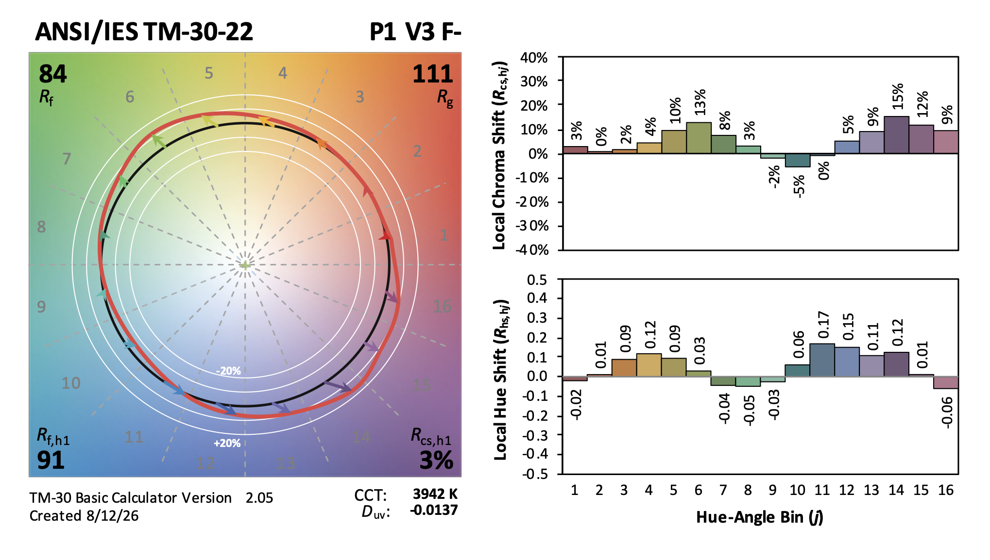
Neither CRI nor TM-30’s Rf (the fidelity index) say anything about the impact of the spectrum on specific color ranges, such as warm colors.  Rg doesn’t either since it gives us an average shift in saturation across all 99 color samples.  To see what color ranges are affected, and how, we need to look at the local hue and chroma shifts (“local” meaning the color samples falling within each of the 16 hue bins shown in the Color Vector Graphic or CVG).  As shown below, a TM-30 intermediate report gives us the CVG and bar graphs of the hue shift (Rhs) and chroma shift (Rcs) for each hue bin.  The bar graph information is included in the Color Vector Graphic, of course, but some may find the bar graphs easier to read.
TM-30 Intermediate Report

So, if the question is, “What colors are enhanced by this spectrum?”, and if “enhanced” means made more vivid, the answer is found in the chroma shift bar graph.  For any spectra, the color ranges that have a positive chroma shift would be enhanced, while those with a negative chroma shift might be described as being muted, dulled, or grayed.  This is true regardless of the material because color rendering is about an object’s color, not its material composition.  “Textiles and darker accents” don’t describe a color range, so there’s no way of knowing the impact of a spectra on those materials without also knowing their color.  As with whiteness, though, the manufacturer gives us no detailed information, just assurances that these lights are great.

Proceed with caution.  Don’t accept any of these claims without proof.  Get your lighting reps to bring you samples to evaluate before specifying these products. CCT and CRI cannot explain and back up a claim about a light source’s impact on the appearance of specific color ranges and white materials.  To do so, a manufacturer should provide specifiers with a description of the impact, a TM-30 report that supports that claim, and perhaps additional metrics for claims that can’t be verified or validated with TM-30.

False TM-30 Reports

I recently received a set of lighting submittals.  In them, one manufacturer had included TM-30 Full Reports.  At first I was delighted, thinking, “Finally, a manufacturer who’s made TM-30 a default part of their documentation!”  Here’s the report.

false tm-30 report


My excitement was followed, a few seconds later, by a sinking feeling as I realized that the report was falsified and was a composite of at least two SPDs.  Can you spot the errors?

  1.  The first odd item is the gray boxes around each graphic. Neither the Excel calculator nor the online calculator have those boxes as part of their graphics.  Something’s wrong.
  2. Look at the CVG and notice that the red shape, which represents the color rendering of the test source, very closely matches the black circle, which is the reference light source.  This is the hallmark of a high fidelity light source, and we would expect both Rf and Rg to be near 100.  Why is Rf 91?  Should it be higher?
  3. Look at Hue Bin 1 (red).  Notice that it’s almost touching the reference source circle.  There’s almost no hue shift or chroma shift.  But…
  4. Look at the graph of Local Chroma Shift.  Hue Bin 1 has a chroma shift of -12%, yet the red shape in the CVG is nearly touching the reference light source and is nowhere near the -10% white ring.  These two graphics are not from the same SPD.
  5. Likewise, the Local Color Fidelity of Hue Bin 1 is 80.  Again, the CVG shows almost no hue or chroma shift, so the Rf should be much higher than 80.  These are not from the same SPD.

What’s happened?  I honesty don’t know.  Obviously, someone cut and pasted TM-30 report components from at least two SPDs to create a false report – there’s simply no way the calculator created this from a single SPD.  Was it done out of ignorance or for a purpose?  Well, there’s no reason to cut and paste elements of a report because they’re generated automatically by the calculator.  I don’t know why this one was edited.  I do know that I rejected all fixtures by this manufacturer in this submittal.  I noted that if I they’re falsifying the spectral data I have no reason to believe they’re not doing the same elsewhere – driver into, housing dimensions, CCT, beam angle…who knows what they’re going to ship?

TM-30 Update: Challenges and strategies for working with SSL manufacturers – LD+A

I have written a lot about TM-30 from the specifier’s viewpoint – how TM-30 is better than CRI, explanations of the various TM-30 measures. why TM-30 data and reports are so important, how to get TM-30 data or reports, how to use TM-30, etc.

This month’s LD+A has a great article about TM-30 from the manufacturer’s viewpoint that addresses issues such as – why TM-30 reports for every LED option aren’t always available, why some manufacturers are reluctant to prepare TM-30 reports, strategies specifiers can use to deal with these issues, and more.  It’s a very useful article.  Give it a read at TM-30 Update: Challenges and strategies for working with SSL manufacturers – Illuminating Engineering Society %

Back to Basics with ALA

On August 16th I’ll be giving a presentation for the American Lighting Association (ALA) called Back to Basics: Fixtures, Spacing, and Techniques.  Here’s their description.

This course will provide an introductory level overview of common fixture types and how they should be spaced/installed. Downlights, wall washers, wall grazers, under shelf, track lighting, LED fixtures, and small size LED fixtures. Learn with the use of drawings/renderings of proper spacing ratios and angle of focus as well as other critical information. This is a can’t miss information for lighting designers, sales professionals, and installers.

The presentation is online at 12 noon, eastern.  If you’re interested you can sign up here.

CCT Doesn’t Predict Circadian Impact

Two of my IES Color Committee friends and colleagues, Tony Esposito and Kevin Houser, have just published a paper in Scientific Reports that looks at the common assumption that CCT can be used to assess circadian entrainment and other biological impacts of light. The assumption by many is that high CCT light contains the blue wavelengths necessary for circadian entrainment, and that assumption is emphasized in the marketing a wide range of tunable white fixtures.

Their study used a five-channel LED system in a full scale model of a room. The LEDs were used to create over 200,000 SPDs across a range of color temperatures and illuminance levels. They found that CCT alone is not an accurate predictor of the spectral content of the light. Since the three major systems used to predict “biological potency” of light – CIE melanopic Equivalent Daylight Illuminance (mel-EDI), Equivalent Melanopic Lux (EML), and Circadian Stimulus (CS) – all use spectral analysis to understand biological impact, using CCT alone is simply inadequate. High CCT may correspond to circadian response, or it may not. They conclude their paper by saying

The lighting industry is experiencing rapid transformation as we expand our awareness of the non-visual impacts of light on humans. It is pertinent that we develop measures, methods, and strategies for implementing architectural lighting solutions that support these non-visual impacts. To do so, we need accurate and predictive measures of the biological potency of light that are based on sound science. In this study, we have argued that CCT is conceptually inappropriate for this purpose and performed a numerical analysis demonstrating that significant variation in circadian stimulus and melanopic equivalent daylight illuminance exists at any fixed CCT and photopic illuminance, making CCT an inappropriate proxy of those measures. Using CCT as a proxy for the biological potency of light cannot be justified.

Understanding that CCT doesn’t correspond with biological impact, it becomes important that designers understand the three systems and push manufacturers to begin providing the relevant information.

Designing Beyond Fidelity

I recently began a project that includes about 8,000 SF of office space that is completely without windows or skylights.  I’ve renovated spaces like this before, and the common complaint from occupants was a disconnect from daylight, weather, and the way they indicate the passage of time.  On this project, I determined that the most appropriate solution was to use a light source that rendered colors in a way that is highly preferred to make the spaces more pleasant to occupy and use.

Of course, as a designer who is very knowledgable about color rendering issues and is a TM-30 advocate, I know two things.  First, highly preferred is not high fidelity.  People prefer a light source that slightly increases the saturation of object colors (especially reds) over a high fidelity source.  Second, TM-30’s Annex E provides specifiers with ranges for certain TM-30 measurements that allow us to accurately specify highly preferred light sources.

The task seemed simple enough.  Forget about fidelity and find a fixture/LED combination with a spectrum designed for preference, i.e. a light source that meets the TM-30 Annex E specification for a highly preferred (aka P1) light source.  After all, we’ve had TM-30 for seven years now, and Annex E for four years.  Surely, by now LED manufacturers have introduced products that meet color rendering goals other than fidelity, right?  Who wouldn’t see that as a huge marketing opportunity?  And surely fixture manufacturers would offer specifiers that LED, again to differentiate their products from the many, many, many similar products from other manufacturers…right?

Alas, the answer is, “No.”  One member of the IES Color Committee shared with me a database of over 1,000 LED products, their SPDs, and their various TM-30 measurements, including the Annex E Preference Design Intent.  Of those, there are a generous handful of retrofit lamps, most of them by Soraa and Cree, that meet the P1 specification, but only one LED in commercially available linear LED fixtures – Focal Point’s Preferred Light series.  That’s it!

Fortunately, this project is for a private firm so I don’t have to worry about developing a three-name or performance spec.  Otherwise, I would have to give up on a preferred spectrum and default to high fidelity not because it would be appropriate for the project but simply because there are more options.

I’ve mentioned fidelity and preference.  You might be asking if there are other color rendering goals.  The answer is, “Yes.”  Other color rendering design goals, with brief explanations, include:

Preference.  Light distorts object colors with slight increases in saturation, especially reds, in a way that is preferred over the reference light source (that is, preferred over high fidelity).   This might be the goal in an expensive restaurant where you want to emphasize the beautiful colors of the food, people, and interior design.

Vividness.  Light renders object colors as more or less vivid, or saturated, than the reference light source. Vividness is different from Preference in the degree of distorted saturation and the design intent – making colors pop, not making colors more attractive.  This might be the goal in the Skittles store in Times Square where you want the colors to leap out at people.  

Naturalness. Light renders object colors as expected, which, surprisingly, is usually not the same as fidelity.  This might be the color rendering goal in a grocery store where you want the food to look ripe and appetizing.

Discrimination.  Light renders object colors so they can be appropriately sorted. This might be the goal in a facility where even slight color variations must be detected.

Specifiers are captives of manufacturers.  We can have design goals oriented toward the needs of the users and the success of the project, but manufacturers only want to sell us fidelity, the same way they’ve been selling us fidelity since CRI was introduced in 1965.  For 50 years we only had a hammer (CRI) so all problems were nails (fidelity).  TM-30 changed that and it’s time for manufacturers to catch up.

Where are the Photometrics?

Today I want to talk about the lack of photometric information provided by manufacturers because the presentation of information frustrates me in two ways. The first issue is the lack of information provided. The second is the difficulty of finding real world examples of what I teach in class. What’s the value of knowing the point and lumen methods if the information needed isn’t available? It seems to be a problem that’s getting worse and I’m not sure why.

  • Do manufacturers not understand photometric calculations, so they don’t see the value in including them?
  • Do manufacturers think lighting designers don’t understand photometrics, so they don’t bother including them?
  • Do manufactures not understand how lighting designers work, and think all calculations are done in AGI? I suspect this is the answer.

By failing to publish photometrics, manufacturers are dictating my workflow without understanding how I work and why I work the way I do. I rarely name names, but I’m going to make an exception here. Maybe a little photmetric-shaming (one of the most obscure types of shaming, to be sure!) will get manufacturers to change.

Are You a Contender?

When I navigate my way to a fixture web page and open the cut sheet my main goal is to determine if the fixture is a contender. Does it seem to have the features I’m looking for? If not I can move on. If so, the next question is, “Does it have the performance I’m looking for?” Photometrically, I’m looking for general distribution type, followed by more specific distribution information, lumen output and load, and beam angle. If those look good, I’ll scroll down the cut sheet to the photometric section to get some info to run a quick calculation in a spreadsheet that’s open on my desktop. If the fixture works in that quick calculation I’ll download the cut sheet and .ies file and run an AGI calc when I’m ready. What I’m looking for on the cut sheet, depending not the calculation, is:

  • Lumen output
  • Center beam candlepower
  • Beam angle
  • Candelas distribution
  • Coefficient of utilization (CU) table

For example, I recently went looking for a linear downlight. My first stop was Coronet because I know they’ve recently revamped their historically deficient cut sheets. Are the new cut sheets any better? No. The first page of the cut sheet for the LSR2, for example, now has a section labeled “Optics” (not photometrics) and gives a sort of candlepower distribution curve, but there’s only one number, which seems to be candlepower at nadir but isn’t labeled as such. A separate section at the bottom of the next page shows “Performance” in terms of watts/ft and lumens/ft for three output levels. That’s it. Any reasonable calculation of the fixture’s performance in a space requires downloading .ies files, building a model in AGI, and running a calculation. As I said earlier, that’s not my workflow. I can run a lumen method calc much faster than I can build an AGI calc and I don’t want to be forced into AGI.

Next I looked at Focal Point’s Seem 2. As with Coronet, there’s a candlepower distribution curve. The ordering matrix tells me there are four lumen outputs, and there’s a table of output, watts, and lumens/watt. A lot of page space is given to lengths and controls, but there’s nothing else about photometric performance on the cut sheet. To find any useful information I have to download .ies files and open them in Photometric Toolbox or AGI.

Finally, I looked at Acuity’s Mark Lighting. The cut sheet for the Slot 2 LED presents a table of lumens/ft, watts/ft, and lumens/watt for four output levels, but there’s no candlepower distribution curve or CU table. On the plus side, the information I want is provided, but in a separate location on the web page called Photometry & Revit (BIM). If I click on Report I find a polar candelas graph, zonal lumen summary, CU table, etc. I wish this was in the cut sheet, but at least it’s available.

I have similar complaints about other manufacturers who make fixtures I generally like: Alphabet, USAI, Day-O-Lite, and Ecosense among them.

Let Manufacturers Know

If you’re similarly frustrated let manufacturers know. If you’re at Lightair this week tell them face to face. If not, tell your reps and anyone at the factory you may know.

Standard 189.1 Now Includes TM-30 Requirements

Yesterday an addendum to ANSI/ASHRAE/ICC/USGBC/IES Standard 189.1-2017 Standard for the Design of High-Performance Green Buildings was published. The addendum makes changes to Section 8.3.5, which covers lighting. One of the biggest changes is to add TM-30 color rendition criteria to the section on Indoor Lighting Quality. Here’s the relevant text:

8.3.5.3 Color Rendition. At least 95% of lighting power of nominally white lighting within each enclosed space shall be provided by luminaires that meet the following criteria at full light output in accordance with IES-TM-30, Annex E, P2 and F3:
1. Rf of at least 85
2. Rf,h1 of at least 85
3. Rg of at least 92
4. Rcs,h1 of at least -7% but no greater than +19%

Nominally white lighting is lighting that has chromaticity within the basic or extended nominal color correlated temperature (CCT) specifications of ANSI C78.377.

Where a lighting system is capable of changing its spectrum, it shall be capable of meeting the color rendition requirements within each nominal CCT of 2700 K, 3500 K, 4000 K, and 5000 K, as defined in ANSI C78.377, that the system is capable of delivering.

I hope that this is going to put more pressure on manufacturers to improve the color rendering of their luminaires as measured by TM-30, not CRI, and to provide TM-30 information on their cut sheets. If not, they’ll risk not being considered on projects that have TM-30 requirements.

CIE Position Statement on the use of UV-C

As interest in using light disinfection continues to grow standard setting organizations and manufacturers are becoming more active in this area.  The International Commission on Illumination (CIE) has just released a position statement on the use of ultraviolet radiation to manage the risk of COVID-19 transmission.

Here are a few bullet points:

  • While ultraviolet light ranges from 400 nm to 100 nm, the most effective wavelengths are at around 254 nm and this is generally what is meant by germicidal ultraviolet or GUV.
  • UV-C has been successfully used for water disinfection and in air handling units for many years.  UV-C has also seen a resurgence for use in healthcare environments.
  • Direct exposure to UV-C can cause photokeratitis (similar to snow blindness) and erythema (skin reddening similar to sunburn) so carefully shielded luminaires are required when used in occupied spaces.
  • Consumers should be wary of products not approved by consumer safety organizations.  Such products could be hazardous to use or may not emit UV-C at all.

Read the full position statement.


Tariffs Impact Lighting Costs

We have been hearing from contractors that many fixture manufacturers, including Acuity Brands, Hubbell Lighting and Eaton, are being forced to raise prices because of the recent tariff increase on Chinese goods.  

The tariff on lighting components and fixtures was 10%.  However, on May 10th the tariff was raised to 25%.  The 15% tariff increase is too much for manufacturers to absorb so they, and ECs, consider this a Force Majeure event (unforeseeable circumstances that prevent someone from fulfilling a contract).  By invoking Force Majeure they are voiding previous pricing and are issuing new quotes showing the cost increases.  

This doesn’t mean that all fixture prices are going to increase by 15%.  The amount of Chinese made components varies by manufacturer and fixture line.  More Chinese components will mean a higher cost increase.  To us this means that until the tariff and trade situation with China settles down lighting designers would do well to keep their clients informed of the varying impact on fixture costs and therefore fixture budgets.