I was recently a guest on The Lighting Controls Podcast where I spoke with C. Webster Marsh and Ron Kuszmar about today’s control requirements, what I’d like to see in future control systems, and (of course!) TM-30. Give it a listen.
Lighting Design Insights from the Author of Designing With Light and Fundamentals of Energy Efficient Lighting and Controls
I was recently a guest on The Lighting Controls Podcast where I spoke with C. Webster Marsh and Ron Kuszmar about today’s control requirements, what I’d like to see in future control systems, and (of course!) TM-30. Give it a listen.
The IES is about to publish ANSI/IES LP-30 Lighting Practice: A Comprehensive Guide to Specifying Color Rendition – Concepts, Criteria, and Implementation, which is essentially a user’s guide to TM-30. The IES Color Committee worked on it for over two years to create an easy to read, comprehensive, phase-by-phase guide to integrating TM-30 into a designer’s work flow.
On January 11th I’ll be giving a presentation on TM-30 and LP-30 at Lightovation at the Dallas Market Center. There will be a book signing afterward, with the first 40 attendees receiving a free copy of my Designing with Light, 2nd Edition. Hope to see you there!

I recently received a set of lighting submittals. In them, one manufacturer had included TM-30 Full Reports. At first I was delighted, thinking, “Finally, a manufacturer who’s made TM-30 a default part of their documentation!” Here’s the report.

My excitement was followed, a few seconds later, by a sinking feeling as I realized that the report was falsified and was a composite of at least two SPDs. Can you spot the errors?
What’s happened? I honesty don’t know. Obviously, someone cut and pasted TM-30 report components from at least two SPDs to create a false report – there’s simply no way the calculator created this from a single SPD. Was it done out of ignorance or for a purpose? Well, there’s no reason to cut and paste elements of a report because they’re generated automatically by the calculator. I don’t know why this one was edited. I do know that I rejected all fixtures by this manufacturer in this submittal. I noted that if I they’re falsifying the spectral data I have no reason to believe they’re not doing the same elsewhere – driver into, housing dimensions, CCT, beam angle…who knows what they’re going to ship?
On Wednesday, September 25th I’ll be on a panel at the Retail Design Institute New York Chapter’s Lighting Summit 2024. The other panelists are Shoshanna Segal of Hantranft Lighting Design, Carlotta Dove of IA Interior Architects, and Kazumi Tanimura of Atelier Lumiere. The event is at the Illuminations showroom at 5 Penn Plaza. Hope to see you there!
I’ll be giving a presentation on TM-30 (naturally) at the American Lighting Association Conference in Palm Beach, FL on September 23rd. If you’re at the conference and/or a fan of TM-30 stop by and say hi.
It’s been a while since I’ve posted anything because I’ve been working on a new book. More on that as we get closer to the publication date. Meanwhile, I’ve been asked (somewhat at the last minute) to speak on Monday June 3rd at an upcoming AIA New York event called Healing Light: The Biological and Social Effects of Lighting. The presentation will be an introduction to color temperature and color rendering and is primarily targeted at architects and interior designers who are new to lighting. Registration is free to AIA members and students, and only $10 for the general public.
I have written a lot about TM-30 from the specifier’s viewpoint – how TM-30 is better than CRI, explanations of the various TM-30 measures. why TM-30 data and reports are so important, how to get TM-30 data or reports, how to use TM-30, etc.
This month’s LD+A has a great article about TM-30 from the manufacturer’s viewpoint that addresses issues such as – why TM-30 reports for every LED option aren’t always available, why some manufacturers are reluctant to prepare TM-30 reports, strategies specifiers can use to deal with these issues, and more. It’s a very useful article. Give it a read at TM-30 Update: Challenges and strategies for working with SSL manufacturers – Illuminating Engineering Society %
On August 16th I’ll be giving a presentation for the American Lighting Association (ALA) called Back to Basics: Fixtures, Spacing, and Techniques. Here’s their description.
This course will provide an introductory level overview of common fixture types and how they should be spaced/installed. Downlights, wall washers, wall grazers, under shelf, track lighting, LED fixtures, and small size LED fixtures. Learn with the use of drawings/renderings of proper spacing ratios and angle of focus as well as other critical information. This is a can’t miss information for lighting designers, sales professionals, and installers.
The presentation is online at 12 noon, eastern. If you’re interested you can sign up here.
Recently a colleague of mine from the IES Color Committee asked of one of the new AIs “Tell me about color rendering.” If we assume that the answer was formulated based on information about color rendering that is available on the internet we have a problem because the answer the AI returned was almost completely wrong. That strongly suggests that most individuals and manufacturers posting information about color rendering don’t fully understand color rendering and are perpetuating outdated or incorrect information. Here’s what the AI had to say, and what’s wrong with it’s response.
Color rendering is a measure of how well a light source reveals the true colors of objects. (1) A light source with a high CRI (Color Rendering Index) will show objects in their natural colors (2), while a light source with a low CRI will make objects look dull or washed out (3). The CRI is a scale from 0 to 100 (4), with 100 being the perfect score (5). A light source with a CRI of 100 will show objects in their true colors (1) while a light source with a CRI if 0 will make all objects look the same color (6).
The CRI (7) is important for applications where it is important to see objects in their true colors (1), such as art galleries, hospitals, and retail stores (8). It is also important for applications where it is important to see subtle variations in color such as fashion design and photography (9).
There are a few things that can affect the CRI of a light source (10). The type of light source (incandescent, fluorescent, LED, etc.) will affect the CRI (11). The color temperature of the light source will also affect the CRI (12). Light sources with a higher color temperature will have a higher CRI (12).
The CRI (7) is a valuable tool for choosing the right light source for your application. By understanding the CRI, you can choose a light source that will show your objects in their true colors (1) and help you achiever the desired look and feel for your space.
As part of the conversation around Diversity, Equity, Inclusion, and Respect there’s been a lot of discussion about color rendering and skin tone. I recently heard one speaker say something like, “We know that historical SPDs are racist.” I don’t think that’s accurate or helpful. Here’s why.
Since the development of the fluorescent lamp, the first priority for lamp manufacturers has been maximizing efficacy – getting the most lumens per watt. That’s still largely true today, even though LEDs are so efficient that there’s a lot of room for other considerations. An exclusive focus on efficacy inevitably results in poor color rendering, so the second priority has been acceptable (not maximized) color rendering. In other words, manufacturers have tried to find the right balance between efficacy and quality, but they emphasize efficacy.
When evaluating color rendering, manufacturers only look at the numbers. Whether it’s a calculation of CRI, Rf, Rg, or something else, it’s all done mathematically. There’s no interest in comparing the calculated values with empirical observations. The eight colors used to calculate CRI are a limited range that don’t include a representation of skin, as shown below.

The 99 colors used for TM-30 calculations span the color space and are not weighted toward any hue, tint, or value, as shown below.
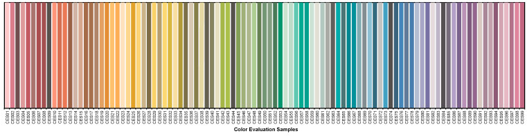
So, there’s never been a focus on caucasian skin tone to the detriment of others because skin tone isn’t part of the evaluation.
Does that mean that all skin tones are rendered equitably? Honestly, we don’t know. On one hand, there’s no reason to think that we evaluate skin tone differently than we evaluate other surfaces. It’s reasonable to expect that a high fidelity source, for example, that give cars, apples, and kittens a good color appearance will do the same for human skin.
On the other hand, we don’t have good studies to confirm that. It may be that we hold different criteria for evaluating skin than we do for apples, resulting in the need for a separate skin tone rendering metric. Again, today we just don’t know.
In fact, the IES Color Committee is looking at this right now. We’ve started with an effort to gather as many studies as we can find – though there are very few that focus on skin rendering. The next step is to evaluate the literature to determine if additional study is needed, and what such a study (or studies) would require and evaluate. The hard part is funding the studies, and that would be the next step. Eventually, we’d have some solid science from high quality studies that would tell us if skin tone is evaluated differently than other surfaces, and if so what the calculation of a skin tone metric should include. The goal is to use the appropriate TM-30 measures (remember, there are 149 of them) to evaluate skin tone rendering, and to add a skin tone metric (maybe Rs) to TM-30, if needed.
If you’re interested in joining the task group looking at this, please contact me.