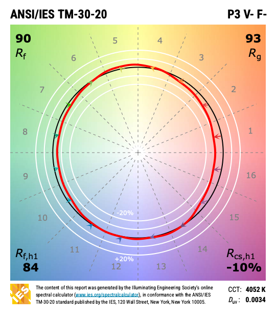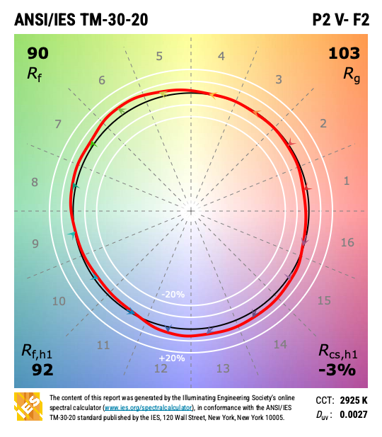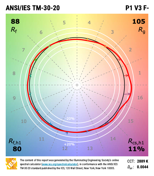
I know I often write about color rendering. It’s because most lighting manufacturers and specifiers treat color rendering as a check box item (80 or 90?). I see color rendering as a powerful, valuable design choice that impacts the appearance of a space. This is especially true when using TM-30’s suite of measurements. So, here I go again…
I recently came across an ad from a luminaire manufacturer that described three versions of a new product line that focuses on color rendering. One version is supposed to “enhance the contrast between colors and whites”. Another is supposed to “accent wood, bronze, textiles and darker accents” (so, warm colors, all colors, and dark colors?). The third is supposed to “enhance white surfaces”. All three versions are described having a CCT of 3000 K and a CRI of 90, and that’s all we’re told. There is no other color rendering information presented in the ad, on the web site, or on the cut sheets. It’s as though somehow 3000 K and 90 CRI are supposed to clearly describe all three color rendering effects. CRI – it’s a hair gel, it’s a toothpaste, and it’s a floor polish! Obviously, this is nonsense. So, let’s talk about what’s really going on here.
Over the years CRI has been erroneously described as measuring the naturalness of a light source, the naturalness of colors, a comparison to daylight, and even a percentage of colors that are rendered (whatever that’s supposed to mean). All of those are wrong. CRI is a fidelity measurement. That is, it compares a light source to its reference source (a black body radiator below 5000 K and a model of daylight at 5000 K and above, and at the exact CCT as the light source in question) and describes how well they match. The reference light source isn’t meant to be considered perfect – it’s meant to be a light source with well understood color rendering properties. A poor match in color rendering results in a low CRI. A better match results in a higher CRI. A CRI of 90 indicates a pretty good, but not exact match. What is the mismatch? What specific colors or color ranges are affected? Are some colors shifted in hue, made less saturated, made more saturated, some combination? We don’t know the answers because the CRI calculation gives us one number, Ra, not a suite of numbers and/or graphics that supplement the top line result.
So, a light source that is 3000 K and 90 CRI might have one of the three color rendering properties described by this manufacturer, and other versions of 3000 K and 90 CRI could have the other characteristics, but the numbers presented don’t describe or confirm those properties or characteristics at all. For that we need to look at TM-30 and beyond.
Two of the three descriptions reference the color rendering of white, but there’s no explanation of how this is determined, and that’s a problem. Neither CRI nor TM-30 specifically evaluate white surfaces or materials. There have been several whiteness metrics proposed over the years, beginning in the 1930s. As far as I know, only one has been adopted by a standards setting organization (the CIE whiteness formula from 1986). However, this manufacturer can’t be using the CIE formula because it only uses D65 (a standardized spectra at 6500 K) and the LEDs here are all 3000 K.
Neither CRI nor TM-30’s Rf (the fidelity index) say anything about the impact of the spectrum on specific color ranges, such as warm colors. Rg doesn’t either since it gives us an average shift in saturation across all 99 color samples. To see what color ranges are affected, and how, we need to look at the local hue and chroma shifts (“local” meaning the color samples falling within each of the 16 hue bins shown in the Color Vector Graphic or CVG). As shown below, a TM-30 intermediate report gives us the CVG and bar graphs of the hue shift (Rhs) and chroma shift (Rcs) for each hue bin. The bar graph information is included in the Color Vector Graphic, of course, but some may find the bar graphs easier to read.
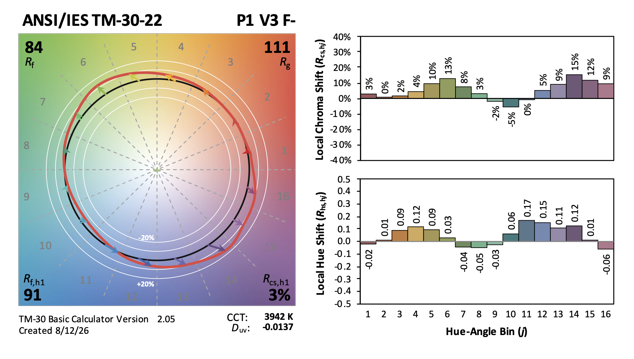
So, if the question is, “What colors are enhanced by this spectrum?”, and if “enhanced” means made more vivid, the answer is found in the chroma shift bar graph. For any spectra, the color ranges that have a positive chroma shift would be enhanced, while those with a negative chroma shift might be described as being muted, dulled, or grayed. This is true regardless of the material because color rendering is about an object’s color, not its material composition. “Textiles and darker accents” don’t describe a color range, so there’s no way of knowing the impact of a spectra on those materials without also knowing their color. As with whiteness, though, the manufacturer gives us no detailed information, just assurances that these lights are great.
Proceed with caution. Don’t accept any of these claims without proof. Get your lighting reps to bring you samples to evaluate before specifying these products. CCT and CRI cannot explain and back up a claim about a light source’s impact on the appearance of specific color ranges and white materials. To do so, a manufacturer should provide specifiers with a description of the impact, a TM-30 report that supports that claim, and perhaps additional metrics for claims that can’t be verified or validated with TM-30.