Next Wednesday I’ll be giving a presentation on LP-30 at LEDucation (hope to see you there!), and in preparing for it I’ve been reflecting on how far we’ve come in our understanding and evaluation of color rendering.
The Color Rendering Index (CRI) was published by the International Commission on Illumination (Commission Internationale de l’Eclairage or CIE) in 1965, primarily to deal with the problem of poor color rendering by early fluorescent lamps. It was a rather simple system that evaluated a light source by mathematically comparing the appearance of eight colors under the test light in question to their appearance under a standardized reference light source of the same correlated color temperature (CCT). It used the latest models of human vision, returned a single value that was easy to understand, and was quickly adopted by the industry.
CRI is a fidelity metric, meaning that the CRI value represents how closely the test light matches the reference light. Since this was the only system endorsed by a standards setting body, and became ubiquitous in our industry, many people came to believe that color rendering and fidelity were the same thing.
Perhaps unsurprisingly for a new system, errors were found and corrected in the 1974 update. The next update, in 1995, made only typographical corrections to the document. Science has, of course, progressed since then with many components of the CRI calculation being withdrawn from use by the CIE as improved components were developed. The problems were well known and documented. For example, the IES Lighting Handbook 9th Edition, published in 2000, included a brief discussion about this, and the 10th Edition, published in 2011, included a table describing nine limitations of CRI. Unfortunately, for what seem to be political, not scientific, reasons CRI hasn’t been updated since. In fact, as late as 2017 CIE 224:2017 continued to recommend CRI for general use.
The “limitations” of CRI were exacerbated by LEDs, whose distinctive spectral shape frequently resulted in CRI values at odds with observed color rendering. By the mid-2010s the mismatch between CRI values and observations, combined with the clear trajectory LEDs were on to exceed the efficacy of other light sources and become the dominant source, meant something had to change. Since it was clear that CIE wasn’t going to update CRI, members of the IES Color Committee formed a Task Group to evaluate the issue and develop a completely up to date, color rendering metric drawing on the best ideas other researchers had proposed over the years. The result, in 2015, was ANSI/IES TM-30 Technical Memorandum: IES Method for Evaluating Light Source Color Rendition, or TM-30.
Initially, we thought that TM-30’s Rf (Fidelity Index) and Rg (Gamut Index) would be the key metrics, because they were similar to the CRI-GAI (Gamut Area Index) system developed at Rensselear Polytechnic Institute as an improvement on CRI alone. Light sources that met certain values were described as Class A under this system. TM-30 produces many more measurements, 149 in fact. We didn’t know what they would mean or how they could be used, but thought the additional information would, at a minimum, be useful to researchers.
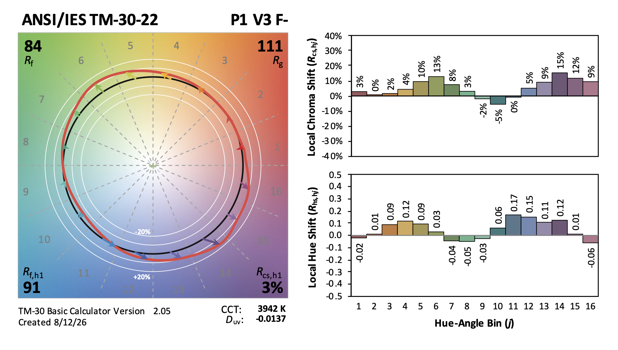
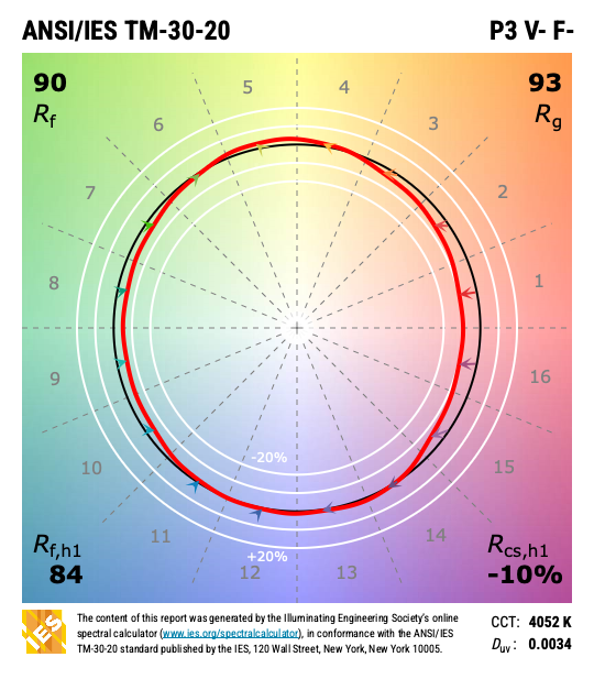
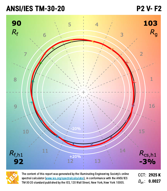
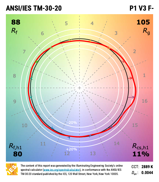
However, by 2018 several studies had been published with exciting results showing that by using four metrics instead of two (Rf, Rg, Rf,h1 (fidelity of red), and Rcs,h1 (chroma shift of red) TM-30 would allow users to evaluate a light source not only for fidelity, but for preference and vividness as well. The analysis of the studies became TM-30’s Annex F, with the explanation of Preference (P), Vividness (V), and Fidelity (F) provided in Annex E, and the TM-30 reports were modified in 2020 to display the four key metrics and the PVF results. This was a huge improvement over CRI and gave designers the ability to tailor their color rendering goals to the needs of the project and the occupants. For example, projects such as hospitality benefit from a light source that renders colors in a way that is preferred vs high fidelity.
In the meantime, CIE did a more thorough evaluation of Rf (specifically their version of Rf as defined in CIE 224:2017) and in January of 2025 CIE PS 002:2025 recommended the industry transition away from CRI to Rf. The IES, on the other hand, takes the position that it doesn’t make sense to simply replace one fidelity metric with another. Instead, they recommend the industry adopt the entire suite of TM-30 metrics, including the evaluation of PVF.
The problem for specifiers, at that point, was how to use this information. What are preference, vividness and fidelity? How do I find a preferred source, and how do I specify it? What TM-30 information do I collect/need at each phase of the design? What language can I put in my specification? While many of us on the Color Committee (and others) gave seminars and webinars over the years, there are still many who aren’t certain how to use TM-30.
To provide a clear answer to those questions the Color Committee formed a Task Group to write a user’s guide to TM-30. For more than three years a half dozen people wrote, illustrated, re-wrote and re-illustrated ANSI/IES LP-30 Lighting Practice: A Comprehensive Guide to Specifying Color Rendition — Concepts, Criteria, and Implementation. LP-30 provides the industry with a guide to specifying color rendition with TM-30 by expanding on the framework of TM-30 Annex E. The goal of this document is to help lighting specifiers understand color rendition considerations for a project and appropriately gather, interpret, and apply TM-30 metrics. It provides a thorough description of how color rendition may be considered in each phase of design, explains color rendition goals and color rendition related steps in the design process, related activities that occur during those steps, and examples of the deliverables in each design phase.
LP-30 is available in the IES Online Lighting Library and the IES Store.
For those of you not able to make it to LEDucation, I will also be giving a presentation on LP-30 at ArchLIGHT Summit in September. There, we hope to have a color rendering demonstration to illustrate the ideas discussed during the presentation.