CRI Has One Job. That’s the Problem.

Below is a slightly expanded version of an article I wrote for this month’s IES NYC newsletter.

Color rendering should be an intentional design decision, not a specification checkbox.  I was recently in what should have been a beautiful hotel bar.  The interior was relatively new and skillfully conceived and executed, the materials were luxurious, and the lighting design should have been beautiful. Unfortunately, the overall look of the space was flat and dull.  It didn’t take me long to figure out why – poor color rendering was muting the colors in the space.

I could tell that the SPD, while warm (roughly 2400 K) was still deficient in red and probably had a CRI in the low 80s.  The lighting designer probably relied on CRI, which isn’t up to the job in this application.  CRI only tells you one thing about a light source: fidelity, or how closely it matches the reference light source.  This means the designer can have only one color rendering goal.  TM-30, on the other hand, supports a broad range of possibly overlapping color rendering goals.  The lighting designer then balances the metrics, evaluating of preference, vividness, and fidelity to achieve specific goals.

Start with Blue to Make Red

Most of us know that white light LEDs start with a blue LED as the “pump”.  Phosphors packed on top of the blue LED convert a large portion of that blue light to longer wavelengths.  Converting high energy, short wavelength blue light to lower energy, longer wavelength light comes at the expense of efficacy.  The more blue light converted to green, yellow, orange, and red, the lower the LED’s lumens per watt.  Since most manufacturers prize efficacy over color rendering, the skimp on red compared to the reference light source, resulting in low CRI.

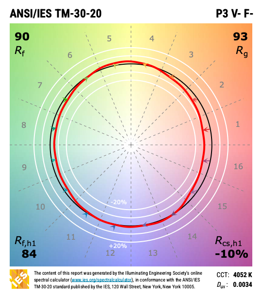
Figure 1 is a TM-30 report for a typical 80 CRI LED.  At the top right hand corner the P3 V- F- means its color rendering meets Priority Level 3 for Color Preference (P3) so it is slightly preferred over a high CRI source, that it doesn’t increase the vividness of colors (V-), and that the color rendering is not very close to its reference source (F-).  In the graphic, the red arrows pointing toward the center of the circle indicate less energy in those color ranges than in the reference source.  This results in the muting or graying of all object colors in those ranges, including the skin of the people in the room.
TM-30 report of a typical CRI 80 light source
Figure 1 – TM-30 report of a typical 80 CRI light source.


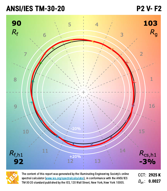
Figure 2 is a TM-30 Simple Report of a typical 90 CRI LED.  Even here, there’s slightly less red than in the reference light source. P2 indicates that it is broadly preferred over a high CRI source and F2 indicates that it has good color fidelity.
 

TM-30 report of a typical 90 CRI light source
Figure 2 – TM-30 report of a typical 90 CRI light source


Use the Tools

So, using a 90 CRI LED instead of an 80 CRI LED would improve things, and many designers and manufacturers are defaulting to 90 CRI these days.  However, there’s another problem – the Hunt effect, which tells us that as illuminance decreases, so does perceived object colorfulness.  The bar was lit to somewhere between 5 and 10 fc, so even under a high CRI source the colors in the room would be muted compared to their appearance at, say, 50 fc.  CRI leaves us powerless to do anything about this, but TM-30 gives us the tools.

Instead of looking for a high CRI source, the designer could have used the PVF measures from TM-30 to find a high preference source, as shown in Figure 3.  A light source that measures P1 (highly preferred compared to the reference source) has a spectrum that increases red saturation, which would enhance the colors of materials in a way that people prefer over high fidelity – and possibly somewhat negate the Hunt effect.
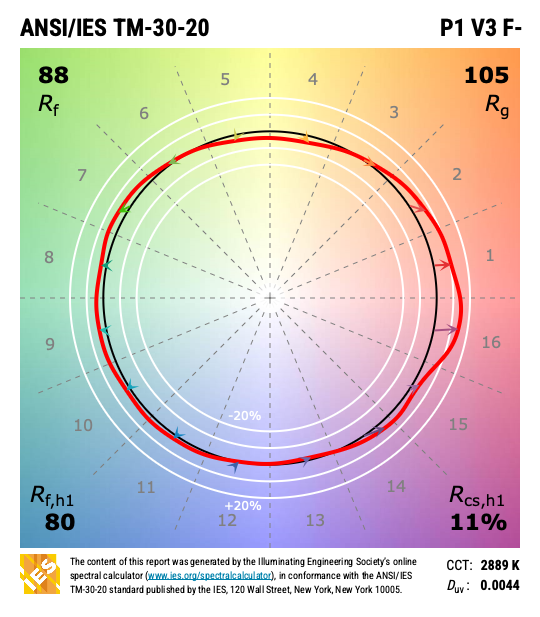
 

TM-30 report for a typical high preference light source
Figure 3 – TM-30 report for a typical high preference light source


When attempting to counter the Hunt effect, a light source that also increases the overall vividness of colors (V3 or V2) would do an even better job.  This is just one example of how switching to TM-30 and broadening your color rendering goals can enhance your lighting designs.

Don’t Trade One-for-One

One final note.  In January of 2025 the CIE recommended the lighting industry transition from CRI to Rf, which is a much more accurate measure of fidelity.  My position, and that of the IES Color Committee, is it makes no sense to swap out one fidelity measure for another.  Designers would still be limited to a single color rendering goal.  We’d like the industry to adopt the full TM-30 suite.  Designers can ignore the 149 calculated values and focus on the PVF categories as I’ve done here.

For a full explanation of the color rendering goals possible with TM-30 and Preference, Vividness, and Fidelity, see ANSI/IES LP-30 Lighting Practice: A Comprehensive Guide to Specifying Color Rendition – Concepts, Criteria, and Implementation in the IES Online Store or the Online Lighting Library.  Despite its long title it is an easy to read, phase-by-phase user’s guide to TM-30. From schematic design to construction documentation, this TM-30 user’s guide outlines important color quality considerations and how to incorporate them into your workflow.


Do you see blue or green? This viral test plays with color perception | The Guardian

Here’s an interesting article about color perception, specifically blue/green perception, from The Guardian.  There’s also a link to a fun web site where you can test your blue/green perception.

Source: Do you see blue or green? This viral test plays with color perception | Well actually | The Guardian

147 Countries Agree to Eliminate Fluorescent Lamps by 2027

The Minamata Convention on Mercury, a program of the United Nations with delegates from at least 150 countries, is dedicated to improving global health by phasing out the use of mercury in manufacturing, banning new mercury mines, and limiting mercury emissions.   Last month, 147 countries (out of a global total of 195) agreed to phase out florescent lighting globally and completely by 2027.

According to the appliance efficiency non-profit, CLASP, the phase out will, between 2027 and 2050:

  • Avoid 2.7 gigatons of CO2 emissions,
  • Eliminate 158 tons of mercury pollution, both from the light bulbs themselves and from avoided mercury emissions from coal-fired power plants,
  • Save US$1.13 trillion on electricity bills.

Early fluorescent lamps were being tested by Thomas Edison and Nicola Tesla in the 1890s, but it took several advances before they were ready for commercial use around the 1940s.  According to the Department of Energy, by 1951 more light was being produced in the US by fluorescent lamps than by incandescent lamps.  But, this always came at a cost.  Fluorescent lamps work by passing an electric current through gaseous mercury, which emits ultraviolet light, which in turn is converted to visible light by the phosphors that line the fluorescent tube. When discarded (and eventually broken) the mercury would enter the environment, which is why the EPA began encouraging fluorescent lamp recycling and mercury recovery in the mid-2000s.  Mercury is a neurotoxin, and symptoms of prolonged and/or acute exposures include:

  • Tremors
  • Emotional changes (such as mood swings, irritability, nervousness, excessive shyness)
  • Insomnia
  • Neuromuscular changes (such as weakness, muscle atrophy, twitching)
  • Poor performance on tests of mental function

So, after around 70 years as the dominant commercial light source, and 10 years of decline after the introduction of LEDs, the fluorescent lamp has joined kerosene, whale oil, and others as an historical or legacy light source.

AI and the Internet Need to Learn Color Rendering

Recently a colleague of mine from the IES Color Committee asked of one of the new AIs “Tell me about color rendering.”  If we assume that the answer was formulated based on information about color rendering that is available on the internet we have a problem because the answer the AI returned was almost completely wrong.  That strongly suggests that most individuals and manufacturers posting information about color rendering don’t fully understand color rendering and are perpetuating outdated or incorrect information.  Here’s what the AI had to say, and what’s wrong with it’s response.

Color rendering is a measure of how well a light source reveals the true colors of objects. (1) A light source with a high CRI (Color Rendering Index) will show objects in their natural colors (2), while a light source with a low CRI will make objects look dull or washed out (3).  The CRI is a scale from 0 to 100 (4), with 100 being the perfect score (5).  A light source with a CRI of 100 will show objects in their true colors (1) while a light source with a CRI if 0 will make all objects look the same color (6).

The CRI (7) is important for applications where it is important to see objects in their true colors (1), such as art galleries, hospitals, and retail stores (8).  It is also important for applications where it is important to see subtle variations in color such as fashion design and photography (9).

There are a few things that can affect the CRI of a light source (10).  The type of light source (incandescent, fluorescent, LED, etc.) will affect the CRI (11).  The color temperature of the light source will also affect the CRI (12).  Light sources with a higher color temperature will have a higher CRI (12).

The CRI (7) is a valuable tool for choosing the right light source for your application.  By understanding the CRI, you can choose a light source that will show your objects in their true colors (1) and help you achiever the desired look and feel for your space.


  1. Objects don’t have “true” colors, they have apparent colors.  The color of an object is determined by the spectrum of light striking it, it’s reflective properties, and the resulting light directed toward the observer.  An object’s reflective properties don’t change, but the spectrum of light changes every time the light source changes.  Changing the spectrum may, therefore, change the color appearance of the object, hence apparent color.
  2. While there is a correlation between fidelity and naturalness, they are not the same thing.  CRI measures fidelity, i.e. how well a given light source matches the color rendering of a defined reference light source.
  3. One of the problems with single measure metrics like CRI is that there’s a lot of information that isn’t conveyed.  As CRI values drop, the only thing conveyed is that the match to the reference light source is worse.  A worse match, however, doesn’t mean colors are made dull. It could be they are increased in saturation since both deviations from the reference are equally penalized.  That’s the advantage of TM-30.  As Rf decreases we can see why by looking at Rg and some of the other 147 measures.
  4. CRI can have negative values.  TM-30 Rf is calculated so that 0 is the lowest value.
  5. 100 is the highest value.  It’s dangerous to call it “perfect” though as that implies that high fidelity is the only color rendering goal, which it isn’t.  TM-30 provides information for the color rendering goals of preference and vividness, and may include more in the future.
  6. A CRI of 0 will certainly make nearly all colors look terrible and very similar, but not all the same.
  7. CRI isn’t a proper noun, and shouldn’t be preceded by “the”.
  8. There are strong arguments for emphasizing preference over fidelity in many applications, including retail.  Again, fidelity isn’t the only color rendering goal, although it is the only one CRI measures.
  9. Research shows that high fidelity isn’t necessarily the best spectrum for detecting color difference.  Additional research is needed, but the IES may eventually add a color difference metric to TM-30.
  10. Only one thing affects CRI value – the spectrum of the light source.
  11. This is true because different light producing technologies have similar quirks in their spectra.  Those similarities can lead us to blanket statements such as “all fluorescents are green” which are not true for all products.  Again, the individual light source’s spectrum determines everything.
  12. A common misconception, but not true at all.  Not in the slightest. CCT and CRI are separate metrics.

Color Rendering and Skin Tone

As part of the conversation around Diversity, Equity, Inclusion, and Respect there’s been a lot of discussion about color rendering and skin tone.  I recently heard one speaker say something like, “We know that historical SPDs are racist.”  I don’t think that’s accurate or helpful.  Here’s why.

Since the development of the fluorescent lamp, the first priority for lamp manufacturers has been maximizing efficacy – getting the most lumens per watt.  That’s still largely true today, even though LEDs are so efficient that there’s a lot of room for other considerations.  An exclusive focus on efficacy inevitably results in poor color rendering, so the second priority has been acceptable (not maximized) color rendering.  In other words, manufacturers have tried to find the right balance between efficacy and quality, but they emphasize efficacy.

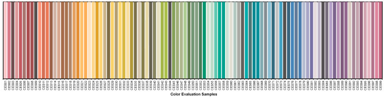
When evaluating color rendering, manufacturers only look at the numbers.  Whether it’s a calculation of CRI, Rf, Rg, or something else, it’s all done mathematically.  There’s no interest in comparing the calculated values with empirical observations.  The eight colors used to calculate CRI are a limited range that don’t include a representation of skin, as shown below.

Color used for CRI calculation

The 99 colors used for TM-30 calculations span the color space and are not weighted toward any hue, tint, or value, as shown below.

So, there’s never been a focus on caucasian skin tone to the detriment of others because skin tone isn’t part of the evaluation.


Does that mean that all skin tones are rendered equitably?  Honestly, we don’t know.  On one hand, there’s no reason to think that we evaluate skin tone differently than we evaluate other surfaces.  It’s reasonable to expect that a high fidelity source, for example, that give cars, apples, and kittens a good color appearance will do the same for human skin.

On the other hand, we don’t have good studies to confirm that.  It may be that we hold different criteria for evaluating skin than we do for apples, resulting in the need for a separate skin tone rendering metric.  Again, today we just don’t know.

In fact, the IES Color Committee is looking at this right now.  We’ve started with an effort to gather as many studies as we can find – though there are very few that focus on skin rendering.  The next step is to evaluate the literature to determine if additional study is needed, and what such a study (or studies) would require and evaluate.  The hard part is funding the studies, and that would be the next step.  Eventually, we’d have some solid science from high quality studies that would tell us if skin tone is evaluated differently than other surfaces, and if so what the calculation of a skin tone metric should include.  The goal is to use the appropriate TM-30 measures (remember, there are 149 of them) to evaluate skin tone rendering, and to add a skin tone metric (maybe Rs) to TM-30, if needed.

If you’re interested in joining the task group looking at this, please contact me.

Designing Beyond Fidelity

I recently began a project that includes about 8,000 SF of office space that is completely without windows or skylights.  I’ve renovated spaces like this before, and the common complaint from occupants was a disconnect from daylight, weather, and the way they indicate the passage of time.  On this project, I determined that the most appropriate solution was to use a light source that rendered colors in a way that is highly preferred to make the spaces more pleasant to occupy and use.

Of course, as a designer who is very knowledgable about color rendering issues and is a TM-30 advocate, I know two things.  First, highly preferred is not high fidelity.  People prefer a light source that slightly increases the saturation of object colors (especially reds) over a high fidelity source.  Second, TM-30’s Annex E provides specifiers with ranges for certain TM-30 measurements that allow us to accurately specify highly preferred light sources.

The task seemed simple enough.  Forget about fidelity and find a fixture/LED combination with a spectrum designed for preference, i.e. a light source that meets the TM-30 Annex E specification for a highly preferred (aka P1) light source.  After all, we’ve had TM-30 for seven years now, and Annex E for four years.  Surely, by now LED manufacturers have introduced products that meet color rendering goals other than fidelity, right?  Who wouldn’t see that as a huge marketing opportunity?  And surely fixture manufacturers would offer specifiers that LED, again to differentiate their products from the many, many, many similar products from other manufacturers…right?

Alas, the answer is, “No.”  One member of the IES Color Committee shared with me a database of over 1,000 LED products, their SPDs, and their various TM-30 measurements, including the Annex E Preference Design Intent.  Of those, there are a generous handful of retrofit lamps, most of them by Soraa and Cree, that meet the P1 specification, but only one LED in commercially available linear LED fixtures – Focal Point’s Preferred Light series.  That’s it!

Fortunately, this project is for a private firm so I don’t have to worry about developing a three-name or performance spec.  Otherwise, I would have to give up on a preferred spectrum and default to high fidelity not because it would be appropriate for the project but simply because there are more options.

I’ve mentioned fidelity and preference.  You might be asking if there are other color rendering goals.  The answer is, “Yes.”  Other color rendering design goals, with brief explanations, include:

Preference.  Light distorts object colors with slight increases in saturation, especially reds, in a way that is preferred over the reference light source (that is, preferred over high fidelity).   This might be the goal in an expensive restaurant where you want to emphasize the beautiful colors of the food, people, and interior design.

Vividness.  Light renders object colors as more or less vivid, or saturated, than the reference light source. Vividness is different from Preference in the degree of distorted saturation and the design intent – making colors pop, not making colors more attractive.  This might be the goal in the Skittles store in Times Square where you want the colors to leap out at people.  

Naturalness. Light renders object colors as expected, which, surprisingly, is usually not the same as fidelity.  This might be the color rendering goal in a grocery store where you want the food to look ripe and appetizing.

Discrimination.  Light renders object colors so they can be appropriately sorted. This might be the goal in a facility where even slight color variations must be detected.

Specifiers are captives of manufacturers.  We can have design goals oriented toward the needs of the users and the success of the project, but manufacturers only want to sell us fidelity, the same way they’ve been selling us fidelity since CRI was introduced in 1965.  For 50 years we only had a hammer (CRI) so all problems were nails (fidelity).  TM-30 changed that and it’s time for manufacturers to catch up.

Manufacturers Don’t Understand Color Rendering

I attended LEDucation in New York City this week.  While there I spoke to over two dozen manufacturers, none of whom understood color rendering beyond the (partially accurate) belief that higher CRI is better.  My conversations when like this.

Lighting Salesperson: “Our color rendering is great.  Our CRI is over 90 and our R9 is over 50.”

Me: “CRI measures color fidelity.  What if my goals are something else?”

Lighting Salesperson: “…”

or

Lighting Salesperson: “Our color rendering is great.  Our CRI is over 90 and our R9 is over 50.”

Me: “CRI has inaccuracies that have been known for decades while TM-30 is the most accurate and up to date system.  If color fidelity is important to you, why aren’t you using TM-30’s Rf?”

Lighting Salesperson: “Well, lighting designers don’t understand TM-30.”

Me: “Oh, I think many of them do.  But, even if they don’t, don’t you want to be sure that your color rendering claims are true?  Couldn’t you educate designers about TM-30?  The IES Color Committee will help.”

Lighting Salesperson: “…”

So, (big sigh, big eye roll) let’s go over this again.  If we think of CIE 13.3-1995 Method of Measuring and Specifying Colour Rendering Properties of Light Sources, aka CRI, as a technology, then it’s a technology from 1965 which is when the first version was published.  In 1965 Lyndon Johnson was president, Bonanza was the most popular TV show, Wooly Bully by Sam the Sham and The Pharaohs was the most popular song, and the Chevrolet Impala (Jet Smooth Ride!) was the most popular car.  CRI is O-L-D.

As with any other technology that is 57 years old,  the science has advanced.  Unfortunately, CRI has not. There were two minor corrections, the most recent in 1995, but they did little to fix at least a half dozen errors and inaccuracies that have been well documented for decades.  The CIE basically admitted that when, in 2017, they published CIE 224 Colour Fidelity Index for Accurate Scientific Use, which is TM-30’s Rf measure of fidelity.  Why publish 224 and not withdraw CRI?  Why have one measure for accurate scientific use and one for (inaccurate?) general use? The CIE requires unanimous votes for any action to be approved.  I’m told by reliable sources who were in the room that one global lamp manufacturer has been resisting updating or replacing CRI for decades, and that one manufacturer has held up progress or change.

So, CRI is has known inaccuracies resulting from a combination of outdated internal calculations along with other limitations.  Meanwhile, TM-30 is known to be the most accurate measure of fidelity.  If fidelity is your concern, Rf is the measurement you want to use.

What about concerns other than fidelity?  When TM-30 was published in 2015 there wasn’t evidence it could be used for purposes other than fidelity.  However, by 2018 studies provided ample evidence that TM-30 measures could also be used to evaluate light sources for preference and vividness.  The studies are summarized in TM-30’s Annex F, and recommendations based on those studies are in Annex E (yes, that seems backwards, sorry).  Here’s an explanation of all three color rendering goals. (Oh, and TM-30 is still a free download from the IES!)

I think preference is an incredibly interesting color rendering goal.  Color preference means that the light source in question renders colors differently than the reference light source (and therefore has a lower fidelity) but does so in a way that is preferred by most people (usually by slightly increasing the saturation of colors, especially red).  Color preference is usually my color rendering goals in spaces, such as hospitality, where aesthetics are the primary concern.

Manufacturers don’t get it. Designers do, and we have to demand that they educate themselves so they can provide us with the tools we need.

Updating the CCT Calculation

As I noted in Chapter 9 of the 2nd edition of Designing with Light, we calculate color temperature, correlated color temperature, and distance from the Plankian locus in a perverse way.  The calculations are performed in the CIE 1960 (u, v) chromaticity diagram (which is why distance from the Plankian locus is Duv).  However, since 1960 (u, v) is obsolete, we perform the calculation using CIE 1976 (u’, v’) chromaticity diagram, but then scale the v’ axis by .66 so that we’re using 1976 (u’, ⅔ v’) which is 1960 (u, v).

To complicate things, to present information graphically, most manufacturers transpose these calculations to the 1931 (x, y) chromaticity diagram, resulting in the industry using 2 ½  chromaticity diagrams for various calculations and illustrations.  Unfortunately, they also use 1931 (x, y) to illustrate the gamut of multi-colored luminaires even though it isn’t uniform, making the illustration of questionable value (they should be using CIE 1976 (u’, v’), which is perceptually uniform).

In a counter to this fragmented system, yesterday Leukos published a research article called Improved Method for Evaluating and Specifying the Chromaticity of Light Sources.  Among other proposed improvements to how we perform chromaticity related calculations, it introduces a new uniform chromaticity scale (UCS) diagram with coordinates (s, t), a measure of correlated color temperature (CCTst), and a measure of distance from the Planckian locus (Dst).  Importantly, it makes all chromaticity calculations in a single chromaticity diagram instead of the 2 ½ diagrams we use today.  It’s heavy on the science, but is an important step in fixing our current system.