Understanding and Applying TM-30-15

Now that the IES has approved TM-30-15 IES Method for Evaluating Light Source Color Rendition they have begun their outreach and education on this significant metric.  To that end, they have joined the DOE in presenting a webinar on September 15.  The webinar will be hosted by Michael Royer of PNNL and Kevin Houser of Penn State University, two of the leaders of the committee that developed TM-30.  Click here to register.

A New Color Rendering Metric

At last week’s Lightfair one of the presentations was Quantifying Color Rendition: A Path Forward. The presentation was the first public look at the (not yet approved) IES Method of quantifying color rendering. What is this new (not yet approved) IES Method? Let’s start with a quick review of the current color rendering metric, Color Rendering Index (officially CIE 013.3-1995 Method of Measuring and Specifying Color Rendering Properties of Light Source) or CRI.

CRI is a fidelity metric. It compares the color rendering properties of a light source to the properties of a light source of the same color temperature, either a black body radiator for color temperatures below 5000 K, or a model of daylight for color temperatures of 5000 K and above. First issued in 1965 and last updated in 1995, CRI has several known defects. It is based on outdated color science, there are too few color samples (only eight for the general color rendering index, or Ra), and the color samples are Munsell colors, not those of real world objects.

CRI-Colors
The eight colors used to calculate the general color rendering index Ra (top) and the six special colors (bottom).

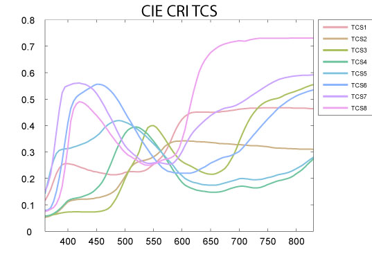
Finally, since the colors used don’t give equal weight to all wavelengths of visible light, as shown below, lamp manufacturers can optimize their lamps spectral power distribution (SPD) to achieve higher scores.

CRI Test Color Sample SPDs
“CIE CRI TCS SPDs” by Adoniscik – Own work. Licensed under CC BY-SA 3.0 via Wikimedia Commons – http://commons.wikimedia.org/wiki/File:CIE_CRI_TCS_SPDs.svg#/media/File:CIE_CRI_TCS_SPDs.svg

The new calculation procedure is called TM-30 IES Method for Evaluating Light Source Color Rendition. It is, in my opinion, substantially better than CRI for several reasons. A disclosure – the Color Metrics Task Group that developed TM-30 is an offshoot of the IES Color Committee, of which I am the vice-chair.

TM-30 is a dual metric system. It provides us with a measurement of fidelity (Rf), although using a completely different method than CRI. It also provides us with a measurement of gamut (Rg). In this case, gamut means that it gives us a number that tells us if a light source that scores lower than 100 on the fidelity metric (and is therefore not a match to the reference light source) increases saturation of colors making them more vibrant, or desaturates colors making them grey or dull. This gives us a much better understanding of the color rendering performance of the light source in question.  These two numbers are supplemented with a variety of graphics.  These include a graphic showing the color distortion produced by the lamp, a graphic showing the change in gamut, and a graph of the Rf and Rg indexes.

It’s the color samples and calculation procedure, however, that drive this new method. Among the improvements are:

  • The use of 99 color samples drawn from real world objects
  • Color samples that are evenly distributed throughout the most accurate color space and throughout the wavelengths of visible light
  • It draws from a wide range of color perception research
  • It is based on an objective and mathematical approach

TM-30 is in the final stages of balloting.  I believe that it will be approved by the end of the summer.  Once it is, I’ll have more to say and graphics to explain it better.  Stay tuned.

Light and Color Perception

NPR’s All Things Considered had a brief piece about light and color on Monday. The main thrust of the story was that color is not inherent in an object, but is perceived and interpreted by our brain, but there’s much more to revealing and perceiving the color of objects. Here’s a quick overview.

To begin, all objects have light reflecting properties. Objects that we identify as red reflect most of the red light that falls on them and absorb the other colors. Likewise for objects that appear to be green, blue, etc. Objects that appear to be white reflect the colors of light more or less equally, while objects that appear to be black absorb most of the light that falls on them. Objects only reflect light, they don’t create it, so if we use blue light to illuminate an object that reflects red light we find that no light is reflected and the object appears to be black.

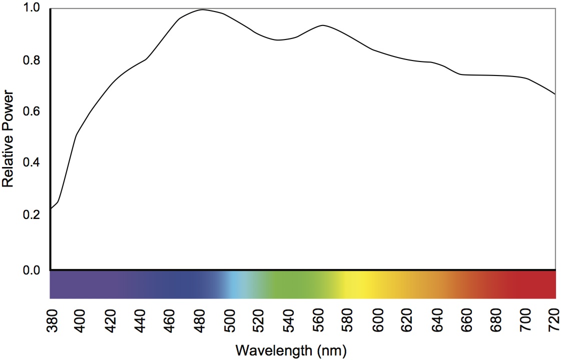
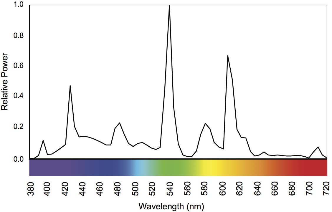
As I explain in Chapter 8, we change the balance of the colors in white light every time we change the light source. Even with a single light technology, such as fluorescent, we change the balance of colors when we change from cool white to warm white. The color content of a light source can be measured (it’s called the spectral power distribution or SPD) and graphed as shown below.

SPD of Daylight
SPD of Daylight


SPD of a Cool White Fluorescent

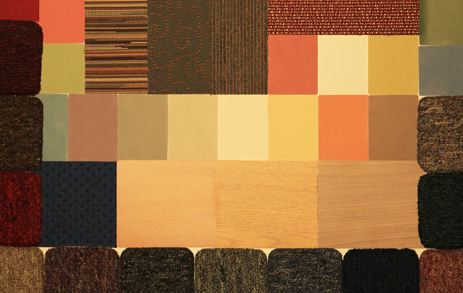
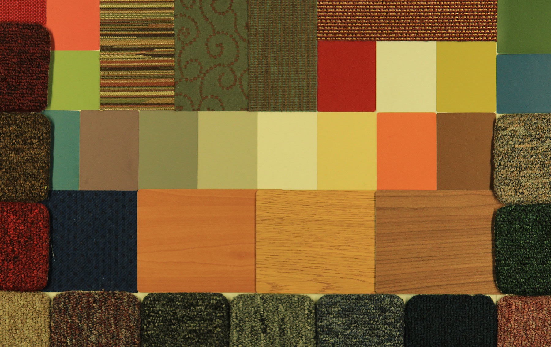
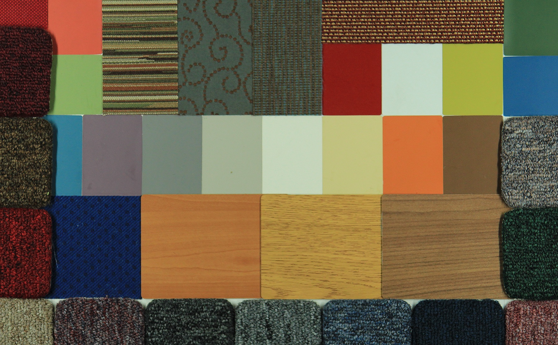
When we change the SPD we change the colors of light that are available for reflection by objects, which means that we also change the balance of light that is reflected and thus the color information that our eyes receive. The result is that changing the light may change the color appearance, or the apparent color, of an object. Many of us have had the experience of buying clothing or paint that was one color in the store and another color at home. Here we see this phenomenon with a color/materials board illuminated by several light sources.  How well a light source enables us to perceive colors is called color rendering.

Illuminated with Incandescent Lamp
Illuminated with Warm White Fluorescent Lamp
Illuminated with Cool White Fluorescent Lamp

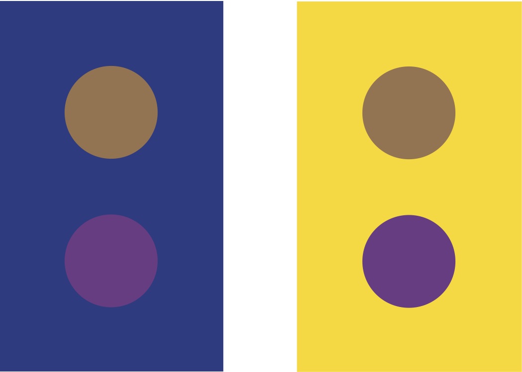
Color and brightness perception are both relative not absolute. A candle in an otherwise dark room may seem too bright to look at directly, while its brightness on a sunny day seems insignificant. In addition to the effect of SPD on our color perception, colors are perceived in relation to one another, especially between foreground and background as shown below.

The color of the dots is the same in both figures.  The strong background colors affect perception of foreground colors.
The color of the dots is the same in both figures. The strong background colors affect perception of foreground colors.

If I can demonstrate shifting our color perception why don’t we experience it in everyday life? Why are my blue jeans blue and my red car red in nearly every lighting situation? The answer is color constancy or chromatic adaptation. It does us no good to spend time and energy struggling to figure out colors. We want to be able to tell if a piece of fruit is ripe regardless of the lighting conditions. Color constancy is our brain’s use of information gathered from the entire visual field to understand the lighting conditions and calibrate our color perception so that color shifts are minimized.

Basking in a New Glow

The New York times has an “I Heart LEDs” article in today’s paper that leaves out some important information about evaluating them.  Here are some additional thoughts.

The government hasn’t done a very good job of publicizing or explaining that the Energy Independence and Security Act of 2007 (EISA) set minimum efficiency requirements for general use light bulbs (the act excluded decorative and colored products).  The incandescent lamp that’s been around for over 100 years doesn’t meet the energy efficiency standard.  Rather than re-engineer incandescent lamps, the lamp manufacturers have focused on expanding and emphasizing compact fluorescent (CFL) and light emitting diode (LED) technologies.  Again, you can still purchase 40 – 100 watt decorative incandescent lamps but not A-lamps, the most common shape in use.

The easiest substitution, one that requires no thinking about rewiring, dimming, etc., is the halogen lamp.  Halogen lamps are an improvement on standard incandescent lamps, and many of them meet the EISA energy efficiency requirements.

If you’re looking for higher energy efficiency, and are willing to pay a higher price up front to get it, CFL and LED lamps are available in a wide range of wattages and shapes.  However, they  need to be approached with caution.  Both technologies can be difficult to dim, especially with older dimmers that were designed with incandescent lamps in mind, so your existing dimmers may need to be replaced.  They can also produce unsatisfactory tints of white light.  LEDs are especially notorious for not matching the information provided on the packaging, as demonstrated through the Department of Energy’s CALiPER program.

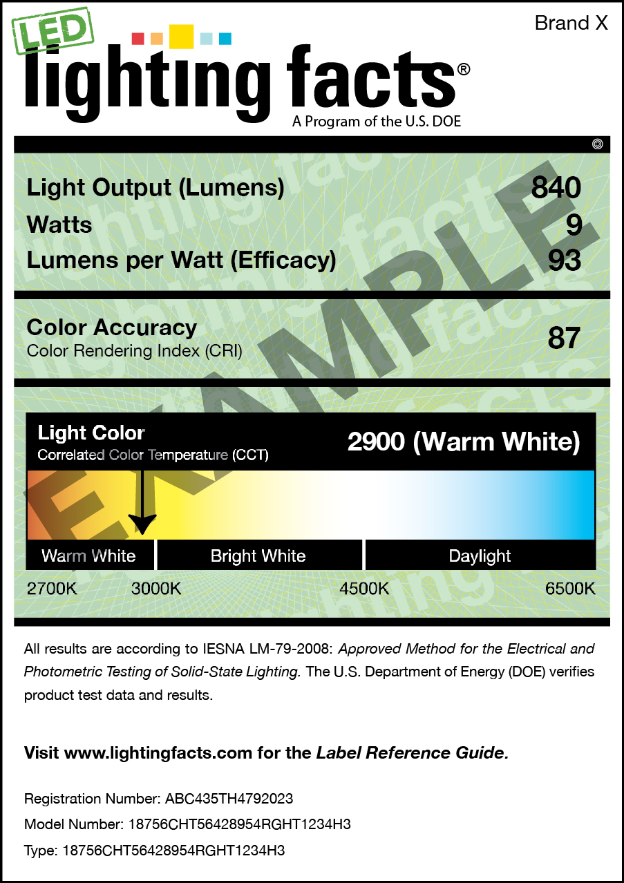
Here’s what to look for.  Every light bulb package should have a Lighting Facts Label that looks like this.

Lighting Facts Label

The orange/yellow/white/blue color bar is where you’ll find information about the warmth or coolness of the light, both with an arrow on the color bar and with a number.  The number is called the Color Temperature (actually the correlated color temperature) and measures the warmth or coolness in Kelvin.  The important thing to know is that a lower number (2700 to 3000 K) is roughly equal to an incandescent light bulb.  As the number gets higher the light gets cooler.

Warmth/coolness isn’t the only measurement of the quality of light.  Another consideration is how well the light source allows us to see the colors of objects.  This is called Color Rendering (Color Accuracy on the Lighting Facts Label) and is indicated by a Color Rendering Index number.  Higher numbers (with a maximum of 100) indicate better color rendering, so a light with a Color Accuracy of 95 should be visibly better than one of 80.

The Color Rendering Index is not very specific, however, and is known to misrepresent LEDs.  Therefore you are the best, final test of whether or not a given light bulb is appropriate.  I recommend purchasing only one or two and trying them out for a few days before committing to changing over your entire house.

My other recommendation is to stick with the major manufacturers (GE, Philips, Sylvania) for most lamps that you test.  These companies have a track record of product consistency and quality that many of the newer manufacturers don’t.  I can almost guarantee that with an off-brand 5-pack of lamps for $10 you’ll get what you pay for and hate the results.  It’s not the technology that you’ll hate, but the manufacturer’s poor execution of the technology.

I hope this helps.

Great Concert Lighting, Times Two

Whatever you thought of Bruno Mars last night (I thought he was terrific), you have to admit that the lighting for last night’s Super Bowl Halftime Show was outstanding!  And it should have been – we would have expected nothing less.  The light, color, movement, and video were clear, supportive of the music and the performances (more so for Mars than for RHCP), and scaled to fill the television screen, the staging area, and the stadium.  We’ll see statistics in the entertainment industry magazines next month, but there were obviously several hundred moving lights and twice as many LED lights and display panels.  It was an appropriately huge rig for a huge show, and it looked great.

There’s an interesting and exciting contrast between the 12 minutes last night and the 90 minutes of Stop Making Sense by the Talking Heads, which I happen to watch on Saturday (and is available on YouTube here). What’s interesting is that this concert has all of the energy of last night’s performance, but rather than back up the music with nearly overwhelming visuals, David Byrne and Beverly Emmons, who are both credited for the lighting design, created a show in which the lighting of the first 1/3 of the concert appears to be accidental, and the rest is still so stripped down that it seems like something must be wrong, especially when compared to today’s visual smorgasbord of color, video and light on contemporary tours.  I’m not knocking big tours at all, I love them, but the contrast between the two shows, and the fact that they’re each successful, is astonishing.

In the film, we open on a slightly cluttered stage with two visible worklights hanging overhead.  An impossibly young Byrne walks on with a boom box and a guitar, and appears to sing Psycho Killer in little more than white worklight.  Of course, the trained eye can see that there’s a lot more going on, but that’s the look they’ve created.  Over the next five songs more musicians are added, and the lighting becomes somewhat more theatrical, with higher contrast and increased intensity on the performers. Yet, it’s not until the fifth song (Slippery People) that a backdrop flies in and it looks like a staged performance instead of a rehearsal in a warehouse.  20 minutes in we get our first taste of “rock” lighting – there’s finally enough haze in the air to outline some beams of light – but it still seems like there’s only one cue per song!  Although I’m sure that there’s color correction used, the entire concert appears to be performed in white light.  In fact, we don’t see any color until the 8th song (Making Flippy Floppy ) a full 30 minutes into the show, and that’s only on the projection screens behind the band!

I could go on, but I won’t.  If you haven’t seen this movie, or haven’t seen it in a while, watch it now.  Between the bold, strong, yet spare lighting and Byrne’s unique performance style, you won’t be bored.  Let everyone else talk about the Super Bowl while you go see one of the best concert films ever made.

The Best Light?

In class yesterday one of my students, thinking about a project she had recently completed, asked, “What’s the best light for a hair salon?”  I’m certain she was hoping I would tell her exactly what lamp technology and/or lamp style to use.  Of course, it’s not that simple.

So the class took a detour to talk about the important aspects of light in a hair salon.  We narrowed it down to two critical considerations – intensity and color rendering.  Intensity is important because the stylist needs to be able to see the details of a head of black hair as well as a head of blonde hair.  Intensity is relatively easy to achieve, and the designer has a wide range of lamp technologies, lamp shapes, and fixture types to choose from.  Finally, everyone intuitively understands how intensity affects vision.  If there’s not enough light one can’t see well enough to work.

Color Rendering is more complicated.  All of my students had heard of color rendering, but few of them understood its meaning or use.  Color rendering is the ability of a light source to enable us to see object colors.  For instance, a light source that produced no red light would do a terrible job of allowing us to judge red apples and we would say it has poor color rendering.  Color rendering is measured on the Color Rendering Index (CRI) which compares the light source being tested to incandescent light (for warm light) or to daylight (for cool light).  The higher the result, on a range that peaks at 100, the more a light source simulates incandescent or daylight in enabling us to see the colors of illuminated objects.

The best light source, then, is one that produces the desired intensity and has a high CRI.  Of course, there’s much, much more to color rendering and to the topic of color in light.  The color chapter in Designing Light is about 40 pages, and the IES DG-1 Color and Illumination looks like it will be about 100 pages.  It’s critical that lighting designers understand color because it has such a strong affect on people.  Color rendering is just one aspect.  Color also affects things such as our impressions and perception of a space, circadian rhythms, visual acuity, and the interior designer’s color palette.  Those are topics for another post.

A Challenge for LED Luminaires

Today I was at an LED “shootout” at the New York City office of Barbizon (special thanks to John Gebbe and Scott Hali).  We were looking at products that might be used in a specific application – that of lighting an auditorium or theatre.  The shootout was between 26 fixtures from 17 manufacturers, all installed at a height of 10′.

Architecturally, the designer is essentially lighting three conjoined rooms:  the orchestra, where the ceiling can be 35′ high or more; the balcony, where the ceiling can range from 12′ to 25′ because of the steep slope of the seating; under the balcony, where the ceiling may range from 12′ to 18′, again because of the slope of the seating.

The first part of the challenge is to find a set of fixtures that can provide even illumination in these three spaces, each one of which has a sloped floor and therefore a  varying throw distance.  The second part of the challenge is for all of the fixtures to dim simultaneously.  Unfortunately, I don’t think we saw success.  Here’s what we saw.

First, only one manufacturer had a product line for all three possible mounting conditions – pendant, surface, and recessed.  That manufacturer, though, didn’t have three beam spread and/or brightness options to meet the range of typical installation heights.

Second, LED manufacturing is maturing, but it’s not mature.  That means we still don’t have strong, industry-wide standards for things like color.  In many cases it was difficult to use fixtures from two or more manufacturers because the color of the light produced (visually evaluated, and measured in color temperature, peak wavelength and spectral content) clearly didn’t match.

Finally, getting fixtures from multiple manufacturers to dim simultaneously proved very difficult.  Each set of installed fixtures would need its own (perhaps custom) dimming curve just to get a close match, and identical performance seemed impossible.   The problem here is three-fold.  First, multiple control protocols would be required.  The fixtures demonstrated used line voltage dimming, three-wire dimming, 0-10v DC, and DMX protocols.  That’s not a deal breaker, but it is an unfortunate complication.  Second, some of the LED drivers produced unacceptable dips, flickering, or pulsing of the light as they dimmed.  Third, some of the LED drivers couldn’t make a smooth transition from darkness or light, or light to darkness.  We saw fixtures pop on and drop out, dim up nicely but not dim out well, and dim out well but pop on.  Eventually this might be as easy as working with incandescent lamps, but not yet.

The easy lesson was that, for now, the safest choice for smooth dimming from darkness to full light is still incandescent.  The color of the light from fixtures in all of the installation conditions will match, the dimming curves will be the same, and they’re easy to dim.

The complicated lesson was that it is absolutely essential to mock up the proposed lighting system, using the LEDs, drivers, control protocols, and dimming equipment that will be installed.  It’s the only way to be certain that the start and end of a show, when the house lights dim down and then back up, isn’t a light show of its own.