As part of the conversation around Diversity, Equity, Inclusion, and Respect there’s been a lot of discussion about color rendering and skin tone. I recently heard one speaker say something like, “We know that historical SPDs are racist.” I don’t think that’s accurate or helpful. Here’s why.
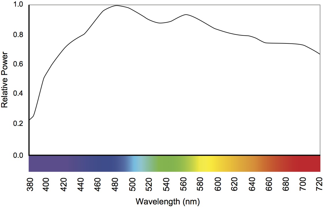
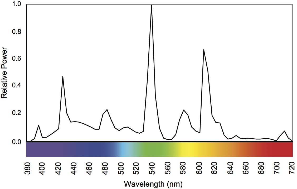
Since the development of the fluorescent lamp, the first priority for lamp manufacturers has been maximizing efficacy – getting the most lumens per watt. That’s still largely true today, even though LEDs are so efficient that there’s a lot of room for other considerations. An exclusive focus on efficacy inevitably results in poor color rendering, so the second priority has been acceptable (not maximized) color rendering. In other words, manufacturers have tried to find the right balance between efficacy and quality, but they emphasize efficacy.
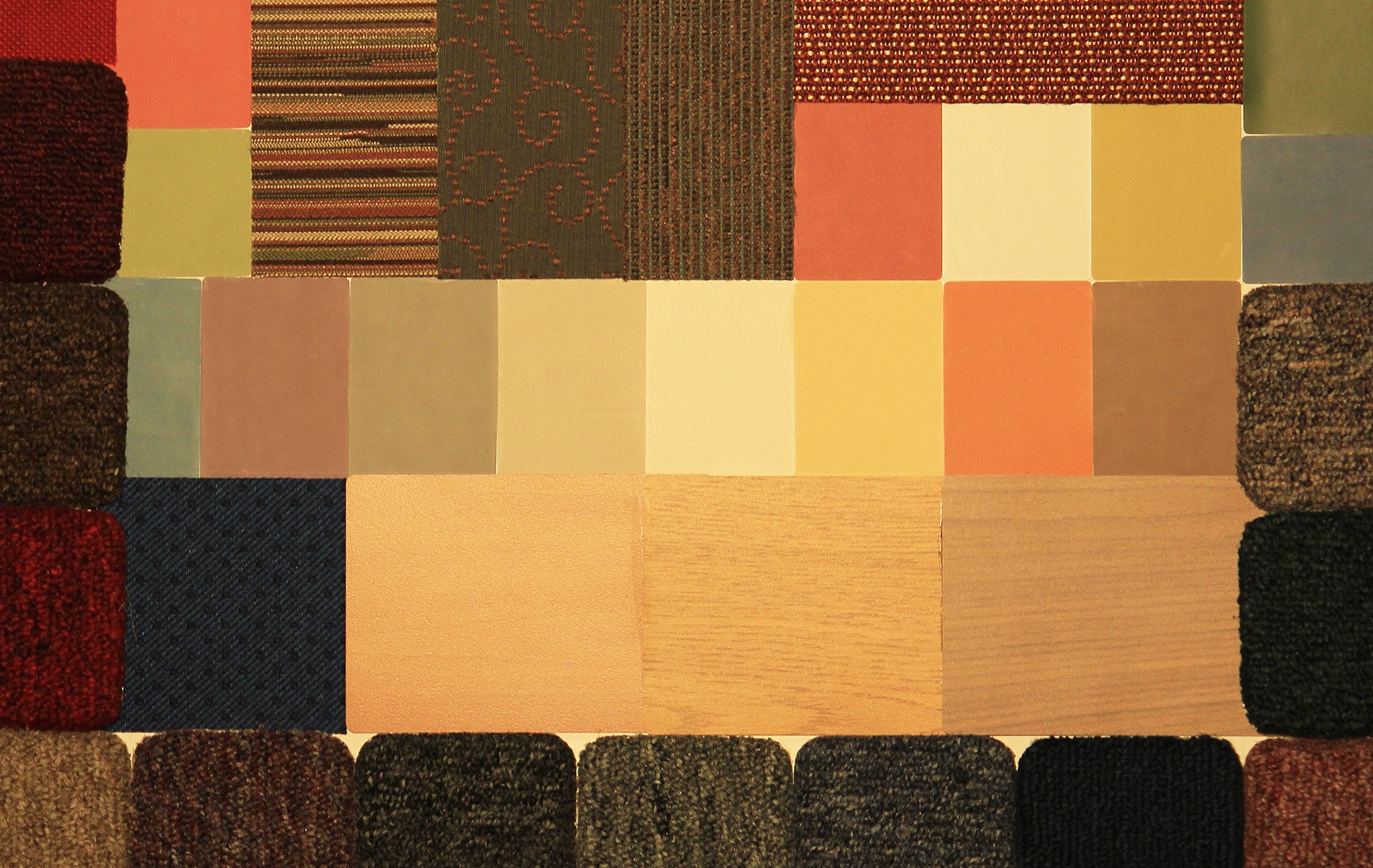
When evaluating color rendering, manufacturers only look at the numbers. Whether it’s a calculation of CRI, Rf, Rg, or something else, it’s all done mathematically. There’s no interest in comparing the calculated values with empirical observations. The eight colors used to calculate CRI are a limited range that don’t include a representation of skin, as shown below.

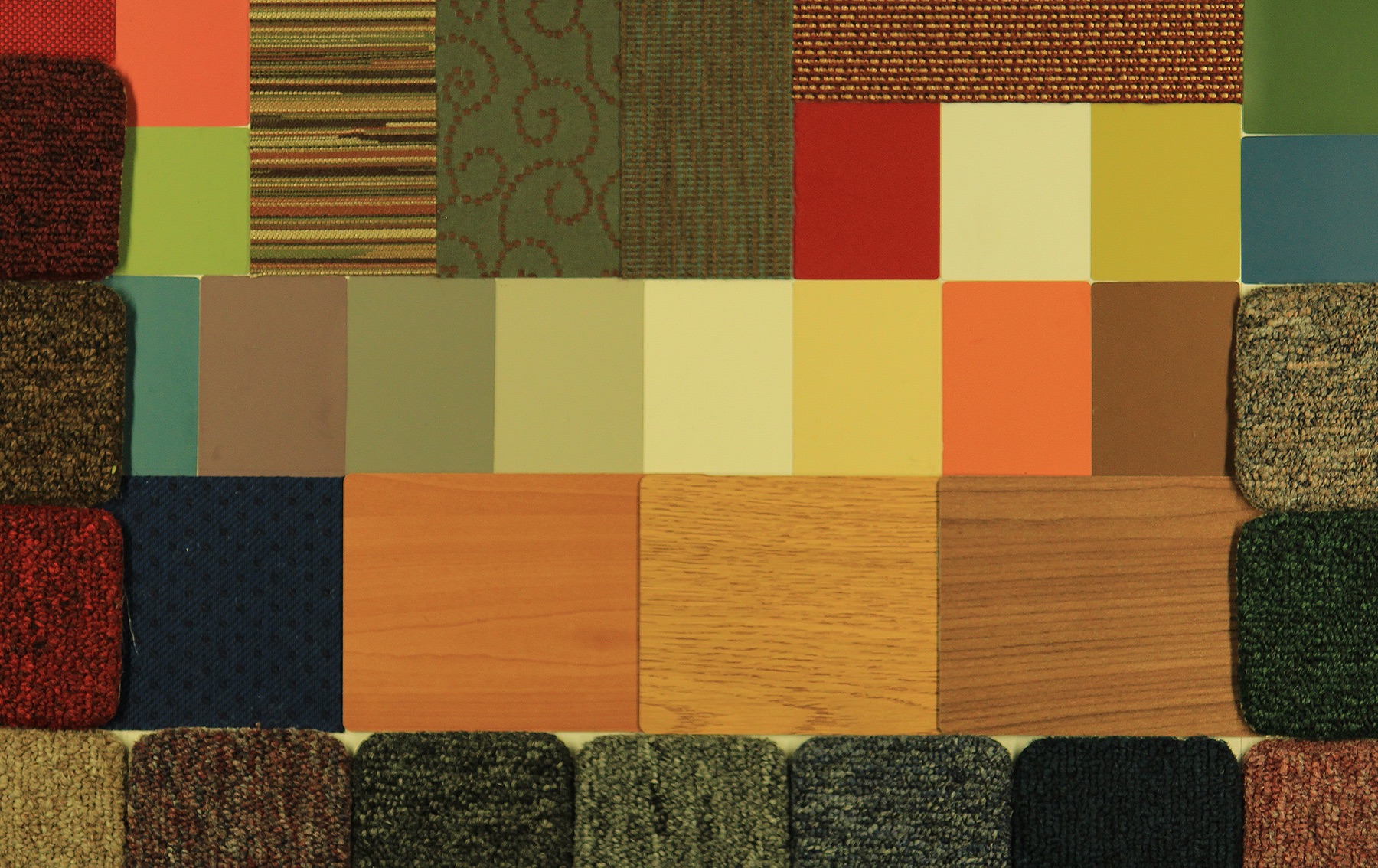
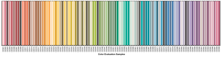
The 99 colors used for TM-30 calculations span the color space and are not weighted toward any hue, tint, or value, as shown below.
So, there’s never been a focus on caucasian skin tone to the detriment of others because skin tone isn’t part of the evaluation.
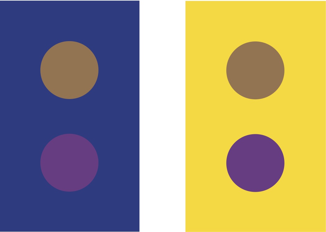
Does that mean that all skin tones are rendered equitably? Honestly, we don’t know. On one hand, there’s no reason to think that we evaluate skin tone differently than we evaluate other surfaces. It’s reasonable to expect that a high fidelity source, for example, that give cars, apples, and kittens a good color appearance will do the same for human skin.
On the other hand, we don’t have good studies to confirm that. It may be that we hold different criteria for evaluating skin than we do for apples, resulting in the need for a separate skin tone rendering metric. Again, today we just don’t know.
In fact, the IES Color Committee is looking at this right now. We’ve started with an effort to gather as many studies as we can find – though there are very few that focus on skin rendering. The next step is to evaluate the literature to determine if additional study is needed, and what such a study (or studies) would require and evaluate. The hard part is funding the studies, and that would be the next step. Eventually, we’d have some solid science from high quality studies that would tell us if skin tone is evaluated differently than other surfaces, and if so what the calculation of a skin tone metric should include. The goal is to use the appropriate TM-30 measures (remember, there are 149 of them) to evaluate skin tone rendering, and to add a skin tone metric (maybe Rs) to TM-30, if needed.
If you’re interested in joining the task group looking at this, please contact me.