Earlier this month, CIE published CIE Position Statement on Color Quality Metrics, in which it recommends the lighting industry transition from the outdated and sometimes inaccurate General Color Rendering Index (CRI) to the General Color Fidelity Index (Rf ) defined in CIE 224:2017. The position statement notes that problems with CRI (which we’ve known about for years) include use of an outdated color space (CIE 1960 (u, v)), the small number of samples used to calculate CRI (only 8), and that CRI has proven to be especially problematic in evaluating narrow band emitters.
The good news is that CIE is finally recommending retiring CRI from use (which was last updated over 50 years ago in 1974) and adopting a modern, accurate metric for evaluating fidelity for all lighting applications. That’s a huge step forward for the lighting industry.
The less good news is that it stops there. The position statement acknowledges that fidelity is not the only aspect of color rendering, and that studies have shown preferences for light sources that slightly enhance saturation (and therefore reduce fidelity). However, it makes no mention of other metrics (such as ANSI/IES TM-30’s Gamut Index and Preference Design Intent) that address the issue. Since CIE 227’s Rf and TM-30’s Rf are identical, I see this as a belated endorsement of Rf as a fidelity metric and of TM-30 in general. My hope is that this spurs the industry to greater adoption of TM-30, especially for its evaluation of color preference, vividness, and fidelity described in Annex E.
One side note: Rf as defined in CIE 227 isRf as defined in TM-30. In fact, TM-30 was published two years before CIE 227, which was a response to TM-30. In evaluating TM-30, CIE found that there were a few places where CIE and IES chose different methods of extrapolating certain information. Since CIE had formalized their procedures and IES had not, the two organizations worked together to harmonize their calculations into one calculation that is used in both systems. It’s frustrating that the CIE position statement reads as if CIE developed Rf out of whole cloth, rather than as a response to TM-30 and a mutual refinement of the Rf calculation.
If you look up the definition of Correlated Color Temperature (CCT) in IES LS-1 you’ll find, “The absolute temperature of a blackbody whose chromaticity most nearly resembles that of the light source.” It seems straightforward. The spectra of non-incandescent light sources don’t exactly match a blackbody radiator. They’ll plot off the blackbody locus in a chromaticity diagram. A CCT calculation identifies the color temperature closest to the light source in question – that’s the CCT. We all know that.
Not long ago someone on the IES Color Committee suggested that we develop and issue a standardized CCT calculation. My first thought was, “What? Are you saying that after decades of specifying CCT there’s no industry standard calculation method? What’s going on?” It turns out that since the late 1930s at least a dozen CCT calculation methods have been developed but none of them have been adopted by a standards setting body like the IES or CIE. The same is true for Duv, the direction and distance between the chromaticity coordinates of the light source and the nearest point on the blackbody locus. This means that the method used is up to the LED or equipment manufacturer, and can vary from one manufacturer to another.
Now, for lighting designers this isn’t a problem. Variations between the calculation methods generally aren’t large (although they can range from less than 1/1000th to several hundred K), and we are selecting LEDs described by their nominal CCT as outlined in NEMA C78.377, not their exact CCT. Those chromaticity quadrangles are huge, roughly 400 – 500 K wide and over 7 MacAdam ellipses, as shown below. For lighting designers the problem is the huge variation possible within a single CCT designation, but that’s for another day.
NEMA C78.377 Chromaticity Quadrangles for LEDs
But, for LED manufacturers, testing equipment manufacturers, and researchers this can be a real problem. If two people attempt to precisely measure the same LED and arrive at two different CCTs how would they determine who’s right, or which calculation is “better”?
Now we have an answer. ANSI/IES TM-40 IES Method for Determining Correlated Color Temperature (CCT) and Distance from the Planckian Locus of Light Sources describes a CCT calculation method with an error of less than 0.1 K that calculates Duv based on the result of the CCT calculation. While there’s no way to compel anyone to use this method, it is an American National Standard developed under the ANSI process, making it the closest thing we have to an industry standard. Finally.
Here’s an interesting article about color perception, specifically blue/green perception, from The Guardian. There’s also a link to a fun web site where you can test your blue/green perception.
I’ll be giving two presentations in the next month.
On September 8th I’ll be giving an online presentation to the Raleigh Section of the IES. Simplifying, Understanding, and Applying IES TM-30 will be from 12:30 to 1:30 eastern. I’m going to set aside the color science that normally opens a TM-30 presentation to make more time for Annex E and the PVF specification system. Admission is free. Register here: https://www.eventbrite.com/e/simplifying-understanding-and-applying-ies-tm-30-tickets-695339287527?aff=oddtdtcreator
On September 19th and 20th Tony Esposito and I will be presenting Designing with TM-30, our third TM-30 presentation at ArchLIGHT Summit in Dallas, TX. This 90 minute presentation starts with Tony talking about color science as it applies to TM-30, then I discuss integrating TM-30 into the lighting design workflow, and we wrap up with a 30 minute demonstration of TM-30s capabilities with the best mockup I’ve ever seen (see below for Tony’s photos of last year’s mockup). Register here: https://archlightsummit2023.sched.com/
TM-30 demonstration showing how varying the SPD, even within a single CCT, affects color appearance.
Recently a colleague of mine from the IES Color Committee asked of one of the new AIs “Tell me about color rendering.” If we assume that the answer was formulated based on information about color rendering that is available on the internet we have a problem because the answer the AI returned was almost completely wrong. That strongly suggests that most individuals and manufacturers posting information about color rendering don’t fully understand color rendering and are perpetuating outdated or incorrect information. Here’s what the AI had to say, and what’s wrong with it’s response.
Color rendering is a measure of how well a light source reveals the true colors of objects. (1) A light source with a high CRI (Color Rendering Index) will show objects in their natural colors (2), while a light source with a low CRI will make objects look dull or washed out (3). The CRI is a scale from 0 to 100 (4), with 100 being the perfect score (5). A light source with a CRI of 100 will show objects in their true colors (1) while a light source with a CRI if 0 will make all objects look the same color (6).
The CRI (7) is important for applications where it is important to see objects in their true colors (1), such as art galleries, hospitals, and retail stores (8). It is also important for applications where it is important to see subtle variations in color such as fashion design and photography (9).
There are a few things that can affect the CRI of a light source (10). The type of light source (incandescent, fluorescent, LED, etc.) will affect the CRI (11). The color temperature of the light source will also affect the CRI (12). Light sources with a higher color temperature will have a higher CRI (12).
The CRI (7) is a valuable tool for choosing the right light source for your application. By understanding the CRI, you can choose a light source that will show your objects in their true colors (1) and help you achiever the desired look and feel for your space.
Objects don’t have “true” colors, they have apparent colors. The color of an object is determined by the spectrum of light striking it, it’s reflective properties, and the resulting light directed toward the observer. An object’s reflective properties don’t change, but the spectrum of light changes every time the light source changes. Changing the spectrum may, therefore, change the color appearance of the object, hence apparent color.
While there is a correlation between fidelity and naturalness, they are not the same thing. CRI measures fidelity, i.e. how well a given light source matches the color rendering of a defined reference light source.
One of the problems with single measure metrics like CRI is that there’s a lot of information that isn’t conveyed. As CRI values drop, the only thing conveyed is that the match to the reference light source is worse. A worse match, however, doesn’t mean colors are made dull. It could be they are increased in saturation since both deviations from the reference are equally penalized. That’s the advantage of TM-30. As Rf decreases we can see why by looking at Rg and some of the other 147 measures.
CRI can have negative values. TM-30 Rf is calculated so that 0 is the lowest value.
100 is the highest value. It’s dangerous to call it “perfect” though as that implies that high fidelity is the only color rendering goal, which it isn’t. TM-30 provides information for the color rendering goals of preference and vividness, and may include more in the future.
A CRI of 0 will certainly make nearly all colors look terrible and very similar, but not all the same.
CRI isn’t a proper noun, and shouldn’t be preceded by “the”.
There are strong arguments for emphasizing preference over fidelity in many applications, including retail. Again, fidelity isn’t the only color rendering goal, although it is the only one CRI measures.
Research shows that high fidelity isn’t necessarily the best spectrum for detecting color difference. Additional research is needed, but the IES may eventually add a color difference metric to TM-30.
Only one thing affects CRI value – the spectrum of the light source.
This is true because different light producing technologies have similar quirks in their spectra. Those similarities can lead us to blanket statements such as “all fluorescents are green” which are not true for all products. Again, the individual light source’s spectrum determines everything.
A common misconception, but not true at all. Not in the slightest. CCT and CRI are separate metrics.
As part of the conversation around Diversity, Equity, Inclusion, and Respect there’s been a lot of discussion about color rendering and skin tone. I recently heard one speaker say something like, “We know that historical SPDs are racist.” I don’t think that’s accurate or helpful. Here’s why.
Since the development of the fluorescent lamp, the first priority for lamp manufacturers has been maximizing efficacy – getting the most lumens per watt. That’s still largely true today, even though LEDs are so efficient that there’s a lot of room for other considerations. An exclusive focus on efficacy inevitably results in poor color rendering, so the second priority has been acceptable (not maximized) color rendering. In other words, manufacturers have tried to find the right balance between efficacy and quality, but they emphasize efficacy.
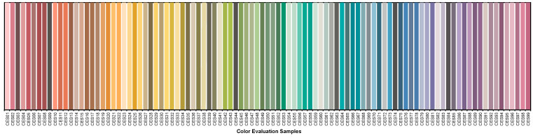
When evaluating color rendering, manufacturers only look at the numbers. Whether it’s a calculation of CRI, Rf, Rg, or something else, it’s all done mathematically. There’s no interest in comparing the calculated values with empirical observations. The eight colors used to calculate CRI are a limited range that don’t include a representation of skin, as shown below.
The 99 colors used for TM-30 calculations span the color space and are not weighted toward any hue, tint, or value, as shown below.
So, there’s never been a focus on caucasian skin tone to the detriment of others because skin tone isn’t part of the evaluation.
Does that mean that all skin tones are rendered equitably? Honestly, we don’t know. On one hand, there’s no reason to think that we evaluate skin tone differently than we evaluate other surfaces. It’s reasonable to expect that a high fidelity source, for example, that give cars, apples, and kittens a good color appearance will do the same for human skin.
On the other hand, we don’t have good studies to confirm that. It may be that we hold different criteria for evaluating skin than we do for apples, resulting in the need for a separate skin tone rendering metric. Again, today we just don’t know.
In fact, the IES Color Committee is looking at this right now. We’ve started with an effort to gather as many studies as we can find – though there are very few that focus on skin rendering. The next step is to evaluate the literature to determine if additional study is needed, and what such a study (or studies) would require and evaluate. The hard part is funding the studies, and that would be the next step. Eventually, we’d have some solid science from high quality studies that would tell us if skin tone is evaluated differently than other surfaces, and if so what the calculation of a skin tone metric should include. The goal is to use the appropriate TM-30 measures (remember, there are 149 of them) to evaluate skin tone rendering, and to add a skin tone metric (maybe Rs) to TM-30, if needed.
If you’re interested in joining the task group looking at this, please contact me.
Tony Esposito and I gave four presentations of Designing with TM-30 at this year’s ArchLIGHT Summit. It was video taped and is now available on Vimeo. Watch it here.
Update: One of the attendees sent the following feedback to ArchLIGHT Summit. “The TM-30 presentation was phenomenal. One of the best lighting presentations that I’ve ever seen. Great work.”
Next month I’ll be at ArchLIGHT Summit in Dallas. Together with my IES Color Committee co-chair Tony Esposito, we’ll be giving several presentations on how designers can make better use of TM-30 by integrating it into their workflow. In anticipation of our ArchLIGHT Summit presentation we were interviewed on Get A Grip On Lighting, where we talked about TM-30, color perception, and color rendering, among other things. You can watch the interview on their web site, or below.
As I noted in Chapter 9 of the 2nd edition of Designing with Light, we calculate color temperature, correlated color temperature, and distance from the Plankian locus in a perverse way. The calculations are performed in the CIE 1960 (u, v) chromaticity diagram (which is why distance from the Plankian locus is Duv). However, since 1960 (u, v) is obsolete, we perform the calculation using CIE 1976 (u’, v’) chromaticity diagram, but then scale the v’ axis by .66 so that we’re using 1976 (u’, ⅔ v’) which is 1960 (u, v).
To complicate things, to present information graphically, most manufacturers transpose these calculations to the 1931 (x, y) chromaticity diagram, resulting in the industry using 2 ½ chromaticity diagrams for various calculations and illustrations. Unfortunately, they also use 1931 (x, y) to illustrate the gamut of multi-colored luminaires even though it isn’t uniform, making the illustration of questionable value (they should be using CIE 1976 (u’, v’), which is perceptually uniform).
In a counter to this fragmented system, yesterday Leukos published a research article called Improved Method for Evaluating and Specifying the Chromaticity of Light Sources. Among other proposed improvements to how we perform chromaticity related calculations, it introduces a new uniform chromaticity scale (UCS) diagram with coordinates (s, t), a measure of correlated color temperature (CCTst), and a measure of distance from the Planckian locus (Dst). Importantly, it makes all chromaticity calculations in a single chromaticity diagram instead of the 2 ½ diagrams we use today. It’s heavy on the science, but is an important step in fixing our current system.
The pandemic has certainly distracted me from regular posting here. I’m probably not back to posting weekly, or even monthly, but I do have a new topic and a few things to say about it. The topic is color science as it applies to lighting.
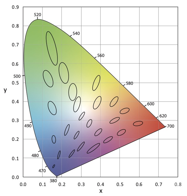
No doubt you’ve seen something like Figure 1 before. It’s the CIE 1931 (x, y) chromaticity diagram and is the most common graphic for showing the range of tunable white luminaires and LED colors and their color mixing possibilities.
Figure 1 CIE 1931 (x, y) Chromaticity Diagram
The thing is, we keep using this diagram even though it has problems and has been replaced twice. The problem is that it isn’t perceptually uniform, which means that the distance between any two color points doesn’t correspond to the perceptual difference between those two colors. This was famously demonstrated in 1942 by David MacAdam. Using 25 chromaticities he had a trained observer, using a device that allowed for the color adjustment of light, attempt to create a side-by side match from different starting points – for example match a yellow sample starting from green, then match it again starting from red, etc. When he plotted the results in CIE 1931 (x, y) the area where color differences could not be detected formed an ellipse as shown in Figure 2. This demonstrated that the color space was not perceptually uniform. If it was the ellipses would have been circles.
These “MacAdam ellipses” have become the default way manufacturers talk about color consistency of their products. You’ll often see statements on cut sheets saying that the LEDs for a particular product line all fall within an X-step MacAdam ellipse (2-step, 3-step, etc.). Want to hear something crazy? In 2014, the International Commission on Illumination (CIE), which sets the standards for most things related to color and light, recommended ending the use of MacAdam ellipses. Why? Look at Figure 2 again. The size of MacAdam ellipses changes as we move around the chromaticity diagram. So does anything related to them, such as Standard Deviation Color Matching (SDCM) another, although less common, measure.
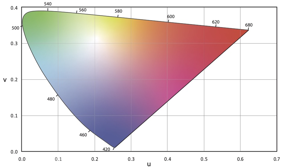
The first attempt to address the uniformity problem resulted in the CIE 1960 (u, v) uniform chromaticity scale (USC) diagram (Figure 3). Correlated color temperature was originally calculated in the CIE 1960 (u, v) UCS.
Figure 3 CIE 1960 (u, v) Chromaticity Diagram
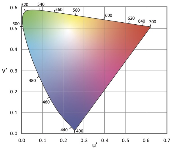
It was later discovered that the CIE 1960 (u, v) USC diagram also was not uniform. To improve uniformity the v-axis was scaled by 1.5, resulting in the CIE 1976 (u’, v’) UCS diagram shown in Figure 4. As the most uniform UCS diagram, CIE 1976 (u’, v’) is the one recommended for use when calculating or evaluating color differences, not CIE 1931 (x, y).
Figure 4 CIE 1976 (u’, v’) Chromaticity Diagram
Correlated color temperature was originally calculated in CIE 1960 (u, v). However, since that diagram is no longer recommended for any purpose by the CIE, we use CIE 1976 (u’, v’) but scale it back to CIE 1960 (u, v). This is described as CIE 1976 (u’, 2/3 v’).
The CIE’s 2014 recommendation mentioned earlier replaced MacAdam ellipses with a circle in the CIE 1976 (u’, v’) UCS. A rough rule of thumb is that one MacAdam ellipse corresponds to a circle with a radius of 0.0011. Unfortunately, it doesn’t seem that any manufacturers have made this transition.
So, our industry is in a situation where we commonly use a 90 year old first generation diagram that was replaced 61 years ago. We calculate CCT in a third generation chromaticity diagram that is 45 years old but tweek the math to refer back to a second generation 61 year old diagram. It’s crazy! No other industry uses a system this convoluted.
Why am I mentioning this? I was recently reminded of a paper that was presented at last August’s IES Annual Conference. Presented by Michael Royer of Pacific Northwest National Laboratory, it proposed using the latest color science to make a fresh start with a single new chromaticity diagram that is very similar to CIE 1976 (u’, v’) where we would calculate CCT, the color temperature bins for LEDs, color differences and the rest. IES members can access the archived presentation after logging in to the IES website.
Full disclosure, I’m on the IES Task Group that is developing this new system. The Task Group is made up of people in academia, design, manufacturing and research from three countries. We’ve refined our work since August and expect to publish these refinements soon. I encourage all of you to look for and learn about this proposal, to attend seminars when available, and to weigh in on this topic. Would our industry benefit from moving to a unified chromaticity system? Is this the right one? How do we educate specifiers and manufacturers? How do we phase in a new system? We can all have a voice in bringing the science we rely on into the 21st Century.
References
CIE. (2014). TN 001:2014 Chromaticity Difference Specification for Light Sources. Vienna: International Commission on Illumination.
CIE. (2018). CIE 015:2018 Colorimetry, 4th Edition. Vienna: International Commission on Illumination.
MacAdam, D. (1942). Visual Sensitivities to Color Differences in Daylight. Journal of the Optical Society of America, 32(5), 247-274.
Royer, M. et. al. (2020). Improved System for Evaluating and Specifying the Chromaticity of Light Sources. In: Illuminating Engineering Society Annual Conference 2020.