Upcoming TM-30 Presentations

I’ll be giving two presentations in the next month.

On September 8th I’ll be giving an online presentation to the Raleigh Section of the IES.  Simplifying, Understanding, and Applying IES TM-30 will be from 12:30 to 1:30 eastern.  I’m going to set aside the color science that normally opens a TM-30 presentation to make more time for Annex E and the PVF specification system.  Admission is free.  Register here: https://www.eventbrite.com/e/simplifying-understanding-and-applying-ies-tm-30-tickets-695339287527?aff=oddtdtcreator

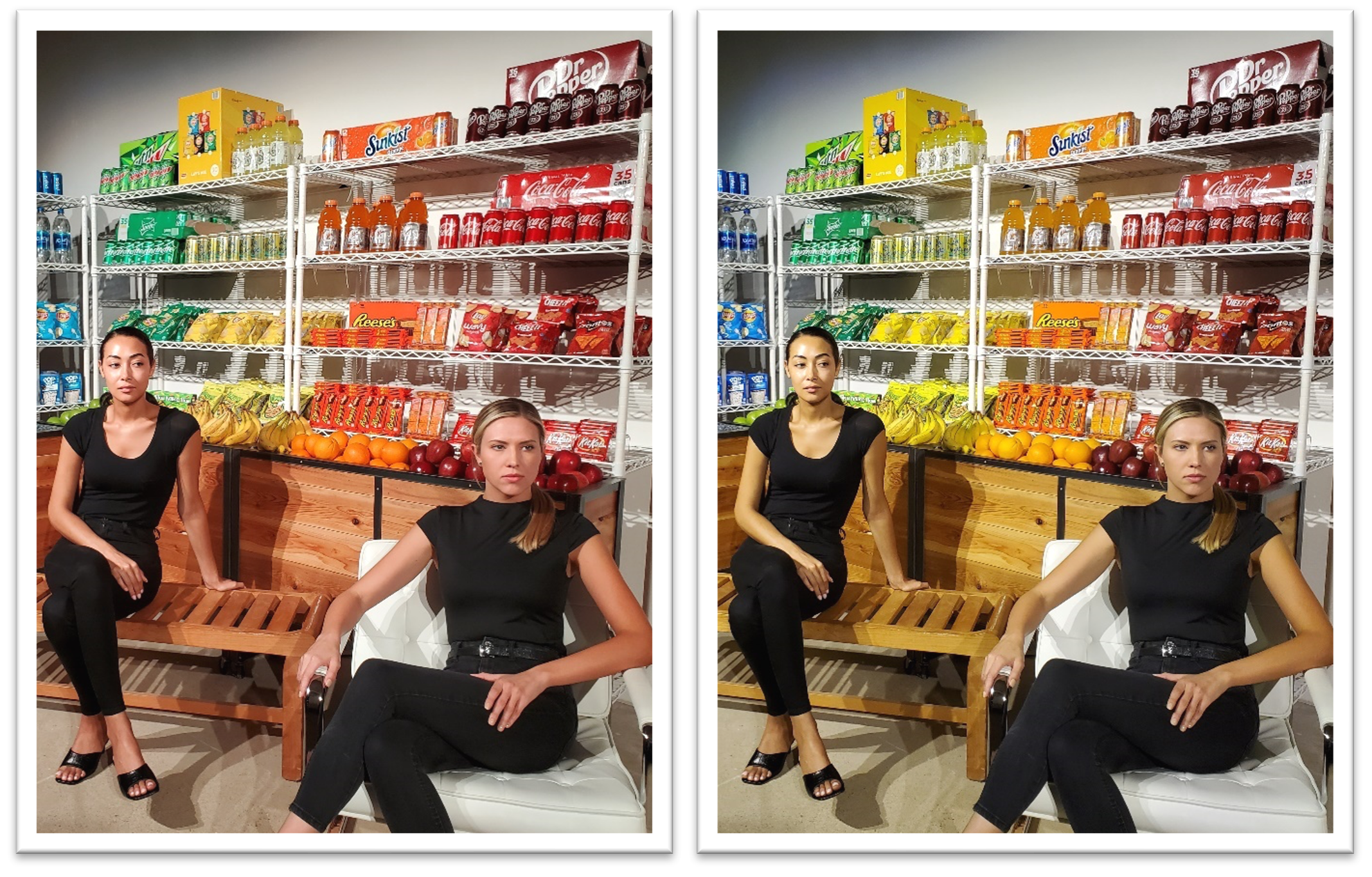
On September 19th and 20th Tony Esposito and I will be presenting Designing with TM-30, our third TM-30 presentation at ArchLIGHT Summit in Dallas, TX.  This 90 minute presentation starts with Tony talking about color science as it applies to TM-30, then I discuss integrating TM-30 into the lighting design workflow, and we wrap up with a 30 minute demonstration of TM-30s capabilities with the best mockup I’ve ever seen (see below for  Tony’s photos of last year’s mockup).  Register here: https://archlightsummit2023.sched.com/

TM-30 demonstration showing how varying the SPD, even within a single CCT, affects color appearance.

TM-30 Update: Challenges and strategies for working with SSL manufacturers – LD+A

I have written a lot about TM-30 from the specifier’s viewpoint – how TM-30 is better than CRI, explanations of the various TM-30 measures. why TM-30 data and reports are so important, how to get TM-30 data or reports, how to use TM-30, etc.

This month’s LD+A has a great article about TM-30 from the manufacturer’s viewpoint that addresses issues such as – why TM-30 reports for every LED option aren’t always available, why some manufacturers are reluctant to prepare TM-30 reports, strategies specifiers can use to deal with these issues, and more.  It’s a very useful article.  Give it a read at TM-30 Update: Challenges and strategies for working with SSL manufacturers – Illuminating Engineering Society %

AI and the Internet Need to Learn Color Rendering

Recently a colleague of mine from the IES Color Committee asked of one of the new AIs “Tell me about color rendering.”  If we assume that the answer was formulated based on information about color rendering that is available on the internet we have a problem because the answer the AI returned was almost completely wrong.  That strongly suggests that most individuals and manufacturers posting information about color rendering don’t fully understand color rendering and are perpetuating outdated or incorrect information.  Here’s what the AI had to say, and what’s wrong with it’s response.

Color rendering is a measure of how well a light source reveals the true colors of objects. (1) A light source with a high CRI (Color Rendering Index) will show objects in their natural colors (2), while a light source with a low CRI will make objects look dull or washed out (3).  The CRI is a scale from 0 to 100 (4), with 100 being the perfect score (5).  A light source with a CRI of 100 will show objects in their true colors (1) while a light source with a CRI if 0 will make all objects look the same color (6).

The CRI (7) is important for applications where it is important to see objects in their true colors (1), such as art galleries, hospitals, and retail stores (8).  It is also important for applications where it is important to see subtle variations in color such as fashion design and photography (9).

There are a few things that can affect the CRI of a light source (10).  The type of light source (incandescent, fluorescent, LED, etc.) will affect the CRI (11).  The color temperature of the light source will also affect the CRI (12).  Light sources with a higher color temperature will have a higher CRI (12).

The CRI (7) is a valuable tool for choosing the right light source for your application.  By understanding the CRI, you can choose a light source that will show your objects in their true colors (1) and help you achiever the desired look and feel for your space.


  1. Objects don’t have “true” colors, they have apparent colors.  The color of an object is determined by the spectrum of light striking it, it’s reflective properties, and the resulting light directed toward the observer.  An object’s reflective properties don’t change, but the spectrum of light changes every time the light source changes.  Changing the spectrum may, therefore, change the color appearance of the object, hence apparent color.
  2. While there is a correlation between fidelity and naturalness, they are not the same thing.  CRI measures fidelity, i.e. how well a given light source matches the color rendering of a defined reference light source.
  3. One of the problems with single measure metrics like CRI is that there’s a lot of information that isn’t conveyed.  As CRI values drop, the only thing conveyed is that the match to the reference light source is worse.  A worse match, however, doesn’t mean colors are made dull. It could be they are increased in saturation since both deviations from the reference are equally penalized.  That’s the advantage of TM-30.  As Rf decreases we can see why by looking at Rg and some of the other 147 measures.
  4. CRI can have negative values.  TM-30 Rf is calculated so that 0 is the lowest value.
  5. 100 is the highest value.  It’s dangerous to call it “perfect” though as that implies that high fidelity is the only color rendering goal, which it isn’t.  TM-30 provides information for the color rendering goals of preference and vividness, and may include more in the future.
  6. A CRI of 0 will certainly make nearly all colors look terrible and very similar, but not all the same.
  7. CRI isn’t a proper noun, and shouldn’t be preceded by “the”.
  8. There are strong arguments for emphasizing preference over fidelity in many applications, including retail.  Again, fidelity isn’t the only color rendering goal, although it is the only one CRI measures.
  9. Research shows that high fidelity isn’t necessarily the best spectrum for detecting color difference.  Additional research is needed, but the IES may eventually add a color difference metric to TM-30.
  10. Only one thing affects CRI value – the spectrum of the light source.
  11. This is true because different light producing technologies have similar quirks in their spectra.  Those similarities can lead us to blanket statements such as “all fluorescents are green” which are not true for all products.  Again, the individual light source’s spectrum determines everything.
  12. A common misconception, but not true at all.  Not in the slightest. CCT and CRI are separate metrics.

Color Rendering and Skin Tone

As part of the conversation around Diversity, Equity, Inclusion, and Respect there’s been a lot of discussion about color rendering and skin tone.  I recently heard one speaker say something like, “We know that historical SPDs are racist.”  I don’t think that’s accurate or helpful.  Here’s why.

Since the development of the fluorescent lamp, the first priority for lamp manufacturers has been maximizing efficacy – getting the most lumens per watt.  That’s still largely true today, even though LEDs are so efficient that there’s a lot of room for other considerations.  An exclusive focus on efficacy inevitably results in poor color rendering, so the second priority has been acceptable (not maximized) color rendering.  In other words, manufacturers have tried to find the right balance between efficacy and quality, but they emphasize efficacy.

When evaluating color rendering, manufacturers only look at the numbers.  Whether it’s a calculation of CRI, Rf, Rg, or something else, it’s all done mathematically.  There’s no interest in comparing the calculated values with empirical observations.  The eight colors used to calculate CRI are a limited range that don’t include a representation of skin, as shown below.

Color used for CRI calculation

The 99 colors used for TM-30 calculations span the color space and are not weighted toward any hue, tint, or value, as shown below.

So, there’s never been a focus on caucasian skin tone to the detriment of others because skin tone isn’t part of the evaluation.


Does that mean that all skin tones are rendered equitably?  Honestly, we don’t know.  On one hand, there’s no reason to think that we evaluate skin tone differently than we evaluate other surfaces.  It’s reasonable to expect that a high fidelity source, for example, that give cars, apples, and kittens a good color appearance will do the same for human skin.

On the other hand, we don’t have good studies to confirm that.  It may be that we hold different criteria for evaluating skin than we do for apples, resulting in the need for a separate skin tone rendering metric.  Again, today we just don’t know.

In fact, the IES Color Committee is looking at this right now.  We’ve started with an effort to gather as many studies as we can find – though there are very few that focus on skin rendering.  The next step is to evaluate the literature to determine if additional study is needed, and what such a study (or studies) would require and evaluate.  The hard part is funding the studies, and that would be the next step.  Eventually, we’d have some solid science from high quality studies that would tell us if skin tone is evaluated differently than other surfaces, and if so what the calculation of a skin tone metric should include.  The goal is to use the appropriate TM-30 measures (remember, there are 149 of them) to evaluate skin tone rendering, and to add a skin tone metric (maybe Rs) to TM-30, if needed.

If you’re interested in joining the task group looking at this, please contact me.

Designing with TM-30

Tony Esposito and I gave four presentations of Designing with TM-30 at this year’s ArchLIGHT Summit.  It was video taped and is now available on Vimeo.  Watch it here.


Update:  One of the attendees sent the following feedback to ArchLIGHT Summit.  “The TM-30 presentation was phenomenal. One of the best lighting presentations that I’ve ever seen. Great work.”

ArchLIGHT Summit and Get A Grip On Lighting

Next month I’ll be at ArchLIGHT Summit in Dallas.  Together with my IES Color Committee co-chair Tony Esposito, we’ll be giving several presentations on how designers can make better use of TM-30 by integrating it into their workflow.  In anticipation of our ArchLIGHT Summit presentation we were interviewed on Get A Grip On Lighting, where we talked about TM-30, color perception, and color rendering, among other things.  You can watch the interview on their web site, or below.


Designing Beyond Fidelity

I recently began a project that includes about 8,000 SF of office space that is completely without windows or skylights.  I’ve renovated spaces like this before, and the common complaint from occupants was a disconnect from daylight, weather, and the way they indicate the passage of time.  On this project, I determined that the most appropriate solution was to use a light source that rendered colors in a way that is highly preferred to make the spaces more pleasant to occupy and use.

Of course, as a designer who is very knowledgable about color rendering issues and is a TM-30 advocate, I know two things.  First, highly preferred is not high fidelity.  People prefer a light source that slightly increases the saturation of object colors (especially reds) over a high fidelity source.  Second, TM-30’s Annex E provides specifiers with ranges for certain TM-30 measurements that allow us to accurately specify highly preferred light sources.

The task seemed simple enough.  Forget about fidelity and find a fixture/LED combination with a spectrum designed for preference, i.e. a light source that meets the TM-30 Annex E specification for a highly preferred (aka P1) light source.  After all, we’ve had TM-30 for seven years now, and Annex E for four years.  Surely, by now LED manufacturers have introduced products that meet color rendering goals other than fidelity, right?  Who wouldn’t see that as a huge marketing opportunity?  And surely fixture manufacturers would offer specifiers that LED, again to differentiate their products from the many, many, many similar products from other manufacturers…right?

Alas, the answer is, “No.”  One member of the IES Color Committee shared with me a database of over 1,000 LED products, their SPDs, and their various TM-30 measurements, including the Annex E Preference Design Intent.  Of those, there are a generous handful of retrofit lamps, most of them by Soraa and Cree, that meet the P1 specification, but only one LED in commercially available linear LED fixtures – Focal Point’s Preferred Light series.  That’s it!

Fortunately, this project is for a private firm so I don’t have to worry about developing a three-name or performance spec.  Otherwise, I would have to give up on a preferred spectrum and default to high fidelity not because it would be appropriate for the project but simply because there are more options.

I’ve mentioned fidelity and preference.  You might be asking if there are other color rendering goals.  The answer is, “Yes.”  Other color rendering design goals, with brief explanations, include:

Preference.  Light distorts object colors with slight increases in saturation, especially reds, in a way that is preferred over the reference light source (that is, preferred over high fidelity).   This might be the goal in an expensive restaurant where you want to emphasize the beautiful colors of the food, people, and interior design.

Vividness.  Light renders object colors as more or less vivid, or saturated, than the reference light source. Vividness is different from Preference in the degree of distorted saturation and the design intent – making colors pop, not making colors more attractive.  This might be the goal in the Skittles store in Times Square where you want the colors to leap out at people.  

Naturalness. Light renders object colors as expected, which, surprisingly, is usually not the same as fidelity.  This might be the color rendering goal in a grocery store where you want the food to look ripe and appetizing.

Discrimination.  Light renders object colors so they can be appropriately sorted. This might be the goal in a facility where even slight color variations must be detected.

Specifiers are captives of manufacturers.  We can have design goals oriented toward the needs of the users and the success of the project, but manufacturers only want to sell us fidelity, the same way they’ve been selling us fidelity since CRI was introduced in 1965.  For 50 years we only had a hammer (CRI) so all problems were nails (fidelity).  TM-30 changed that and it’s time for manufacturers to catch up.

IES Publishes “Standards Toolbox”

The IES has added a Standards Toolbox to their web site that features an online TM-30 and TM-21 (projected luminous flux maintenance, i.e. LED lifetime projections) calculators, an interactive illuminance selector (for subscribers to the IES Online Library), and an IES Reference Retriever where members can access all of the documents, articles, and papers referenced in various IES documents.

Of course, I’m most excited about the TM-30 calculator which imports and exports spectral data and reports in a variety of formats and increments, and will always be the most up-to-date version.  As a bonus, the calculator’s code is also available for download on GitHub, which may be of special interest to manufacturers who want to bring calculations in house instead of doing them online.

The TM-30 calculator includes CIE S026 Alpha-Opic calculations (CIE S 026:2018. System for Metrology of Optical Radiation for ipRGC-Influenced Responses to Light) and output, and is expected to include additional spectral calculations in the future.

Tony and I Talk Color Rendering

Podcast Album Cover

In September at ArchLIGHT Summit, Tony Esposito and I gave a series of demonstrations on the spectral flexibility of LEDs and the possibilities they present with regard to color rendering.  While there we spoke to Sam Koerbel on his LytePod podcast about the basics of the new measures introduced in Annex E, and discuss why TM-30’s multi-dimensional approach to quantifying color preference is superior to the old-standby in the industry: CRI.  Our discussion is now available.  Give it a listen.

The Strength of TM-30

Last week Tony Esposito and I presented seminars at ArchLIGHT Summit in Dallas, TX. The topic was TM-30 and the deep information that it provides us about a light source’s spectrum and the resulting color rendering. CRI, of course, only evaluates fidelity – how close a light source matches its reference light source. But CRI penalizes all deviations and says nothing about the rendering of individual colors. Nor does it help us understand if the deviations from the reference are acceptable to viewers.

A small part of our demo is shown below. It illustrates how two light sources can have the same fidelity (in this case Rf of 70) but wildly different spectra that produce wildly different color rendering results. This is the great strength of TM-30, a deeper insight into the effect of a light source on illuminated objects and their color appearance – not just fidelity, but chroma shift, hue shift, and the perceptual implications of those shifts.

The video below shows the color appearance shifts. The graphic illustrates that even though the Rf is 70, the first light source renders objects in a preferred manner (Preference Priority Level of 3 or P3) and increases vividness (Vividness Priority Level of 2 or V2). At the same Rf the second source mutes colors and fails to achieve any of the Design Intents and Priority Levels specified in TM-30’s Annex E.

Alternating between light sources with Rf 70, Rg 94 and Rf 70 Rg 111