Here’s an interesting article about color perception, specifically blue/green perception, from The Guardian. There’s also a link to a fun web site where you can test your blue/green perception.
I’ll be giving two presentations in the next month.
On September 8th I’ll be giving an online presentation to the Raleigh Section of the IES. Simplifying, Understanding, and Applying IES TM-30 will be from 12:30 to 1:30 eastern. I’m going to set aside the color science that normally opens a TM-30 presentation to make more time for Annex E and the PVF specification system. Admission is free. Register here: https://www.eventbrite.com/e/simplifying-understanding-and-applying-ies-tm-30-tickets-695339287527?aff=oddtdtcreator
On September 19th and 20th Tony Esposito and I will be presenting Designing with TM-30, our third TM-30 presentation at ArchLIGHT Summit in Dallas, TX. This 90 minute presentation starts with Tony talking about color science as it applies to TM-30, then I discuss integrating TM-30 into the lighting design workflow, and we wrap up with a 30 minute demonstration of TM-30s capabilities with the best mockup I’ve ever seen (see below for Tony’s photos of last year’s mockup). Register here: https://archlightsummit2023.sched.com/
TM-30 demonstration showing how varying the SPD, even within a single CCT, affects color appearance.
Recently a colleague of mine from the IES Color Committee asked of one of the new AIs “Tell me about color rendering.” If we assume that the answer was formulated based on information about color rendering that is available on the internet we have a problem because the answer the AI returned was almost completely wrong. That strongly suggests that most individuals and manufacturers posting information about color rendering don’t fully understand color rendering and are perpetuating outdated or incorrect information. Here’s what the AI had to say, and what’s wrong with it’s response.
Color rendering is a measure of how well a light source reveals the true colors of objects. (1) A light source with a high CRI (Color Rendering Index) will show objects in their natural colors (2), while a light source with a low CRI will make objects look dull or washed out (3). The CRI is a scale from 0 to 100 (4), with 100 being the perfect score (5). A light source with a CRI of 100 will show objects in their true colors (1) while a light source with a CRI if 0 will make all objects look the same color (6).
The CRI (7) is important for applications where it is important to see objects in their true colors (1), such as art galleries, hospitals, and retail stores (8). It is also important for applications where it is important to see subtle variations in color such as fashion design and photography (9).
There are a few things that can affect the CRI of a light source (10). The type of light source (incandescent, fluorescent, LED, etc.) will affect the CRI (11). The color temperature of the light source will also affect the CRI (12). Light sources with a higher color temperature will have a higher CRI (12).
The CRI (7) is a valuable tool for choosing the right light source for your application. By understanding the CRI, you can choose a light source that will show your objects in their true colors (1) and help you achiever the desired look and feel for your space.
Objects don’t have “true” colors, they have apparent colors. The color of an object is determined by the spectrum of light striking it, it’s reflective properties, and the resulting light directed toward the observer. An object’s reflective properties don’t change, but the spectrum of light changes every time the light source changes. Changing the spectrum may, therefore, change the color appearance of the object, hence apparent color.
While there is a correlation between fidelity and naturalness, they are not the same thing. CRI measures fidelity, i.e. how well a given light source matches the color rendering of a defined reference light source.
One of the problems with single measure metrics like CRI is that there’s a lot of information that isn’t conveyed. As CRI values drop, the only thing conveyed is that the match to the reference light source is worse. A worse match, however, doesn’t mean colors are made dull. It could be they are increased in saturation since both deviations from the reference are equally penalized. That’s the advantage of TM-30. As Rf decreases we can see why by looking at Rg and some of the other 147 measures.
CRI can have negative values. TM-30 Rf is calculated so that 0 is the lowest value.
100 is the highest value. It’s dangerous to call it “perfect” though as that implies that high fidelity is the only color rendering goal, which it isn’t. TM-30 provides information for the color rendering goals of preference and vividness, and may include more in the future.
A CRI of 0 will certainly make nearly all colors look terrible and very similar, but not all the same.
CRI isn’t a proper noun, and shouldn’t be preceded by “the”.
There are strong arguments for emphasizing preference over fidelity in many applications, including retail. Again, fidelity isn’t the only color rendering goal, although it is the only one CRI measures.
Research shows that high fidelity isn’t necessarily the best spectrum for detecting color difference. Additional research is needed, but the IES may eventually add a color difference metric to TM-30.
Only one thing affects CRI value – the spectrum of the light source.
This is true because different light producing technologies have similar quirks in their spectra. Those similarities can lead us to blanket statements such as “all fluorescents are green” which are not true for all products. Again, the individual light source’s spectrum determines everything.
A common misconception, but not true at all. Not in the slightest. CCT and CRI are separate metrics.
As part of the conversation around Diversity, Equity, Inclusion, and Respect there’s been a lot of discussion about color rendering and skin tone. I recently heard one speaker say something like, “We know that historical SPDs are racist.” I don’t think that’s accurate or helpful. Here’s why.
Since the development of the fluorescent lamp, the first priority for lamp manufacturers has been maximizing efficacy – getting the most lumens per watt. That’s still largely true today, even though LEDs are so efficient that there’s a lot of room for other considerations. An exclusive focus on efficacy inevitably results in poor color rendering, so the second priority has been acceptable (not maximized) color rendering. In other words, manufacturers have tried to find the right balance between efficacy and quality, but they emphasize efficacy.
When evaluating color rendering, manufacturers only look at the numbers. Whether it’s a calculation of CRI, Rf, Rg, or something else, it’s all done mathematically. There’s no interest in comparing the calculated values with empirical observations. The eight colors used to calculate CRI are a limited range that don’t include a representation of skin, as shown below.
The 99 colors used for TM-30 calculations span the color space and are not weighted toward any hue, tint, or value, as shown below.
So, there’s never been a focus on caucasian skin tone to the detriment of others because skin tone isn’t part of the evaluation.
Does that mean that all skin tones are rendered equitably? Honestly, we don’t know. On one hand, there’s no reason to think that we evaluate skin tone differently than we evaluate other surfaces. It’s reasonable to expect that a high fidelity source, for example, that give cars, apples, and kittens a good color appearance will do the same for human skin.
On the other hand, we don’t have good studies to confirm that. It may be that we hold different criteria for evaluating skin than we do for apples, resulting in the need for a separate skin tone rendering metric. Again, today we just don’t know.
In fact, the IES Color Committee is looking at this right now. We’ve started with an effort to gather as many studies as we can find – though there are very few that focus on skin rendering. The next step is to evaluate the literature to determine if additional study is needed, and what such a study (or studies) would require and evaluate. The hard part is funding the studies, and that would be the next step. Eventually, we’d have some solid science from high quality studies that would tell us if skin tone is evaluated differently than other surfaces, and if so what the calculation of a skin tone metric should include. The goal is to use the appropriate TM-30 measures (remember, there are 149 of them) to evaluate skin tone rendering, and to add a skin tone metric (maybe Rs) to TM-30, if needed.
If you’re interested in joining the task group looking at this, please contact me.
Next month I’ll be at ArchLIGHT Summit in Dallas. Together with my IES Color Committee co-chair Tony Esposito, we’ll be giving several presentations on how designers can make better use of TM-30 by integrating it into their workflow. In anticipation of our ArchLIGHT Summit presentation we were interviewed on Get A Grip On Lighting, where we talked about TM-30, color perception, and color rendering, among other things. You can watch the interview on their web site, or below.
I tell my students that we’re lighting designers not scientists, but that it’s good to understand some of the science that underpins our work. This is especially true when the science is out of date and produces results that don’t necessarily agree with our vision and/or perception. It’s frustrating and amazing to me that as individuals we’d never agree to use a broadcast only TV and give up our modern cable and internet channels. We’d never agree to use a flip phone and miss out on all of the upgrades and improvements that have been developed over the years. Yet as an industry we seem perfectly happy to continue to use 75+ year old technology with known flaws when we calculate color rendering, measure brightness, plot chromaticity in color spaces, etc. Our industry doesn’t seem interested in “upgrading” to get the latest features like less metameric mismatch and measurements that better align with our vision and perception. But, I continue to shout into the void about these things.
One of these topics is the standard observer. This article, online and in the current issue of LD+A, looks at the problems that can arise from continuing to rely on the 1931 standard observer, and not “upgrading” to the 1964 or 2015 standard observers.
Last week Tony Esposito and I presented seminars at ArchLIGHT Summit in Dallas, TX. The topic was TM-30 and the deep information that it provides us about a light source’s spectrum and the resulting color rendering. CRI, of course, only evaluates fidelity – how close a light source matches its reference light source. But CRI penalizes all deviations and says nothing about the rendering of individual colors. Nor does it help us understand if the deviations from the reference are acceptable to viewers.
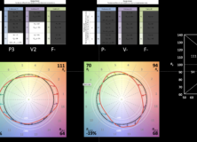
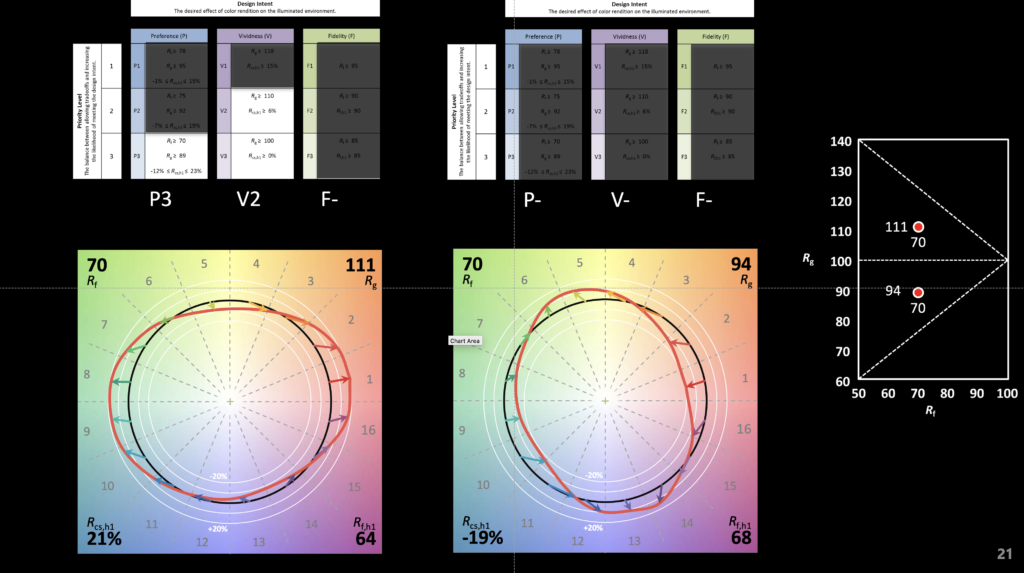
A small part of our demo is shown below. It illustrates how two light sources can have the same fidelity (in this case Rf of 70) but wildly different spectra that produce wildly different color rendering results. This is the great strength of TM-30, a deeper insight into the effect of a light source on illuminated objects and their color appearance – not just fidelity, but chroma shift, hue shift, and the perceptual implications of those shifts.
The video below shows the color appearance shifts. The graphic illustrates that even though the Rf is 70, the first light source renders objects in a preferred manner (Preference Priority Level of 3 or P3) and increases vividness (Vividness Priority Level of 2 or V2). At the same Rf the second source mutes colors and fails to achieve any of the Design Intents and Priority Levels specified in TM-30’s Annex E.
Alternating between light sources with Rf 70, Rg 94 and Rf 70 Rg 111
A reminder that Tony Esposito and I will be presenting Specifying Light Source Color Rendition three times at ArchLIGHT Summit in Dallas next Tuesday and Wednesday, the 21st and 22nd. Hope to see you there!
Last Thursday Donald Trump spoke to a group of Republicans in Baltimore. One of the things he said caught my attention: “The lightbulb. People said what’s with the lightbulb? I said, here’s the story. And I looked at it, the bulb that we’re being forced to use, No. 1, to me, most importantly, the light’s no good. I always look orange. And so do you. The light is the worst.”
Now, I’m not aware of being made to look orange under LEDs, nor have I ever noticed LEDs making my friends, colleagues, or students appear orange. You can’t imagine how embarrassed I’d be if it turned out that a real estate developer and entertainer had more astute color perception than me, a lighting designer and Co-Chair of the IES Color Committee. If our only means of evaluating the color rendering of a light source, and evaluating the orange content specifically, was CRI we would have no objective way of testing his statement. CRI, technically Ra, is a single value that gives us an average of the match between the light source in question and its reference source (either a blackbody radiator or a CIE definition of daylight, depending on CCT) using only eight color samples.
Colors used to calculate CRI Ra
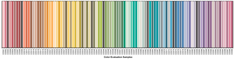
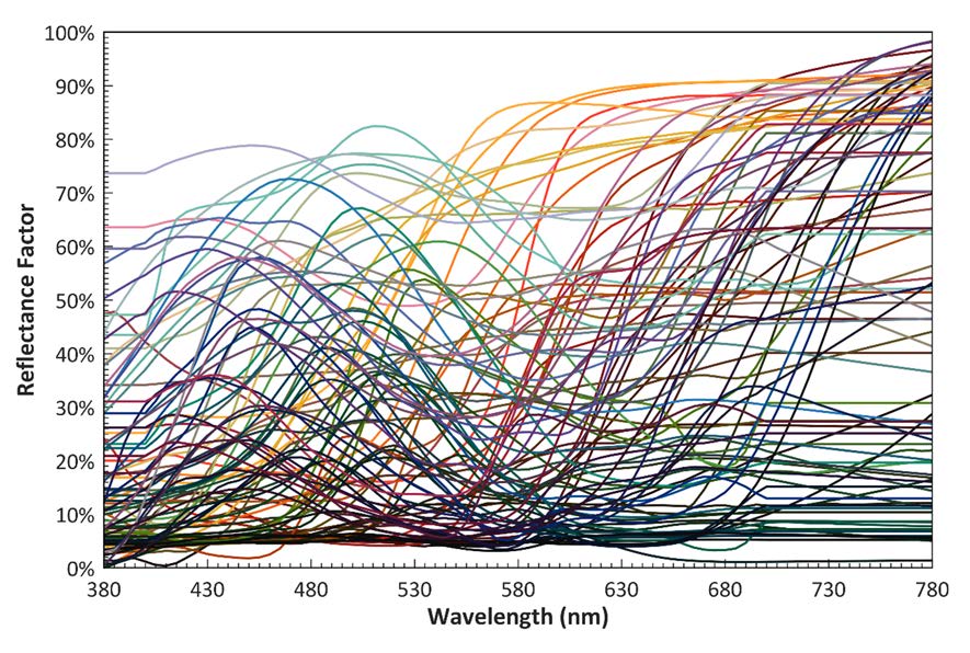
Since Ra is an average value there’s no way to understand the rendering of any particular hue. I’ve talked about this here. However, one of the wonderful things about ANSI/IES TM-30 IES Method for EvaluatingLight Source Color Rendition is that we can use it to test that claim. TM-30 uses 99 color samples that are distributed across the color space and the visible spectrum.
TM-30 99 color evaluation samples (CES)TM-30 CES spectral reflectance functions
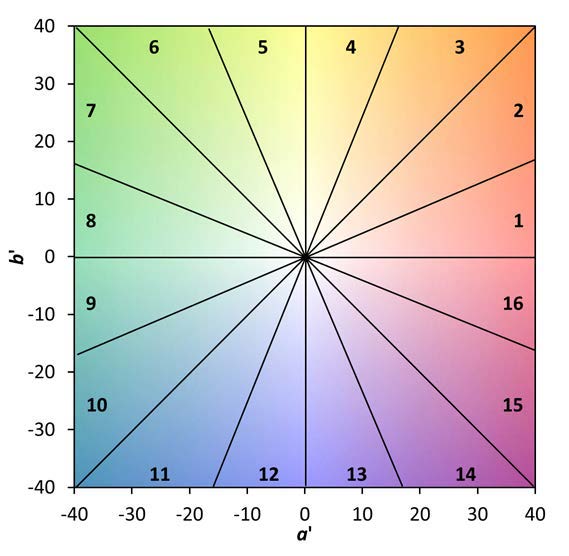
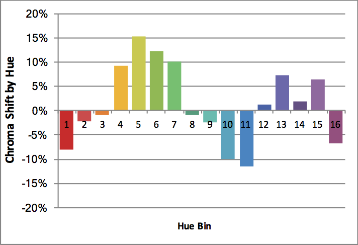
It also breaks the color space up onto 16 Hue Bins, each one covering a specific range of the color space. In the case of orange, we want to look at Hue Bin 3. Specially, we want to look at Rcs,h3 (the subscript CS stands for Chroma Shift) which quantifies the increase or decrease in the saturation or vividness of orange compared to the reference light source.
TM-30 hue binsExample of TM-30 chroma shift bar graph by hue bin
So, let’s put the science of TM-30 to work and see if we really do know that LEDs make us look orange!
The TM-30 calculator contains a library of 300 SPDs (spectral power distributions), of which 137 are commercially available white LEDs. The CCTs range from 2776 K to 6123 K. If white light LEDs really did make us look orange we’d expect to see a large majority of them have a positive Rcs,h3, probably with an average chroma shift in excess of 10%. In fact, the 137 SPDs have Rcs,h3 that range from -8% to 1% with an average of -3.6%, a decrease (not an increase) in the saturation of orange. It’s not me, it’s him. TM-30, which uses the most modern models of human vision and a set of colors that cover the color space and visible light spectrum, proves it. What a relief!
Don’t believe me? Download TM-30 and the calculator for free from the IES web site and see for yourself.
Of course, I’m not saying LEDs are perfect light sources. Like any other product there are good ones and bad ones. However, TM-30’s measurements of fidelity and gamut (as averages) and measurements of fidelity, chroma shift, and hue shift (by hue bin) permit us to make a thorough evaluation of a light source to understand its color rendering characteristics. Using this knowledge, we can determine if a particular light source distorts colors and is appropriate for a project, or not.
I should take a moment to note another error he made when he said, “And very importantly—I don’t know if you know this—they have warnings. If it breaks, it’s considered a hazardous waste site. It’s gases inside.” Perhaps you’ve heard the acronym SSL or the phrase solid state lighting. LEDs are a version of SSL, which means that they are…well, solid. Unlike previous light producing technologies LEDs are a solid combination of materials. As such, if one were to physically break (which is unlikely since LEDs are small, are mounted to a heat sink and often covered with a lens, so you’d have to break a lot of materials simultaneously) no gas, hazardous or benign, is emitted. He’s thinking of fluorescent lamps and the small amount of mercury they contain. Even then, a broken fluorescent lamp doesn’t turn the area into a” hazardous waste site.” Here are the EPA’s instructions for cleaning up a broken fluorescent lamp.