Designing With Light is now available in Simplified Chinese!
The companion blog to the books Designing With Light and Fundamentals of Energy Efficient Lighting and Controls
Designing With Light is now available in Simplified Chinese!

Recently, ANSI/IES TM-30 was improved with the addition of Annexes E and F. Annex F reviews and summarized five studies that explored using TM-30 metrics to predict subjective visual outcomes. Annex E uses that research to establish recommended specification criteria when the designer’s color rendering goals are Preference, Vividness and/or Fidelity.
The IES Forum for Illumination Research, Engineering, and Science (FIRES) has an article I wrote with Michael Royer and Tony Esposito explaining the Annexes and how to use the information in Annex E. Here’s the link: Using TM-30 to Improve Your Lighting Design – Illuminating Engineering Society
I’ve been using Annex E on projects and have spoken to other designers who have begun to use it. It provides useful, accurate information that allows me to evaluate the color rendering results of light sources in a way that hasn’t been possible until now. It lets me make informed decisions about my projects, and explain those decisions to colleagues and stakeholders in (relatively) easy to understand terms.
TM-30 and the TM-30 calculators continue to be a free download from the IES here. Annexes E and F are also free on the Errata and Addenda page here and here.
Here’s this semester’s back to school video. This time it’s Kylie Minogue in a concert performance of Light Years.
Last Thursday Donald Trump spoke to a group of Republicans in Baltimore. One of the things he said caught my attention: “The lightbulb. People said what’s with the lightbulb? I said, here’s the story. And I looked at it, the bulb that we’re being forced to use, No. 1, to me, most importantly, the light’s no good. I always look orange. And so do you. The light is the worst.”
Now, I’m not aware of being made to look orange under LEDs, nor have I ever noticed LEDs making my friends, colleagues, or students appear orange. You can’t imagine how embarrassed I’d be if it turned out that a real estate developer and entertainer had more astute color perception than me, a lighting designer and Co-Chair of the IES Color Committee. If our only means of evaluating the color rendering of a light source, and evaluating the orange content specifically, was CRI we would have no objective way of testing his statement. CRI, technically Ra, is a single value that gives us an average of the match between the light source in question and its reference source (either a blackbody radiator or a CIE definition of daylight, depending on CCT) using only eight color samples.

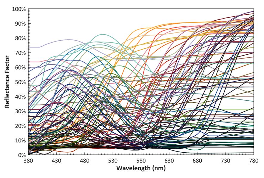
Since Ra is an average value there’s no way to understand the rendering of any particular hue. I’ve talked about this here. However, one of the wonderful things about ANSI/IES TM-30 IES Method for Evaluating Light Source Color Rendition is that we can use it to test that claim. TM-30 uses 99 color samples that are distributed across the color space and the visible spectrum.

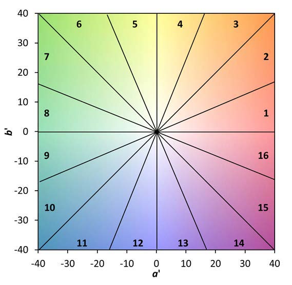
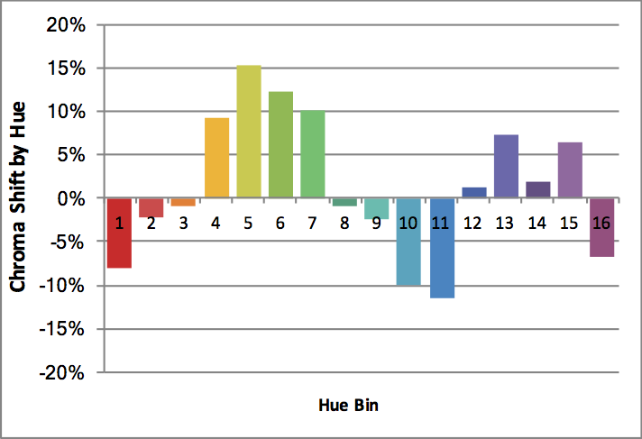
It also breaks the color space up onto 16 Hue Bins, each one covering a specific range of the color space. In the case of orange, we want to look at Hue Bin 3. Specially, we want to look at Rcs,h3 (the subscript CS stands for Chroma Shift) which quantifies the increase or decrease in the saturation or vividness of orange compared to the reference light source.
So, let’s put the science of TM-30 to work and see if we really do know that LEDs make us look orange!
The TM-30 calculator contains a library of 300 SPDs (spectral power distributions), of which 137 are commercially available white LEDs. The CCTs range from 2776 K to 6123 K. If white light LEDs really did make us look orange we’d expect to see a large majority of them have a positive Rcs,h3, probably with an average chroma shift in excess of 10%. In fact, the 137 SPDs have Rcs,h3 that range from -8% to 1% with an average of -3.6%, a decrease (not an increase) in the saturation of orange. It’s not me, it’s him. TM-30, which uses the most modern models of human vision and a set of colors that cover the color space and visible light spectrum, proves it. What a relief!
Don’t believe me? Download TM-30 and the calculator for free from the IES web site and see for yourself.
Of course, I’m not saying LEDs are perfect light sources. Like any other product there are good ones and bad ones. However, TM-30’s measurements of fidelity and gamut (as averages) and measurements of fidelity, chroma shift, and hue shift (by hue bin) permit us to make a thorough evaluation of a light source to understand its color rendering characteristics. Using this knowledge, we can determine if a particular light source distorts colors and is appropriate for a project, or not.
I should take a moment to note another error he made when he said, “And very importantly—I don’t know if you know this—they have warnings. If it breaks, it’s considered a hazardous waste site. It’s gases inside.” Perhaps you’ve heard the acronym SSL or the phrase solid state lighting. LEDs are a version of SSL, which means that they are…well, solid. Unlike previous light producing technologies LEDs are a solid combination of materials. As such, if one were to physically break (which is unlikely since LEDs are small, are mounted to a heat sink and often covered with a lens, so you’d have to break a lot of materials simultaneously) no gas, hazardous or benign, is emitted. He’s thinking of fluorescent lamps and the small amount of mercury they contain. Even then, a broken fluorescent lamp doesn’t turn the area into a” hazardous waste site.” Here are the EPA’s instructions for cleaning up a broken fluorescent lamp.
In 2007 Congress passed the Energy Independence and Security Act (EISA) with the goal of increasing energy efficiency across the economy. Part of EISA has affected the lighting industry in the form of mandated efficacy of light sources. The initial efficacy rules targeted A-Lamps (standard household light bulbs) and set the efficacy level above that of incandescent but below that of halogen lamps. The result was a slow shift to the more energy efficient technology. Over the years the energy efficiency requirements have been expanded to more lamp shapes, always in keeping with technological ability so that we never faced a lamp shortage or loss of a lamp shape. Today, more than 50% of lamps sold are LED that exceed even the most stringent requirements.
On September 4th the administration announced that it was going to cancel a new set of requirements that would have taken effect in January 2020 that would have applied to products such as decorative medium base lamps and MR type lamps. In my opinion, this is another example of the administration cutting off its nose to spite its face. As with the threat to “investigate” automakers who agree with the State of California’s proposed energy efficiency requirements, this effort to undo energy efficiency despite the monumental consensus that we need to reign in our energy consumption isn’t going to go have any effect. No lamp manufacturer is going to reopen or build new factories to make incandescent lamps when it’s obvious that A) the next administration is going to reinstate the efficacy requirements B) the public has embraced the energy savings of LED lamps, and C) the companies know that it would be bad for their image to turn their backs on mitigating climate change.
Source: White House to Relax Energy Efficiency Rules for Light Bulbs – The New York Times
School is starting up again so it’s time for another back to school music video of a song that’s about or features the word “light.” This time with Billy Joel!
We have been hearing from contractors that many fixture manufacturers, including Acuity Brands, Hubbell Lighting and Eaton, are being forced to raise prices because of the recent tariff increase on Chinese goods.
The tariff on lighting components and fixtures was 10%. However, on May 10th the tariff was raised to 25%. The 15% tariff increase is too much for manufacturers to absorb so they, and ECs, consider this a Force Majeure event (unforeseeable circumstances that prevent someone from fulfilling a contract). By invoking Force Majeure they are voiding previous pricing and are issuing new quotes showing the cost increases.
This doesn’t mean that all fixture prices are going to increase by 15%. The amount of Chinese made components varies by manufacturer and fixture line. More Chinese components will mean a higher cost increase. To us this means that until the tariff and trade situation with China settles down lighting designers would do well to keep their clients informed of the varying impact on fixture costs and therefore fixture budgets.
Science geeks everywhere are celebrating World Metrology Day today. Today has also been chosen by Bureau International des Poids et Mesures (International Bureau of Weights and Measures) to implement changes to the International System of Units or the SI. The changes are to the definitions of the kilogram, ampere, kelvin, and mole.
Of special interest to lighting designers, the Kelvin is now defined “by taking the fixed numerical value of the Boltzmann constant k to be 1.380 649 x 10–23 when expressed in the unit J K–1, which is equal to kg m2 s–2 K–1, where the kilogram, metre and second are defined in terms of h, c and Cs.”
Yeah, I don’t know what that means, either! Here’s a link to the full definition and formula.
On April 23rd the CIE (Commission Internationale de l´Eclairage) published a position statement on so-called Blue Light Hazard. Given the amount of press this phrase has received and the responses, such as the AMA Policy H-135.927 Human and Environmental Effects of Light Emitting Diode (LED) Community Lighting, which was refuted by the IES and the LRC, it’s a timely piece.
The position statement makes a couple of key points. The first is that the phrase itself “has been inaccurately used to represent the risk of actual eye damage and the influence on general well-being. The term ‘blue light hazard’ should only be used when considering the photochemical risk to the retinal tissues of the eye (technically referred to as “photomaculopathy”), usually associated with staring into bright sources, such as the sun or welding arcs”
The second point is that “There is no evidence in humans of any adverse health effects from occasional exposure to optical radiation at the exposure limits.” It’s an important position paper with links to research. Read it for yourself.
Soraa (the LED lamp and fixture manufacturer) has published a profile of me and Studio T+L as part of their “Masters of Light” series. You can read it here.