Manufacturers Don’t Understand Color Rendering

I attended LEDucation in New York City this week.  While there I spoke to over two dozen manufacturers, none of whom understood color rendering beyond the (partially accurate) belief that higher CRI is better.  My conversations when like this.

Lighting Salesperson: “Our color rendering is great.  Our CRI is over 90 and our R9 is over 50.”

Me: “CRI measures color fidelity.  What if my goals are something else?”

Lighting Salesperson: “…”

or

Lighting Salesperson: “Our color rendering is great.  Our CRI is over 90 and our R9 is over 50.”

Me: “CRI has inaccuracies that have been known for decades while TM-30 is the most accurate and up to date system.  If color fidelity is important to you, why aren’t you using TM-30’s Rf?”

Lighting Salesperson: “Well, lighting designers don’t understand TM-30.”

Me: “Oh, I think many of them do.  But, even if they don’t, don’t you want to be sure that your color rendering claims are true?  Couldn’t you educate designers about TM-30?  The IES Color Committee will help.”

Lighting Salesperson: “…”

So, (big sigh, big eye roll) let’s go over this again.  If we think of CIE 13.3-1995 Method of Measuring and Specifying Colour Rendering Properties of Light Sources, aka CRI, as a technology, then it’s a technology from 1965 which is when the first version was published.  In 1965 Lyndon Johnson was president, Bonanza was the most popular TV show, Wooly Bully by Sam the Sham and The Pharaohs was the most popular song, and the Chevrolet Impala (Jet Smooth Ride!) was the most popular car.  CRI is O-L-D.

As with any other technology that is 57 years old,  the science has advanced.  Unfortunately, CRI has not. There were two minor corrections, the most recent in 1995, but they did little to fix at least a half dozen errors and inaccuracies that have been well documented for decades.  The CIE basically admitted that when, in 2017, they published CIE 224 Colour Fidelity Index for Accurate Scientific Use, which is TM-30’s Rf measure of fidelity.  Why publish 224 and not withdraw CRI?  Why have one measure for accurate scientific use and one for (inaccurate?) general use? The CIE requires unanimous votes for any action to be approved.  I’m told by reliable sources who were in the room that one global lamp manufacturer has been resisting updating or replacing CRI for decades, and that one manufacturer has held up progress or change.

So, CRI is has known inaccuracies resulting from a combination of outdated internal calculations along with other limitations.  Meanwhile, TM-30 is known to be the most accurate measure of fidelity.  If fidelity is your concern, Rf is the measurement you want to use.

What about concerns other than fidelity?  When TM-30 was published in 2015 there wasn’t evidence it could be used for purposes other than fidelity.  However, by 2018 studies provided ample evidence that TM-30 measures could also be used to evaluate light sources for preference and vividness.  The studies are summarized in TM-30’s Annex F, and recommendations based on those studies are in Annex E (yes, that seems backwards, sorry).  Here’s an explanation of all three color rendering goals. (Oh, and TM-30 is still a free download from the IES!)

I think preference is an incredibly interesting color rendering goal.  Color preference means that the light source in question renders colors differently than the reference light source (and therefore has a lower fidelity) but does so in a way that is preferred by most people (usually by slightly increasing the saturation of colors, especially red).  Color preference is usually my color rendering goals in spaces, such as hospitality, where aesthetics are the primary concern.

Manufacturers don’t get it. Designers do, and we have to demand that they educate themselves so they can provide us with the tools we need.

Updating the CCT Calculation

As I noted in Chapter 9 of the 2nd edition of Designing with Light, we calculate color temperature, correlated color temperature, and distance from the Plankian locus in a perverse way.  The calculations are performed in the CIE 1960 (u, v) chromaticity diagram (which is why distance from the Plankian locus is Duv).  However, since 1960 (u, v) is obsolete, we perform the calculation using CIE 1976 (u’, v’) chromaticity diagram, but then scale the v’ axis by .66 so that we’re using 1976 (u’, ⅔ v’) which is 1960 (u, v).

To complicate things, to present information graphically, most manufacturers transpose these calculations to the 1931 (x, y) chromaticity diagram, resulting in the industry using 2 ½  chromaticity diagrams for various calculations and illustrations.  Unfortunately, they also use 1931 (x, y) to illustrate the gamut of multi-colored luminaires even though it isn’t uniform, making the illustration of questionable value (they should be using CIE 1976 (u’, v’), which is perceptually uniform).

In a counter to this fragmented system, yesterday Leukos published a research article called Improved Method for Evaluating and Specifying the Chromaticity of Light Sources.  Among other proposed improvements to how we perform chromaticity related calculations, it introduces a new uniform chromaticity scale (UCS) diagram with coordinates (s, t), a measure of correlated color temperature (CCTst), and a measure of distance from the Planckian locus (Dst).  Importantly, it makes all chromaticity calculations in a single chromaticity diagram instead of the 2 ½ diagrams we use today.  It’s heavy on the science, but is an important step in fixing our current system.

Designers Thinking About Light – IES Vancouver Section

On February 24th I’m giving an online presentation called Designers Thinking About Light to the Vancouver section of the IES.  I’ll be talking about how lighting designers think about light as an artistic medium.  The presentation will include some ideas you probably know, as well as some approaches that will be new.  To register, visit the IES Vancouver Section web site.

The Limits of a ‘Standard’ Observer

I tell my students that we’re lighting designers not scientists, but that it’s good to understand some of the science that underpins our work.  This is especially true when the science is out of date and produces results that don’t necessarily agree with our vision and/or perception.  It’s frustrating and amazing to me that as individuals we’d never agree to use a broadcast only TV and give up our modern cable and internet channels. We’d never agree to use a flip phone and miss out on all of the upgrades and improvements that have been developed over the years. Yet as an industry we seem perfectly happy to continue to use 75+ year old technology with known flaws when we calculate color rendering, measure brightness, plot chromaticity in color spaces, etc.  Our industry doesn’t seem interested in “upgrading” to get the latest features like less metameric mismatch and measurements that better align with our vision and perception. But, I continue to shout into the void about these things.

One of these topics is the standard observer. This article, online and in the current issue of LD+A, looks at the problems that can arise from continuing to rely on the 1931 standard observer, and not “upgrading” to the 1964 or 2015 standard observers.

Tony and I Talk Color Rendering

Podcast Album Cover

In September at ArchLIGHT Summit, Tony Esposito and I gave a series of demonstrations on the spectral flexibility of LEDs and the possibilities they present with regard to color rendering.  While there we spoke to Sam Koerbel on his LytePod podcast about the basics of the new measures introduced in Annex E, and discuss why TM-30’s multi-dimensional approach to quantifying color preference is superior to the old-standby in the industry: CRI.  Our discussion is now available.  Give it a listen.

Where are the Photometrics?

Today I want to talk about the lack of photometric information provided by manufacturers because the presentation of information frustrates me in two ways. The first issue is the lack of information provided. The second is the difficulty of finding real world examples of what I teach in class. What’s the value of knowing the point and lumen methods if the information needed isn’t available? It seems to be a problem that’s getting worse and I’m not sure why.

  • Do manufacturers not understand photometric calculations, so they don’t see the value in including them?
  • Do manufacturers think lighting designers don’t understand photometrics, so they don’t bother including them?
  • Do manufactures not understand how lighting designers work, and think all calculations are done in AGI? I suspect this is the answer.

By failing to publish photometrics, manufacturers are dictating my workflow without understanding how I work and why I work the way I do. I rarely name names, but I’m going to make an exception here. Maybe a little photmetric-shaming (one of the most obscure types of shaming, to be sure!) will get manufacturers to change.

Are You a Contender?

When I navigate my way to a fixture web page and open the cut sheet my main goal is to determine if the fixture is a contender. Does it seem to have the features I’m looking for? If not I can move on. If so, the next question is, “Does it have the performance I’m looking for?” Photometrically, I’m looking for general distribution type, followed by more specific distribution information, lumen output and load, and beam angle. If those look good, I’ll scroll down the cut sheet to the photometric section to get some info to run a quick calculation in a spreadsheet that’s open on my desktop. If the fixture works in that quick calculation I’ll download the cut sheet and .ies file and run an AGI calc when I’m ready. What I’m looking for on the cut sheet, depending not the calculation, is:

  • Lumen output
  • Center beam candlepower
  • Beam angle
  • Candelas distribution
  • Coefficient of utilization (CU) table

For example, I recently went looking for a linear downlight. My first stop was Coronet because I know they’ve recently revamped their historically deficient cut sheets. Are the new cut sheets any better? No. The first page of the cut sheet for the LSR2, for example, now has a section labeled “Optics” (not photometrics) and gives a sort of candlepower distribution curve, but there’s only one number, which seems to be candlepower at nadir but isn’t labeled as such. A separate section at the bottom of the next page shows “Performance” in terms of watts/ft and lumens/ft for three output levels. That’s it. Any reasonable calculation of the fixture’s performance in a space requires downloading .ies files, building a model in AGI, and running a calculation. As I said earlier, that’s not my workflow. I can run a lumen method calc much faster than I can build an AGI calc and I don’t want to be forced into AGI.

Next I looked at Focal Point’s Seem 2. As with Coronet, there’s a candlepower distribution curve. The ordering matrix tells me there are four lumen outputs, and there’s a table of output, watts, and lumens/watt. A lot of page space is given to lengths and controls, but there’s nothing else about photometric performance on the cut sheet. To find any useful information I have to download .ies files and open them in Photometric Toolbox or AGI.

Finally, I looked at Acuity’s Mark Lighting. The cut sheet for the Slot 2 LED presents a table of lumens/ft, watts/ft, and lumens/watt for four output levels, but there’s no candlepower distribution curve or CU table. On the plus side, the information I want is provided, but in a separate location on the web page called Photometry & Revit (BIM). If I click on Report I find a polar candelas graph, zonal lumen summary, CU table, etc. I wish this was in the cut sheet, but at least it’s available.

I have similar complaints about other manufacturers who make fixtures I generally like: Alphabet, USAI, Day-O-Lite, and Ecosense among them.

Let Manufacturers Know

If you’re similarly frustrated let manufacturers know. If you’re at Lightair this week tell them face to face. If not, tell your reps and anyone at the factory you may know.

The Strength of TM-30

Last week Tony Esposito and I presented seminars at ArchLIGHT Summit in Dallas, TX. The topic was TM-30 and the deep information that it provides us about a light source’s spectrum and the resulting color rendering. CRI, of course, only evaluates fidelity – how close a light source matches its reference light source. But CRI penalizes all deviations and says nothing about the rendering of individual colors. Nor does it help us understand if the deviations from the reference are acceptable to viewers.

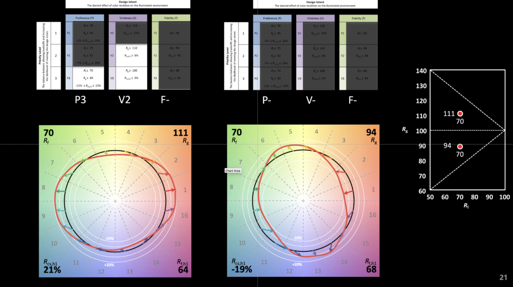
A small part of our demo is shown below. It illustrates how two light sources can have the same fidelity (in this case Rf of 70) but wildly different spectra that produce wildly different color rendering results. This is the great strength of TM-30, a deeper insight into the effect of a light source on illuminated objects and their color appearance – not just fidelity, but chroma shift, hue shift, and the perceptual implications of those shifts.

The video below shows the color appearance shifts. The graphic illustrates that even though the Rf is 70, the first light source renders objects in a preferred manner (Preference Priority Level of 3 or P3) and increases vividness (Vividness Priority Level of 2 or V2). At the same Rf the second source mutes colors and fails to achieve any of the Design Intents and Priority Levels specified in TM-30’s Annex E.

Alternating between light sources with Rf 70, Rg 94 and Rf 70 Rg 111