My classes at Pratt resume tomorrow so it’s time for another video of a song about light. This is John Fogerty singing CCR’s “As Long As I Can See The Light” and the lighting on this one is actually pretty good. Have Fun!
My classes at Pratt resume tomorrow so it’s time for another video of a song about light. This is John Fogerty singing CCR’s “As Long As I Can See The Light” and the lighting on this one is actually pretty good. Have Fun!
Registration is now open for the IES Research Symposium III, Light + Color. I’m on one subcommittee that’s coordinating the symposium and have sat in on organizing meetings, and I can assure you that it will be a very informative three days. The IES describes the symposium, saying “This international lighting research and application symposium will draw on the talents and expertise of the researcher, the technologist and the design professional to better understand the growing role of color in lighting from the standpoints of color vision, color perception, color preference, color metrics and color technology.” The symposium will be April 3-5 in Gaithersburg, MD and will include tour of the color labs at NIST. Register here. See you there!
On November 12 the National Electrical Manufacturers Association (NEMA) published a position paper on IES TM-30-15. The document is here. It seems to be a willful misunderstanding and misrepresentation of TM-30. Here’s how…
The paper opens with NEMA’s support of an improved color metric but then goes on to say that “NEMA opposes any mandatory reporting or performance requirements for IES-Rf or IES-Rg.” This is a strange opening since neither the IES, in general, or TM-30, in specific, is proposing mandatory requirements. In fact, the IES’s own position paper on this states that “As with any IES Technical Memorandum, TM-30-15 is not a required standard.” So the paper begins with alarm about a non-issue.
Next, it says that, “Any single-number fidelity measure (such as Ra or the new Rf) that averages the results of many colors in a light source could possibly have a high numerical value and yet perform poorly with some specific colors.” Exactly. That’s the problem with CRI Ra, only a single number is reported. The great advantage of TM-30 is that in addition to the average fidelity value Rf, the calculation tool allows designers to see 1) the fidelity within color groups, called Hue Angle Bins, that encompass the entire color space 2) the direction of hue shift (if any) as displayed in the Color Vector Graphic, and 3) the Rf for each of the 99 Color Evaluation Samples (CES). Far from being a single value, as with Ra, TM-30 provides designers with layers of additional information about the performance of the lamp in question.
In the next paragraph we are told “The IES-Rg metric can have a value greater than 100 and yet saturation might be lower than the reference light source for certain colors.” Right again, but in a misleading way. As with color fidelity, TM-30’s evaluation of color gamut is layered. Rg represents the average shift in saturation of the 99 CES. If a specifier wants deeper information it is available in the calculation tool as 1) a CES chromaticity comparison that plots the CES under both the reference illuminant and the test source so that one can see the shift 2) a graph showing the change of chroma by Hue Angle Bin.
The entire third paragraph complains that if Rf is 100 there can be no increase or decrease in Rg – saturation is held at 100, too. This is like pointing out that the problem with taking a bath is that you get wet and soapy. The interrelation between Rf and Rg is a feature, not a bug. When the fidelity index of a light source matches it’s reference then OF COURSE they will produce the same saturation of colors. If one wants to purposely increase or decrease saturation the only way to do so is to use a light source that is NOT an exact match to the reference source, and hence one that has a lower fidelity value. The relationship between Rf and Rg are shown as a graph in the calculation tool to help designers visualize the values that the tool calculates. That’s a good thing.
Finally, the paper concludes with “It is premature to consider IES TM-30-15 as a mandatory requirement or regulation because the metrics are likely to evolve.” As I said at the beginning, this is a non-issue.
The IES developed and issued TM-30 because CRI does not consistently and accurately represent the color rendering of many light sources, especially narrow band emitters like LEDs. This issue is well known and completely accepted by the industry, including the CIE. (A list of CRI’s shortcomings is included in the latest edition of the IES Lighting Handbook.) The IES position is that TM-30 “has been developed for the benefit of the lighting community to provide: (a) a more accurate assessment of color fidelity; (b) an additional, complementary assessment of the influence of the preferred color appearance of objects (related to color gamut); and (c) more detailed information about the rendition of specific colors.“ and goes on to say that, “the issuance of TM-30-15 will enable the international lighting community to carefully evaluate it, providing a path leading to improved standards and design guidance. Technical analysis and feedback regarding the method described in TM-30 will be critical to continued development and standardization of color quality metrics.” In other words, “We think this is a good tool. We’re publishing it so that other concerned parties can evaluate it. We hope that this will trigger the acceptance of TM-30 or the development of another tool.”
Clearly NEMA as an organization, or members of their Lighting Systems Division, has a problem with the IES issuing TM-30, but the position paper is a red herring. It stirs up alarm over TM-30 becoming a requirement or regulation when the IES has noted that isn’t the purpose of a TM, and attempts to point out shortcomings that actually belong to CRI, not to TM-30. I don’t know about the politics involved here, but I do know that this paper should be read with skepticism.
The CIE’s Color Rendition Index (CRI) has long had several known weaknesses including outdated components of the calculations, a limited set of color samples, and standard reporting of only one piece of data (the average color distortion of the first eight colors, known as the General Color Rendering Index or Ra). After more than a decade of stalemate it seems that the IES’s TM-30 has convinced the CIE to make another attempt at updating CRI.
In a recently released position statement the CIE announced that the CRI technical committee (TC 1-90) has taken up the problem again and is expected to write a technical report on a new, improved color fidelity metric that can update CRI before the end of 2016. They will use TM-30 Rf as the basis for their work. Another committee, TC 1-91, will write a report on a color preference metric in the same time period.
This is both good and bad news. CRI is the international standard for measuring and reporting light source color rendering. It is long overdue for an update, and I’m glad to see the CIE working on it. On the downside, the press release makes it sound as though 1) parts of TM-30’s Rf may be incorporated, but the CRI fidelity metric will be a new creation 2) we may see the addition of a color preference metric but TM-30’s gamut metric Rg apparently isn’t being considered. The biggest reason that this is a concern is the amount of time it takes to create the work, gain internal consensus, approve the work, and gain organization approval – all of this before the work can be released to the larger lighting community for consideration. I think it is extremely optimistic to think that the two committees can write meaningful reports on these issues in only one year, especially given the difficulty they’ve had reaching consensus in the past.
I would much rather see the CIE committees study TM-30 and report on its strengths and weaknesses before deciding that it won’t work and they should start over. Adopting or modifying TM-30 can happen much quicker than developing one or more new metrics. TM-30 took three years to develop and the industry shouldn’t have to wait another three years for an updated metric that has the CIE’s approval.
You may be familiar with the idea of a color gamut from displays or from RGB LED fixtures. In both cases the gamut describes the full range of colors that the device can create. In TM-30-15 IES Method for Evaluating Light Source Color Rendition gamut (Rg) has a somewhat different meaning. It refers to the average color shift of the 99 color evaluation samples (CES) under the test light source when compared to the reference light source. The reference source used in Rg is the same source used when calculating color fidelity (Rf) (as opposed to a fixed reference source as has been proposed in other gamut metrics).
A gamut index of 100 means that, on average, the test light source doesn’t change the hue or saturation of the CES compared to the reference source. An Rg above 100 indicates that the test light source, on average, increases the saturation of the CES producing colors that are more vivid. An Rg below 100 indicates that the test light source decreases the saturation of the CES producing colors that are less saturated.
The addition of a gamut index is a huge improvement over the single CRI (Ra) number that we’re used to. With Ra, every shift from a match to the reference source, whether it increases or decreases saturation, is treated equally and the direction of the shift is not reported. However, this is important information. For instance, research has shown that in many situations most people prefer a slight increase in color saturation. With Rg designers know the direction of the color shift, and the TM-30 calculation tool also shows the shift by hue and for each of the CES.
What’s the relationship between Rf and Rg? If Rf is 100 (a match to the reference source) Rg must also be 100. If the Rf calculation doesn’t indicate a mismatch with the reference source then there is no change in saturation. As the Rf value falls the potential range of Rg above and below 100 (indicating an increase or a decrease in saturation) grows. The calculation tool includes a chart that shows this relationship and gives a visual indication of where the light source in question fits.
Another graphic, the Color Distortion Icon, is plotted on the CAM02-UCS color space. In this graphic both the reference source and the test source are shown, along with an indication of the direction and magnitude of the hue shift caused by the test source. Finally, we can even look at the color shift for each of the 99 CES.
A designer using TM-30 now has three big picture metrics to evaluate a light source: color fidelity (Rf), color gamut (Rg), and correleated color temperature (CCT). The designer can use TM-30’s calculation tool to examine the Rf and Rg of a light souce in as much detail as the project merits, from a very broad overview to a very detailed, color by color, evaluation.
The one thing that TM-30 does not do is provide guidance on the significance of the values it calculates. It is a Technical Memorandum that describes two calculation proceedures, not a design guide for using the results of those proceedures. Guidance will come later in the form of a TM-30 addenda or a design guide prepared by the IES, or guides prepared by other parties. In the meantime designers can begin to build their own understanding by comparing Rf and Rg values to the their visual evaluation of the light source, and by sharing the results of their work with others.
The pubication date has not been set, but now that the TM has been approved by the IES board of directors it should be available soon. Keep an eye on the IES bookstore and on trade publications for updates. In my opinion TM-30 is a huge improvement over CRI, and I hope that the industry enthusiastically adopts it.
Note: This post was originally published on June 15, 2015 but was taken down when the IES contacted me and claimed copyright to all graphics produced by the TM-30 calculation tool. This seems to me as absurd as Adobe claiming copyright to all pictures edited in Photoshop, but I didn’t have the time to argue. I took down the original post and have reposted it here, without graphics, and edited the text to omit references to graphics.
NPR’s All Things Considered had a brief piece about light and color on Monday. The main thrust of the story was that color is not inherent in an object, but is perceived and interpreted by our brain, but there’s much more to revealing and perceiving the color of objects. Here’s a quick overview.
To begin, all objects have light reflecting properties. Objects that we identify as red reflect most of the red light that falls on them and absorb the other colors. Likewise for objects that appear to be green, blue, etc. Objects that appear to be white reflect the colors of light more or less equally, while objects that appear to be black absorb most of the light that falls on them. Objects only reflect light, they don’t create it, so if we use blue light to illuminate an object that reflects red light we find that no light is reflected and the object appears to be black.
As I explain in Chapter 8, we change the balance of the colors in white light every time we change the light source. Even with a single light technology, such as fluorescent, we change the balance of colors when we change from cool white to warm white. The color content of a light source can be measured (it’s called the spectral power distribution or SPD) and graphed as shown below.
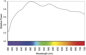
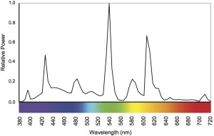
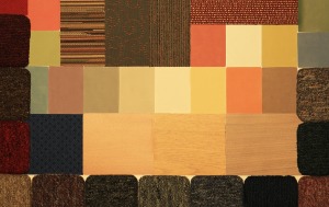
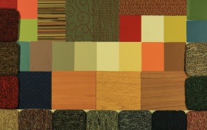
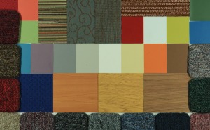
When we change the SPD we change the colors of light that are available for reflection by objects, which means that we also change the balance of light that is reflected and thus the color information that our eyes receive. The result is that changing the light may change the color appearance, or the apparent color, of an object. Many of us have had the experience of buying clothing or paint that was one color in the store and another color at home. Here we see this phenomenon with a color/materials board illuminated by several light sources. How well a light source enables us to perceive colors is called color rendering.
Color and brightness perception are both relative not absolute. A candle in an otherwise dark room may seem too bright to look at directly, while its brightness on a sunny day seems insignificant. In addition to the effect of SPD on our color perception, colors are perceived in relation to one another, especially between foreground and background as shown below.
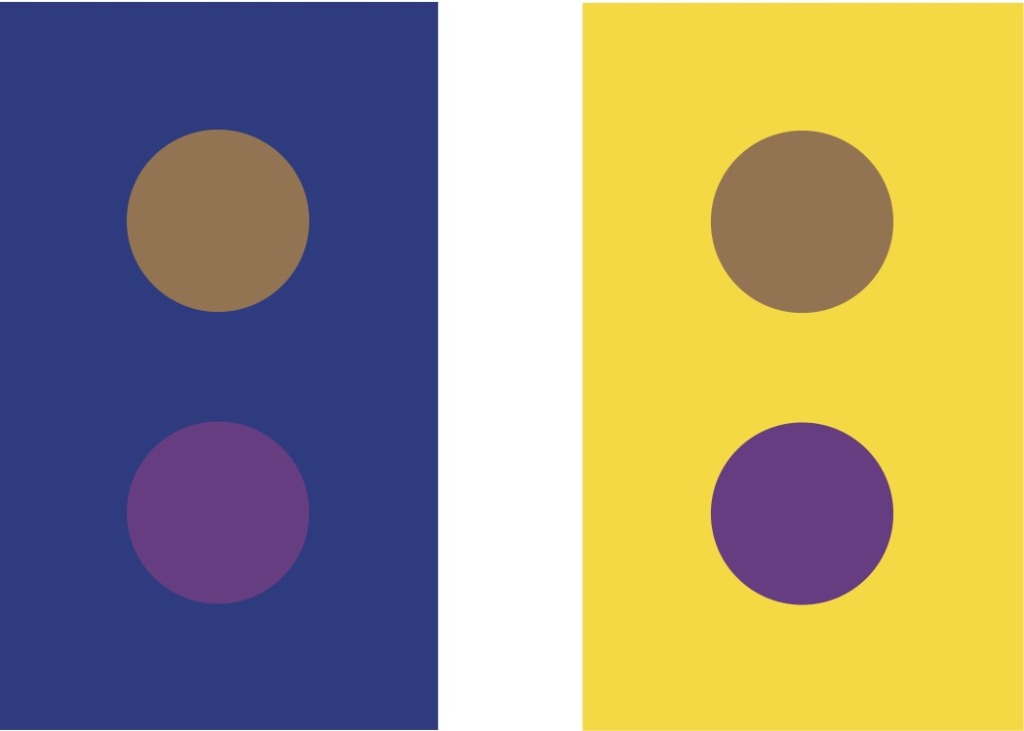
If I can demonstrate shifting our color perception why don’t we experience it in everyday life? Why are my blue jeans blue and my red car red in nearly every lighting situation? The answer is color constancy or chromatic adaptation. It does us no good to spend time and energy struggling to figure out colors. We want to be able to tell if a piece of fruit is ripe regardless of the lighting conditions. Color constancy is our brain’s use of information gathered from the entire visual field to understand the lighting conditions and calibrate our color perception so that color shifts are minimized.
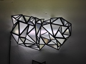
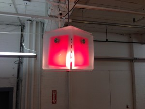
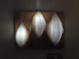
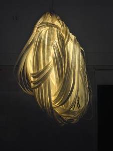
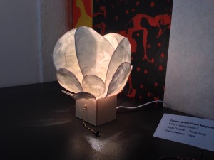
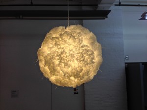
Yesterday my students at Pratt presented custom built lighting fixtures inspired buy the work of a fashion designer. Here are some of them.
The current version of Cosmos, like Carl Sagan’s original, is considerably more inspirational than informational, but it’s still well worth the time. This week’s episode is all about light. Take a look…
http://www.hulu.com/watch/617730