As the Co-Chair of the IES Color Committee, I have seen too many statements that full-scale adoption of TM-30 is too difficult and will create confusion in the market. Often, these assertions come from major manufacturers who want to control market disruption, not be disrupted. In my professional lifetime there have been, and continue to be, significant changes in the lighting marketplace. When new products are introduced, designers are told about the wonderful benefits of using them. There has never been a time when large manufacturers or organizations with loud voices have said the market could not accept about a new product because doing so was too burdensome. For example,
- The introduction and transition to electronic ballasts and transformers meant that we had to learn about reverse phase dimming and control protocols.
- The T5 lamp meant we had to change our layout patterns to accommodate lamps that weren’t standard 2’, 4’, and 8’ lengths.
- Metal Halide lamps, especially PARS, meant that in exchange for energy savings we had to learn about the color rendering of a new type of lamp, and give up dimming.
- Daylight harvesting and daylight responsive designs meant we had to learn about daylight zones, photosensors, and daylight harvesting control systems.
- White LEDs meant we had to learn about another light source and its specific pros and cons, including different color rendering properties due to its SPD.
- Circadian lighting means we are all in the process of learning how and when to apply the most current scientific evidence to certain project types. Since the science is constantly advancing on this topic, we must be aware and continue to educate ourselves.
- Regularly updated energy conservation codes mean that as we begin to memorize the lower LPDs and changes to control and daylighting requirements, we have to relearn that information because it changes every three years.
- Most recently, we’re supposed to enthusiastically embrace IoT, adding huge complexity to our lighting control systems and opening them up to hacking.
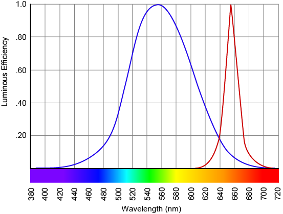
But, I keep hearing that industry adoption of TM-30, allowing specifiers to have a much clearer idea of the color rendering properties of their light sources, is tooo haaaaard! This is especially maddening when so many professions, including lighting design if you have an LC or LEED credential, require continuing education that is supposed to be more than halfway paying attention to a webinar.
Manufacturers love introducing and promoting new products and technologies that will expand profits, and specifiers get the hard sell all the time. But some manufacturers don’t want to consider TM-30 for several reasons. First, there’s the fear that the Rf value, which is analogous to CRI Ra, will be lower than the Ra value. Even though it’s a different, and tougher, test they fear loss of sales if numbers change. I suspect the manufacturers who fear this the most are those who have most engineered their spectra to score well on Ra, but know that Rf can’t be gamed in the same way. Second, as one manufacturer flat out told me, they’d rather put their money into IoT (and other new and profitable products) instead of updating cut sheets and web pages.
Here’s the thing – as a designer and specifier I have no interest in being stuck in 1965 (the year CRI was unveiled) or even 1995 (the most recent update to CRI). We know that CRI is flawed, we know what the flaws are, and we know that the CIE has been unable to come to consensus on fixing the flaws. The IES has done a great job of developing a new, accurate, modern tool that gives us so much more information than CRI ever could. My design decisions, and my ability to learn about my profession so I can be better at it, are not driven by manufacturer profit masquerading as manufacturers worrying about specifier or consumer confusion. Research over the past two years has shown TM-30 to be more accurate, and we continue to learn more about how to effectively use it. Lighting specifiers should begin the transition to TM-30 by insisting that manufacturers provide them with Rf, Rg, and color vector graphics.