Substitutions vs Specifications

Earlier this week I had a disagreement with a contractor about my specifications and fixture schedule.  The client, who had never been involved in a construction project of this type, didn’t know which one of us to believe.  It went like this:  We are coming up on the end of construction and the contractor is slightly over budget.  In order to save money he wants to start to substitute less expensive products for those that have not yet been purchased which, in this case, includes the lighting fixtures and control system.  His problem is that my specification and fixture schedule are so clear and precise (also referred to as “tight”) that he is having a hard time finding acceptable alternates.  He told that owner that my tight specification is unfair because of this, and that I’ve essentially “given” the project to certain manufacturers “regardless of price.”  I explained that a tight specification protects the integrity of the design, and thus protects the owner, by guaranteeing that the expected design is the one that is installed.   Who is a client to believe?  Let’s go through this.

As a lighting designer I have one source of income – my fee.  I don’t get a royalty or commission from manufacturers that I specify*, I don’t sell fixtures to the project, and I don’t set pricing for fixtures.  As a result, my only incentive to specify one manufacturer over another is appropriateness for the project.  I talk to the owner about their needs and desires, budget, and timeline. I evaluate fixtures based on performance, options, accessories, quality, and price.  I run calculations to make sure that the appropriate amount of light is being delivered and that the lighting system’s power consumption is within code limits.  In some cases I’m contractually required to identify three equal fixtures for each type.  That’s a lot of work and I want to make sure that it isn’t lost or undermined, so I write a tight specification.

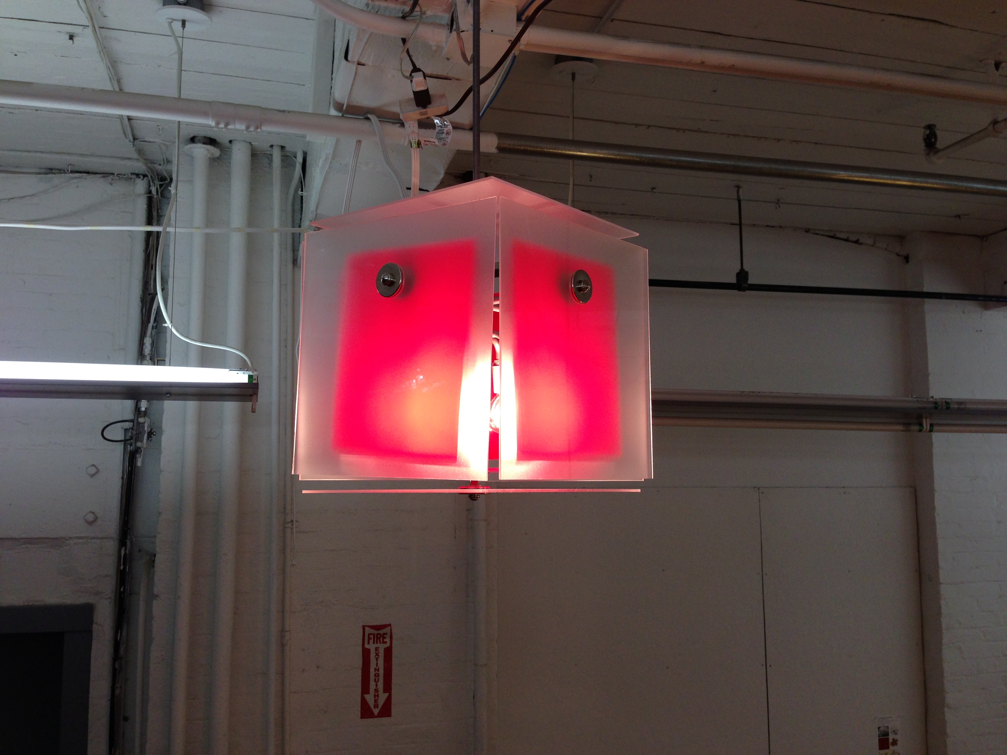
After all of that work, though, most projects don’t require the contractor to provide only those items that the designers have specified.  The rationale is that this gives contractors more flexibility in getting the best price, especially for public projects being paid for with tax dollars.  In practice, however, this is often not the case.  The contractor wasn’t present during the design process and doesn’t understand the criteria that went into selecting each fixture.  He (or she) is primarily concerned with price, not performance.  It’s common for the first round of substitutions offered by the contractor contain a large number of fixtures that are inappropriate for one reason or another.  If a substitute fixture will do the job I usually accept it, but I won’t accept a fixture just because it’s offered.  A tight specification sets the requirements for the fixtures and provides the basis for rejecting inappropriate substitutions.  Yes, this can constrain the contractor’s choice of substitutions but for a good reason.  There are huge variations in fixture performance, even when fixtures look the same.  I’ve had contractors (and architects) say that a downlight is a downlight is a downlight.  Take a look at the photometrics and it quickly becomes obvious that this just isn’t so.

From a designer’s perspective we protect the client by protecting the design, accepting substitutions that work but rejecting those that don’t.  A tight specification can limit the amount of back and forth with substitutions by setting strict criteria that substitutions must meet.  That’s part of the professional expertise we bring to the project.

*I admit I do sometimes get a nice box of chocolates during the holidays.

Lighting Up Pratt

Yesterday my students at Pratt presented custom built lighting fixtures inspired buy the work of a fashion designer.  Here are some of them.

Designed by Connie Chen Inspired by Calla Haynes
Designed by Connie Chen
Inspired by Calla Haynes


Designed by Devon Aerts Inspired by Jil Sander
Designed by Devon Aerts
Inspired by Jil Sander
Designed by Kelsey Birchenall Inspired by Jolka Wiens
Designed by Kelsey Birchenall
Inspired by Jolka Wiens


Designed by Marianne Kim Inspired by Philip Lim
Designed by Marianne Kim
Inspired by Philip Lim


Designed by Sonya Jeong Inspired by Choe
Designed by Sonya Jeong
Inspired by Choe


Designed by YG Jeong Inspired by Longchamp
Designed by YG Jeong
Inspired by Longchamp


“Design Guidelines for the Visual Environment” Comment Period

The Low Vision Design Committee of the New Buildings Institute has release a draft of its new “Design Guidelines for the Visual Environment” for public review and comment.  The intent of the guidelines is to offer assistance to design professionals and others in accommodating those  with a variety of vision disorders.  Click here to visit the NBI site to download the draft.

Great Concert Lighting, Times Two

Whatever you thought of Bruno Mars last night (I thought he was terrific), you have to admit that the lighting for last night’s Super Bowl Halftime Show was outstanding!  And it should have been – we would have expected nothing less.  The light, color, movement, and video were clear, supportive of the music and the performances (more so for Mars than for RHCP), and scaled to fill the television screen, the staging area, and the stadium.  We’ll see statistics in the entertainment industry magazines next month, but there were obviously several hundred moving lights and twice as many LED lights and display panels.  It was an appropriately huge rig for a huge show, and it looked great.

There’s an interesting and exciting contrast between the 12 minutes last night and the 90 minutes of Stop Making Sense by the Talking Heads, which I happen to watch on Saturday (and is available on YouTube here). What’s interesting is that this concert has all of the energy of last night’s performance, but rather than back up the music with nearly overwhelming visuals, David Byrne and Beverly Emmons, who are both credited for the lighting design, created a show in which the lighting of the first 1/3 of the concert appears to be accidental, and the rest is still so stripped down that it seems like something must be wrong, especially when compared to today’s visual smorgasbord of color, video and light on contemporary tours.  I’m not knocking big tours at all, I love them, but the contrast between the two shows, and the fact that they’re each successful, is astonishing.

In the film, we open on a slightly cluttered stage with two visible worklights hanging overhead.  An impossibly young Byrne walks on with a boom box and a guitar, and appears to sing Psycho Killer in little more than white worklight.  Of course, the trained eye can see that there’s a lot more going on, but that’s the look they’ve created.  Over the next five songs more musicians are added, and the lighting becomes somewhat more theatrical, with higher contrast and increased intensity on the performers. Yet, it’s not until the fifth song (Slippery People) that a backdrop flies in and it looks like a staged performance instead of a rehearsal in a warehouse.  20 minutes in we get our first taste of “rock” lighting – there’s finally enough haze in the air to outline some beams of light – but it still seems like there’s only one cue per song!  Although I’m sure that there’s color correction used, the entire concert appears to be performed in white light.  In fact, we don’t see any color until the 8th song (Making Flippy Floppy ) a full 30 minutes into the show, and that’s only on the projection screens behind the band!

I could go on, but I won’t.  If you haven’t seen this movie, or haven’t seen it in a while, watch it now.  Between the bold, strong, yet spare lighting and Byrne’s unique performance style, you won’t be bored.  Let everyone else talk about the Super Bowl while you go see one of the best concert films ever made.

The Best Light?

In class yesterday one of my students, thinking about a project she had recently completed, asked, “What’s the best light for a hair salon?”  I’m certain she was hoping I would tell her exactly what lamp technology and/or lamp style to use.  Of course, it’s not that simple.

So the class took a detour to talk about the important aspects of light in a hair salon.  We narrowed it down to two critical considerations – intensity and color rendering.  Intensity is important because the stylist needs to be able to see the details of a head of black hair as well as a head of blonde hair.  Intensity is relatively easy to achieve, and the designer has a wide range of lamp technologies, lamp shapes, and fixture types to choose from.  Finally, everyone intuitively understands how intensity affects vision.  If there’s not enough light one can’t see well enough to work.

Color Rendering is more complicated.  All of my students had heard of color rendering, but few of them understood its meaning or use.  Color rendering is the ability of a light source to enable us to see object colors.  For instance, a light source that produced no red light would do a terrible job of allowing us to judge red apples and we would say it has poor color rendering.  Color rendering is measured on the Color Rendering Index (CRI) which compares the light source being tested to incandescent light (for warm light) or to daylight (for cool light).  The higher the result, on a range that peaks at 100, the more a light source simulates incandescent or daylight in enabling us to see the colors of illuminated objects.

The best light source, then, is one that produces the desired intensity and has a high CRI.  Of course, there’s much, much more to color rendering and to the topic of color in light.  The color chapter in Designing Light is about 40 pages, and the IES DG-1 Color and Illumination looks like it will be about 100 pages.  It’s critical that lighting designers understand color because it has such a strong affect on people.  Color rendering is just one aspect.  Color also affects things such as our impressions and perception of a space, circadian rhythms, visual acuity, and the interior designer’s color palette.  Those are topics for another post.