On February 24th I’m giving an online presentation called Designers Thinking About Light to the Vancouver section of the IES. I’ll be talking about how lighting designers think about light as an artistic medium. The presentation will include some ideas you probably know, as well as some approaches that will be new. To register, visit the IES Vancouver Section web site.
I tell my students that we’re lighting designers not scientists, but that it’s good to understand some of the science that underpins our work. This is especially true when the science is out of date and produces results that don’t necessarily agree with our vision and/or perception. It’s frustrating and amazing to me that as individuals we’d never agree to use a broadcast only TV and give up our modern cable and internet channels. We’d never agree to use a flip phone and miss out on all of the upgrades and improvements that have been developed over the years. Yet as an industry we seem perfectly happy to continue to use 75+ year old technology with known flaws when we calculate color rendering, measure brightness, plot chromaticity in color spaces, etc. Our industry doesn’t seem interested in “upgrading” to get the latest features like less metameric mismatch and measurements that better align with our vision and perception. But, I continue to shout into the void about these things.
One of these topics is the standard observer. This article, online and in the current issue of LD+A, looks at the problems that can arise from continuing to rely on the 1931 standard observer, and not “upgrading” to the 1964 or 2015 standard observers.
Today I want to talk about the lack of photometric information provided by manufacturers because the presentation of information frustrates me in two ways. The first issue is the lack of information provided. The second is the difficulty of finding real world examples of what I teach in class. What’s the value of knowing the point and lumen methods if the information needed isn’t available? It seems to be a problem that’s getting worse and I’m not sure why.
Do manufacturers not understand photometric calculations, so they don’t see the value in including them?
Do manufacturers think lighting designers don’t understand photometrics, so they don’t bother including them?
Do manufactures not understand how lighting designers work, and think all calculations are done in AGI? I suspect this is the answer.
By failing to publish photometrics, manufacturers are dictating my workflow without understanding how I work and why I work the way I do. I rarely name names, but I’m going to make an exception here. Maybe a little photmetric-shaming (one of the most obscure types of shaming, to be sure!) will get manufacturers to change.
Are You a Contender?
When I navigate my way to a fixture web page and open the cut sheet my main goal is to determine if the fixture is a contender. Does it seem to have the features I’m looking for? If not I can move on. If so, the next question is, “Does it have the performance I’m looking for?” Photometrically, I’m looking for general distribution type, followed by more specific distribution information, lumen output and load, and beam angle. If those look good, I’ll scroll down the cut sheet to the photometric section to get some info to run a quick calculation in a spreadsheet that’s open on my desktop. If the fixture works in that quick calculation I’ll download the cut sheet and .ies file and run an AGI calc when I’m ready. What I’m looking for on the cut sheet, depending not the calculation, is:
Lumen output
Center beam candlepower
Beam angle
Candelas distribution
Coefficient of utilization (CU) table
For example, I recently went looking for a linear downlight. My first stop was Coronet because I know they’ve recently revamped their historically deficient cut sheets. Are the new cut sheets any better? No. The first page of the cut sheet for the LSR2, for example, now has a section labeled “Optics” (not photometrics) and gives a sort of candlepower distribution curve, but there’s only one number, which seems to be candlepower at nadir but isn’t labeled as such. A separate section at the bottom of the next page shows “Performance” in terms of watts/ft and lumens/ft for three output levels. That’s it. Any reasonable calculation of the fixture’s performance in a space requires downloading .ies files, building a model in AGI, and running a calculation. As I said earlier, that’s not my workflow. I can run a lumen method calc much faster than I can build an AGI calc and I don’t want to be forced into AGI.
Next I looked at Focal Point’s Seem 2. As with Coronet, there’s a candlepower distribution curve. The ordering matrix tells me there are four lumen outputs, and there’s a table of output, watts, and lumens/watt. A lot of page space is given to lengths and controls, but there’s nothing else about photometric performance on the cut sheet. To find any useful information I have to download .ies files and open them in Photometric Toolbox or AGI.
Finally, I looked at Acuity’s Mark Lighting. The cut sheet for the Slot 2 LED presents a table of lumens/ft, watts/ft, and lumens/watt for four output levels, but there’s no candlepower distribution curve or CU table. On the plus side, the information I want is provided, but in a separate location on the web page called Photometry & Revit (BIM). If I click on Report I find a polar candelas graph, zonal lumen summary, CU table, etc. I wish this was in the cut sheet, but at least it’s available.
I have similar complaints about other manufacturers who make fixtures I generally like: Alphabet, USAI, Day-O-Lite, and Ecosense among them.
Let Manufacturers Know
If you’re similarly frustrated let manufacturers know. If you’re at Lightair this week tell them face to face. If not, tell your reps and anyone at the factory you may know.
Last week Tony Esposito and I presented seminars at ArchLIGHT Summit in Dallas, TX. The topic was TM-30 and the deep information that it provides us about a light source’s spectrum and the resulting color rendering. CRI, of course, only evaluates fidelity – how close a light source matches its reference light source. But CRI penalizes all deviations and says nothing about the rendering of individual colors. Nor does it help us understand if the deviations from the reference are acceptable to viewers.
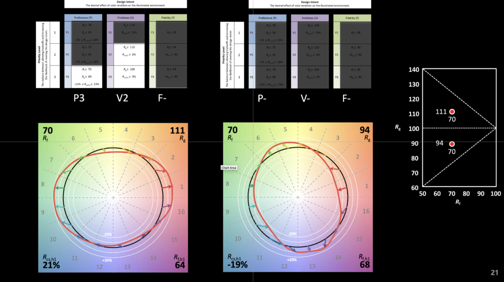
A small part of our demo is shown below. It illustrates how two light sources can have the same fidelity (in this case Rf of 70) but wildly different spectra that produce wildly different color rendering results. This is the great strength of TM-30, a deeper insight into the effect of a light source on illuminated objects and their color appearance – not just fidelity, but chroma shift, hue shift, and the perceptual implications of those shifts.
The video below shows the color appearance shifts. The graphic illustrates that even though the Rf is 70, the first light source renders objects in a preferred manner (Preference Priority Level of 3 or P3) and increases vividness (Vividness Priority Level of 2 or V2). At the same Rf the second source mutes colors and fails to achieve any of the Design Intents and Priority Levels specified in TM-30’s Annex E.
There’s an excellent post on the IES’s FIRES blog. It recounts some of the the history of V(λ) and our pursuit of measurements for brightness. It points out how much we’ve learned since the metrics we use today were developed, and calls for rethinking and development of new, 21st century metrics. Read it!
My colleague Tony Esposito and I will be giving a new TM-30 seminar and demonstration at ArchLIGHT Summit 2021 in Dallas on September 21st and 22nd. We’re working on a new, and we hope more attendee friendly, presentation and an all new set of demonstrations to explain TM-30s Annex E specifications. The demo will include, for the first time, live models of different ethnicities so attendees can evaluate the impact of of the specifications on skin tone. I hope to see you there!
Many of us on the IES Color Committee, myself included, have written and spoken about TM-30 and how to use it. I’ve written posts on this blog (click on the color rendering tag to see them all), authored articles, spoken at IES Annual Conferences, given webinars to architects and lighting designers, and assisted manufacturers in adding TM-30 data to their cut sheets. Despite our efforts, and those of others, TM-30 is still not as well understood and broadly implemented as it could be.
A recent issue of Leukos featured an excellent tutorial by Michael Royer of Pacific Northwest National Laboratory. In it, he describes the development of TM-30, color rendering fundamentals, the workings of the TM-30 calculation framework, TM-30 measures and their meaning, and more. That article is now available on the US Department of Energy’s website here. Anyone who’s unsure about TM-30 will find it immensely useful.
On a related note, many members of the IES Color Committee, myself included, can make themselves available to answer questions or present webinars to architects, interior designers, lighting designers, electrical engineers, sales reps, and manufacturers. If you’re interested, use the Contact Jason Livingston link above to send me a message. If I’m not available or the right person for your organization I’ll find someone who is.
Recently, a well-known lighting designer gave a presentation at a well-known lighting conference. During the Q&A he was asked his opinion of TM-30 and replied that it was too hard so he just specified CRI>90. At the risk of sounding like a jerk I have to say that maybe it was too hard for him, but it’s not too hard for most of us. Here is a brief list of new things lighting designers have had to learn over the years.
The introduction and transition to electronic ballasts and transformers meant that we had to learn about reverse phase dimming and control protocols.
The T5 lamp meant we had to change our layout patterns to accommodate lamps that weren’t standard 2’, 4’, and 8’ lengths.
Metal Halide lamps, especially PARs, meant that in exchange for energy savings we had to learn about the color rendering of a new type of lamp, and give up dimming.
Daylight harvesting and daylight responsive designs meant we had to learn about daylight zones, photosensors, and daylight harvesting control systems.
White LEDs meant we had to learn about another light source and its specific pros and cons, including different color rendering properties due to its SPD.
Circadian lighting means we are all in the process of learning how and when to apply the most current scientific evidence to certain project types. Since the science is constantly advancing on this topic, we must be aware and continue to educate ourselves.
Regularly updated energy conservation codes mean that as we begin to memorize the lower LPDs and changes to control and daylighting requirements, we have to relearn that information because it changes every three years.
Most recently, we’re supposed to enthusiastically embrace IoT, adding new hardware and controls to our lighting control systems.
There is a ton of TM-30 educational material available, including posts on this blog here, here, here, here, here, and here. There’s this article on the IES’s FIRES Forum, and this page on the Department of Energy web site. Manufacturers are also providing education including DMF Lighting, Soraa, Premier Lighting, Alphabet, and Lighting Services Inc. Then there are the articles in trade magazines and sites such as Lux Review and Architect Magazine, not to mention many articles in Lighting Design and Application and Leukos (no links because they’re behind the IES login). In addition, there have been presentations at other conferences (some given by me) at the IES Annual Conference, LightFair, and LEDucation.
If that’s not enough for you, let me know. I have a presentation approved for one AIA HSW LU, so if you’re architectural firm wants to learn more let’s set up a presentation. Ditto for lighting design firms and teachers of lighting. If I’m not available there are a half dozen others on the IES Color Committee who regularly give TM-30 presentations. You can learn TM-30. I’m here to help.
The pandemic has certainly distracted me from regular posting here. I’m probably not back to posting weekly, or even monthly, but I do have a new topic and a few things to say about it. The topic is color science as it applies to lighting.
No doubt you’ve seen something like Figure 1 before. It’s the CIE 1931 (x, y) chromaticity diagram and is the most common graphic for showing the range of tunable white luminaires and LED colors and their color mixing possibilities.
The thing is, we keep using this diagram even though it has problems and has been replaced twice. The problem is that it isn’t perceptually uniform, which means that the distance between any two color points doesn’t correspond to the perceptual difference between those two colors. This was famously demonstrated in 1942 by David MacAdam. Using 25 chromaticities he had a trained observer, using a device that allowed for the color adjustment of light, attempt to create a side-by side match from different starting points – for example match a yellow sample starting from green, then match it again starting from red, etc. When he plotted the results in CIE 1931 (x, y) the area where color differences could not be detected formed an ellipse as shown in Figure 2. This demonstrated that the color space was not perceptually uniform. If it was the ellipses would have been circles.
These “MacAdam ellipses” have become the default way manufacturers talk about color consistency of their products. You’ll often see statements on cut sheets saying that the LEDs for a particular product line all fall within an X-step MacAdam ellipse (2-step, 3-step, etc.). Want to hear something crazy? In 2014, the International Commission on Illumination (CIE), which sets the standards for most things related to color and light, recommended ending the use of MacAdam ellipses. Why? Look at Figure 2 again. The size of MacAdam ellipses changes as we move around the chromaticity diagram. So does anything related to them, such as Standard Deviation Color Matching (SDCM) another, although less common, measure.
The first attempt to address the uniformity problem resulted in the CIE 1960 (u, v) uniform chromaticity scale (USC) diagram (Figure 3). Correlated color temperature was originally calculated in the CIE 1960 (u, v) UCS.
It was later discovered that the CIE 1960 (u, v) USC diagram also was not uniform. To improve uniformity the v-axis was scaled by 1.5, resulting in the CIE 1976 (u’, v’) UCS diagram shown in Figure 4. As the most uniform UCS diagram, CIE 1976 (u’, v’) is the one recommended for use when calculating or evaluating color differences, not CIE 1931 (x, y).
Correlated color temperature was originally calculated in CIE 1960 (u, v). However, since that diagram is no longer recommended for any purpose by the CIE, we use CIE 1976 (u’, v’) but scale it back to CIE 1960 (u, v). This is described as CIE 1976 (u’, 2/3 v’).
The CIE’s 2014 recommendation mentioned earlier replaced MacAdam ellipses with a circle in the CIE 1976 (u’, v’) UCS. A rough rule of thumb is that one MacAdam ellipse corresponds to a circle with a radius of 0.0011. Unfortunately, it doesn’t seem that any manufacturers have made this transition.
So, our industry is in a situation where we commonly use a 90 year old first generation diagram that was replaced 61 years ago. We calculate CCT in a third generation chromaticity diagram that is 45 years old but tweek the math to refer back to a second generation 61 year old diagram. It’s crazy! No other industry uses a system this convoluted.
Why am I mentioning this? I was recently reminded of a paper that was presented at last August’s IES Annual Conference. Presented by Michael Royer of Pacific Northwest National Laboratory, it proposed using the latest color science to make a fresh start with a single new chromaticity diagram that is very similar to CIE 1976 (u’, v’) where we would calculate CCT, the color temperature bins for LEDs, color differences and the rest. IES members can access the archived presentation after logging in to the IES website.
Full disclosure, I’m on the IES Task Group that is developing this new system. The Task Group is made up of people in academia, design, manufacturing and research from three countries. We’ve refined our work since August and expect to publish these refinements soon. I encourage all of you to look for and learn about this proposal, to attend seminars when available, and to weigh in on this topic. Would our industry benefit from moving to a unified chromaticity system? Is this the right one? How do we educate specifiers and manufacturers? How do we phase in a new system? We can all have a voice in bringing the science we rely on into the 21st Century.
References
CIE. (2014). TN 001:2014 Chromaticity Difference Specification for Light Sources. Vienna: International Commission on Illumination.
CIE. (2018). CIE 015:2018 Colorimetry, 4th Edition. Vienna: International Commission on Illumination.
MacAdam, D. (1942). Visual Sensitivities to Color Differences in Daylight. Journal of the Optical Society of America, 32(5), 247-274.
Royer, M. et. al. (2020). Improved System for Evaluating and Specifying the Chromaticity of Light Sources. In: Illuminating Engineering Society Annual Conference 2020.
The Illuminating Engineering Society’s Recommended Practice 16 Nomenclature and Definitions for Illuminating Engineering (aka RP-16) has long been one of the two reference sources for the definition of lighting related words and phrases – the other being the CIE International Lighting Vocabulary (ILV).
As part of the IES converting all of their publications to an online library format, some publications have been given a new designation. RP-16 is now Lighting Science 1 (LS-1) and is at this link. Bookmark it now!