This month’s issue of Lighting Design + Application (LD+A) has a review of Designing With Light by Fred Oberkircher. He calls the book “beautifully imaged” and “one of the best lighting design texts.” Read the full review.
This month’s issue of Lighting Design + Application (LD+A) has a review of Designing With Light by Fred Oberkircher. He calls the book “beautifully imaged” and “one of the best lighting design texts.” Read the full review.
The 69th Annual Tony Awards are on CBS tonight at 8 pm. I was at the rehearsal this morning (see below) and I can tell you that it’s going to be a good show. Kristin Chenoweth and Alan Cumming are great fun. Check out this year’s nominees for best play and best musical (you can even stream it!), then get yourself some theatre tickets.

On May 29th the DOE issued a final clarification of energy conservation standards and test procedures for fluorescent lamp ballasts. The new rule reorganizes, reformats, and clarifies the scope of the energy conservation standards for fluorescent lamp ballasts. It includes establishing new active mode test procedures, standby and off mode test procedures, and revised active mode test procedures for fluorescent ballasts.
At last week’s Lightfair one of the presentations was Quantifying Color Rendition: A Path Forward. The presentation was the first public look at the (not yet approved) IES Method of quantifying color rendering. What is this new (not yet approved) IES Method? Let’s start with a quick review of the current color rendering metric, Color Rendering Index (officially CIE 013.3-1995 Method of Measuring and Specifying Color Rendering Properties of Light Source) or CRI.
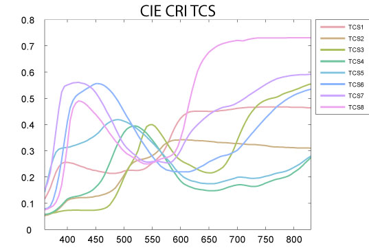
CRI is a fidelity metric. It compares the color rendering properties of a light source to the properties of a light source of the same color temperature, either a black body radiator for color temperatures below 5000 K, or a model of daylight for color temperatures of 5000 K and above. First issued in 1965 and last updated in 1995, CRI has several known defects. It is based on outdated color science, there are too few color samples (only eight for the general color rendering index, or Ra), and the color samples are Munsell colors, not those of real world objects.

Finally, since the colors used don’t give equal weight to all wavelengths of visible light, as shown below, lamp manufacturers can optimize their lamps spectral power distribution (SPD) to achieve higher scores.
The new calculation procedure is called TM-30 IES Method for Evaluating Light Source Color Rendition. It is, in my opinion, substantially better than CRI for several reasons. A disclosure – the Color Metrics Task Group that developed TM-30 is an offshoot of the IES Color Committee, of which I am the vice-chair.
TM-30 is a dual metric system. It provides us with a measurement of fidelity (Rf), although using a completely different method than CRI. It also provides us with a measurement of gamut (Rg). In this case, gamut means that it gives us a number that tells us if a light source that scores lower than 100 on the fidelity metric (and is therefore not a match to the reference light source) increases saturation of colors making them more vibrant, or desaturates colors making them grey or dull. This gives us a much better understanding of the color rendering performance of the light source in question. These two numbers are supplemented with a variety of graphics. These include a graphic showing the color distortion produced by the lamp, a graphic showing the change in gamut, and a graph of the Rf and Rg indexes.
It’s the color samples and calculation procedure, however, that drive this new method. Among the improvements are:
TM-30 is in the final stages of balloting. I believe that it will be approved by the end of the summer. Once it is, I’ll have more to say and graphics to explain it better. Stay tuned.
Here are my comments from last night’s “Celebrating Pratt Authors” event.
Let me say a few words about my book and than I’ll move on. One of the things that drive me to write “Designing With Light” is missing content in other lighting design books. I come from the theatre-both my undergraduate and graduate degrees are in design for the stage, and I worked in the theatre for over a decade before transitioning to architectural lighting. The other two common paths to becoming a lighting designer are from work as an architect or as an electrical engineer. Until now, as far as I can tell, lighting design books have been written by people with those two backgrounds. They do a fine job of discussing how to light architecture and how to calculate illuminance, but none of them actually address the issue of design. None of them discuss how to think about light as a design element in a space, or how to use light to create the desired atmosphere, environment, or ambiance. That’s the void I wanted to fill.
Some of you may know that the United Nations has designated 2015 as the International Year of Light. I want to build on this by saying a few words about the importance of light and lighting design. There’s an old saying, “out of sight, out of mind” but with lighting design the truth is actually closer to “within sight, out of mind.” Too often people ignore or are unaware of the potential that lighting design offers because as long as they can see they’re satisfied. Many people only notice light when it’s beautiful, as with a sunset, or when it’s an impairment, as when there’s not enough light to do what they want to do. Yet, while only a small percentage of people are aware of the lighting in their surroundings, 100% of people are affected by that lighting.
Sight is, without a doubt, our most important sense. Research shows that about 80% of our sensory input, learning, and activities are related to vision.
Our visual interaction with the world, and has two components. The first is target or object identification. “I see and apple,” is an example of object identification. However, our minds are much more sophisticated than that. We don’t stop at object identification. We’re not really aware of it, but we automatically go on to evaluate our visual target and its relationship to the surrounding visual field, to our previous experience, and to our expectations. This second component of vision is perception-the identification, organization and interpretation of sensory input. Perception is directly affected by the way light reveals the world to us. Can we see the texture of a material or not? Is the color as expected or is it distorted? Can we see the three-dimensionality or does the object appear flattened? Are details visible or are they hidden in shadow? Lighting design matters, in part, because it affects our perception.
The lighting requirements for object identification in terms of brightness, color, direction, etc. are minimal. However, the effect light has on our perception is huge. Perception causes us to form opinions about, and have intellectual and emotional reactions to, everything we see.
If I were to say that I want to take you to a romantic French restaurant, every one of you immediately has a mental image of that space. You may have a mental picture of the color palette of the room, or the ceiling height, or the spacing of the tables. That image varies from person to person, but there is a remarkable amount of commonality in our expectations. For example, I’ll bet that in your restaurant there’s a candle on the table, that the lighting is dim, and that the wood is dark and polished.
If we walked into a restaurant that we have been told is romantic and find it illuminated like a classroom, the perceptual dissonance between our expectations and our experience would cause us to immediately reject the notion that we were in a romantic restaurant. We would declare that the lighting design was a failure. We would, perhaps, extend the idea of failure to the interior design and, depending on the strength of our emotional response, maybe even to the food. Lighting matters, and understanding how expectations of the users affect their perception is one aspect of creating a successful lighting design.
This is something that I emphasize to my students all of the time – you must understand the intended look and feel of the space before you can light it. I also emphasize that they must understand the distribution of light in three dimensions, not just in a two-dimensional plan view.
To control the three dimensional distribution of light requires an understanding of the many types of lighting fixtures that are available, and of the light sources that they use. To control those light sources we have to know about dimming and control systems and technology. The body of knowledge required to create a lighting design is very large.
And, it’s getting larger every year. New lighting technologies such as LEDs and OLEDs have some unique properties. To use them well we have to expand our understanding of issues such as color and control technologies. Add to that the fact that energy conservation codes compel us to think much more carefully and creatively about what we do and how we do it because we’re given so little electrical power to realize our design goals.
Add all of this up and we find that lighting design is hard! It requires a solid grounding in light sources, fixtures, controls, and codes. All of that technical expertise has to be combined with a broad understanding of architecture, interior design, lighting techniques, and aesthetics to turn a mental vision or a rendering into a realized design.
I get very excited when I talk about light and lighting, but I’m frustrated, too. Only about 10% of design and construction projects include a lighting designer on their team. For the other 90% of projects, the lighting design is handled by the architect, the interior designer, or the electrical engineer. Yet academia is not providing the lighting education future designers need.
I’ll use Pratt as an example. Not only is lighting design not a required course in the any of the architecture programs, it isn’t even an elective. Students have to go to the Interior Design department if they want a semester of lighting, but that course is going to be eliminated within a few years as the Interior Design department reorganizes. Pratt is just a single example of what I think is an overall disregard or failure to understand the way light affects our experience of the built environment, and the need to teach future designers how to address the entire visual experience. This, of course, takes us right back to “within sight, out of mind.” But, good enough lighting isn’t good enough.
So, in this International Year of Light, I want all of you to think about and talk about the importance of good lighting in your homes, at work, an in the other places you spend your time. If you teach architecture or engineering or interior design, I urge you to give lighting design a place on the curriculum. If you’re a student I want you to demand that lighting design be made a part of your education. The International Year of Light has set the stage, but it’s up to us to act, to raise the importance we place on good lighting.
One of the biggest challenges to the shift to renewable energy is that the supply is not consistent. The sun sets or the wind stops blowing and one is left without power. A number of researchers and companies are working on storage solutions. This article describes a storage system being developed by Tesla Motors.
Tesla Motors says it is making a foray into the challenge of how to use the sun’s energy when it isn’t shining, with a fleet of battery systems for homeowners, businesses and utilities.
Source: With New Factory, Tesla Ventures Into Solar Power Storage for Home and Business
Mayor Bill de Blasio’s administration and a host of environmental advocates agree that light pollution should be addressed, but some are disputing parts of a proposed City Council bill.
Source: New York Plan to Save Energy May Mean a Dimmer Skyline
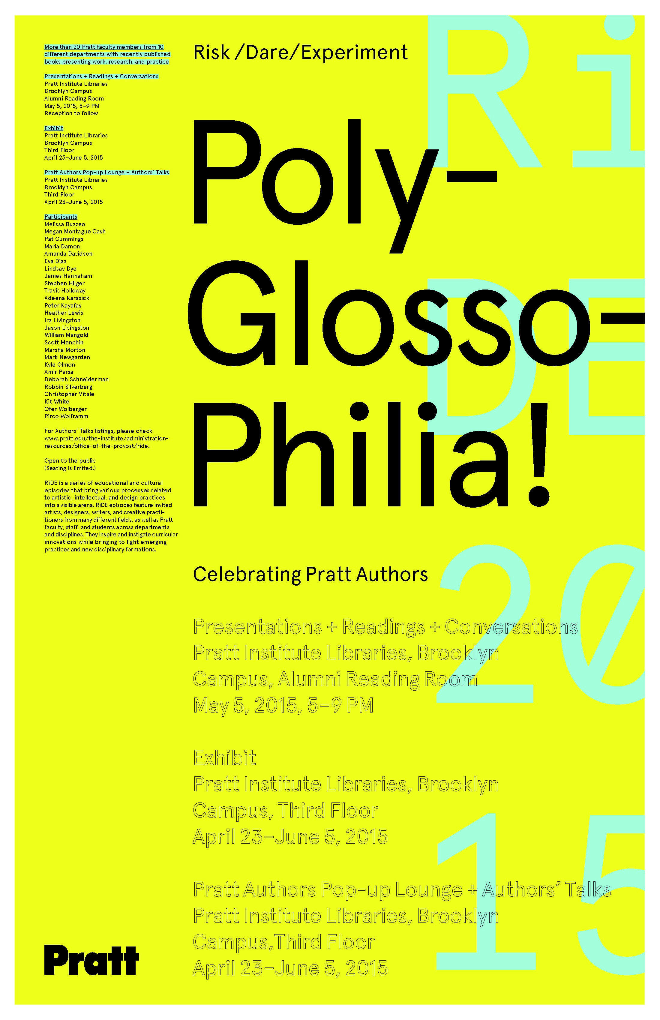
On May 5th I’ll be speaking at PolyGlossoPhilia—Celebrating Pratt Authors, a cross-institute initiative that brings together authors from various departments and schools of Pratt. The event is from 5 to 9 pm. I’m scheduled for around 7:30. Up to date information is available on Pratt’s web site here.
A light bulb made with graphene – said by its UK developers to be the first commercially viable consumer product using the super-strong carbon – is to go on sale later this year.
Source: Graphene light bulb set for shops – BBC News
I’ve been hired to review an architect’s lighting design and then design an appropriate control system. The fixtures selected are all LED products by a manufacturer that falls into the high-end residential/economy commercial range of quality and price. The cut sheets are extremely frustrating. After nearly a decade of LED lighting, and with all of the progress the industry has made in setting standards so that designers and specifiers know what they’re getting, this manufacturer still tells us nothing. What basic information is missing?
Lamp life. The only information even remotely connected to lamp life is the statement that the fixture is covered under a five-year warranty. There’s nothing else. Not a word. How much light, compared to initial output, can we expect at that five-year mark? We have no idea.
LEDs do not fail like other lamps do. They gradually dim as they age. At what point is the light output so low that we’d say the lamp is no longer useful? Right now the answer is when the light output has fallen to 70% of the initial output (often referred to as L70), although many designers prefer to use 80% of initial output (referred to as L80). This is calculated using a procedure developed by the IES and designated as LM-80 (details are here and here). What we want, at a minimum, is the IES LM-80 calculation of lamp life to 70% of initial output. L80 data would be even better.
Warranty. The warranty is not on the manufacturer’s web site so, although we’re told that it is good for five years, we have no information about what is covered and what is excluded.
LED manufacturer. With all other lamp types the designer chooses the exact lamp for the project. Criteria such as initial lumen output, mean lumen output, lamp life, color temperature, CRI, and the manufacturer’s reputation for quality are all valid considerations. We have standards that allow designers to make valid comparisons between LED products, too, but we can do that only if that information is generated and shared. I suspect that this fixture manufacturer uses LEDs from a several manufacturers based on the best price available, and that the performance of those LEDs varies widely.
Color consistency. The cut sheet says that the standard applied to their LED selection is, “minimum 3-step color binning.” We are left to infer that means three-step MacAdam Ellipses. A one-step MacAdam Ellipse describes a region on a chromaticity diagram or color space where the edges of the ellipse represent a just noticeable difference from the color at the center (additional information on MacAdam Ellipses is here and here). The data is usually plotted on the CIE 1931 (x, y) chromaticity diagram. The diagram below shows 10-step MacAdam Ellipses.

The color variation within a three-step ellipse would be noticeable to over 99% of the population. Worse, though, is that a three-step ellipse is the minimum, not the maximum. Knowing this, the designer should have no expectation of color consistency from one fixture to another.
Photometrics. The cut sheet contains no information about the optical performance of the fixture. IES files are available, but it’s very difficult to look at the array of numbers and understand performance, which is why the good manufacturers include photometric information on their documentation, including candlepower distribution curves and CU tables.
Part of my review will be pointing out the lack of data about the specified fixtures and recommending several alternates by manufacturers who provide the information necessary to evaluate their products.