Do LEDs Make You Look Orange?

Last Thursday Donald Trump spoke to a group of Republicans in Baltimore.  One of the things he said caught my attention: “The lightbulb. People said what’s with the lightbulb? I said, here’s the story. And I looked at it, the bulb that we’re being forced to use, No. 1, to me, most importantly, the light’s no good. I always look orange. And so do you. The light is the worst.”

Now, I’m not aware of being made to look orange under LEDs, nor have I ever noticed LEDs making my friends, colleagues, or students appear orange.  You can’t imagine how embarrassed I’d be if it turned out that a real estate developer and entertainer had more astute color perception than me, a lighting designer and Co-Chair of the IES Color Committee.  If our only means of evaluating the color rendering of a light source, and evaluating the orange content specifically, was CRI we would have no objective way of testing his statement.   CRI, technically Ra, is a single value that gives us an average of the match between the light source in question and its reference source (either a blackbody radiator or a CIE definition of daylight, depending on CCT) using only eight color samples. 

Colors used to calculate CRI Ra

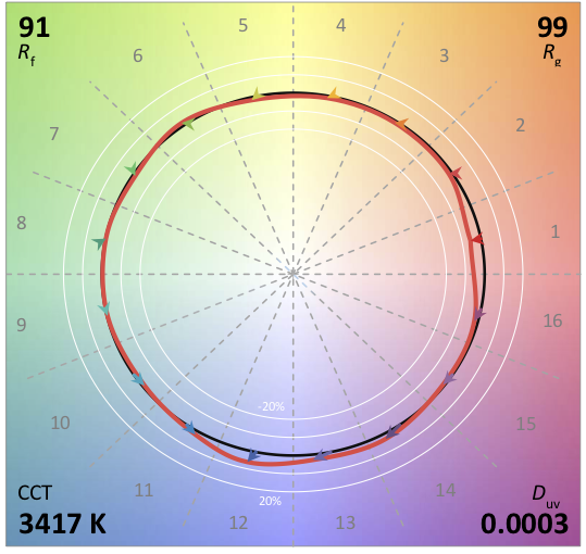
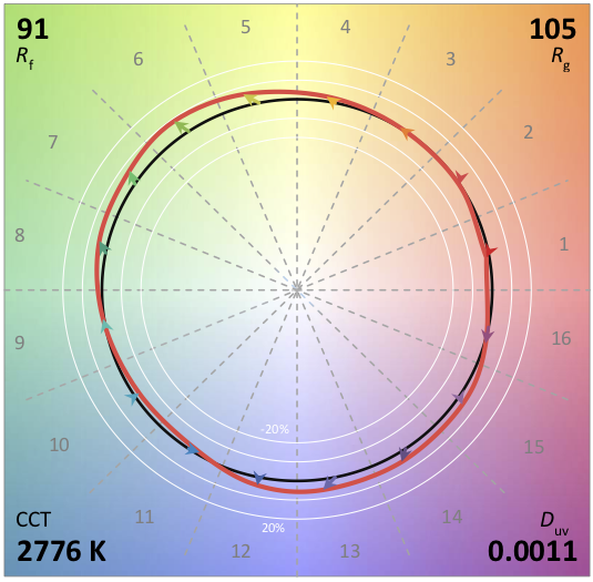
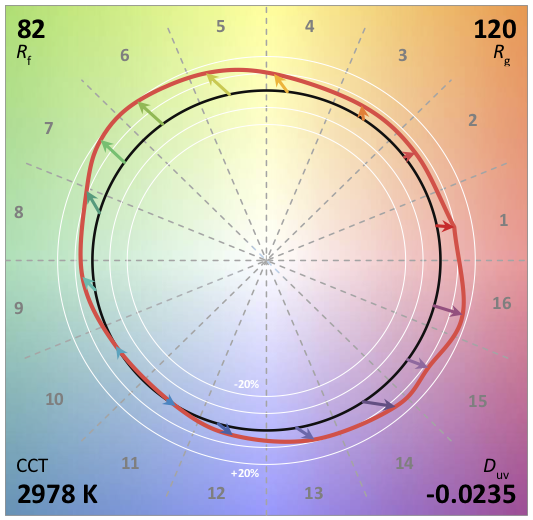
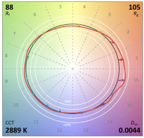
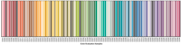
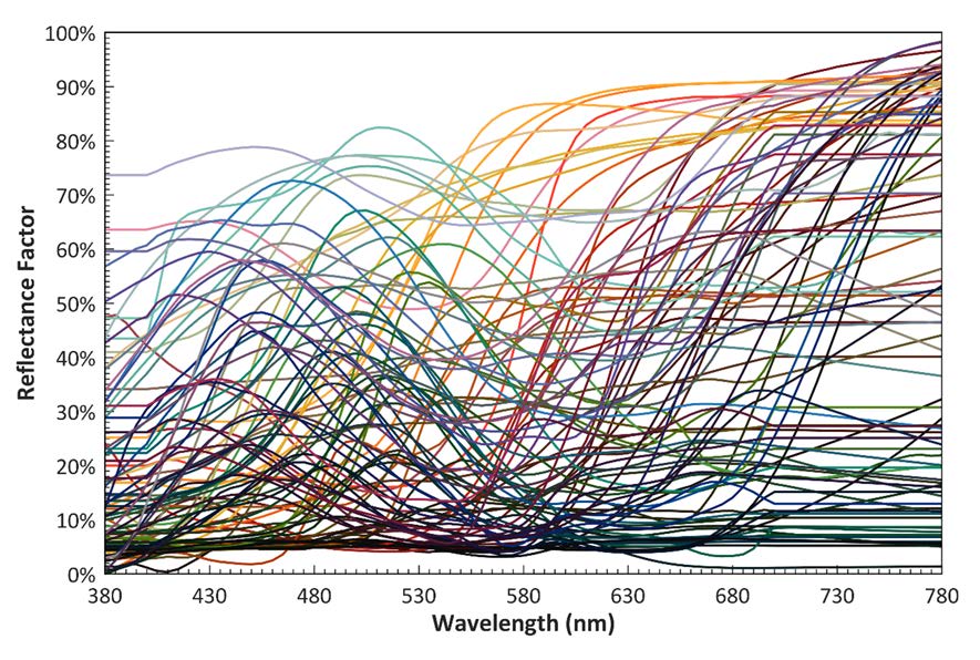
Since Ra is an average value there’s no way to understand the rendering of any particular hue. I’ve talked about this here. However, one of the wonderful things about ANSI/IES TM-30 IES Method for Evaluating Light Source Color Rendition is that we can use it to test that claim.  TM-30 uses 99 color samples that are distributed across the color space and the visible spectrum. 

TM-30 99 color evaluation samples (CES)
TM-30 CES spectral reflectance functions

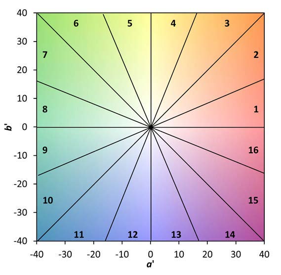
It also breaks the color space up onto 16 Hue Bins, each one covering a specific range of the color space.  In the case of orange, we want to look at Hue Bin 3.  Specially, we want to look at Rcs,h3 (the subscript CS stands for Chroma Shift) which quantifies the increase or decrease in the saturation or vividness of orange compared to the reference light source.  

TM-30 hue bins
Example of TM-30 chroma shift bar graph by hue bin

So, let’s put the science of TM-30 to work and see if we really do know that LEDs make us look orange!

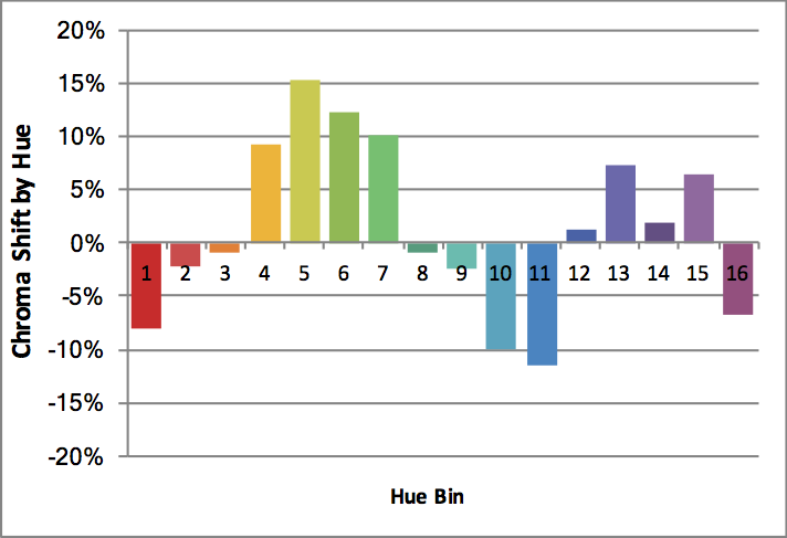
The TM-30 calculator contains a library of 300 SPDs (spectral power distributions), of which 137 are commercially available white LEDs.  The CCTs range from 2776 K to 6123 K.  If white light LEDs really did make us look orange we’d expect to see a large majority of them have a positive Rcs,h3, probably with an average chroma shift in excess of 10%.  In fact, the 137 SPDs have Rcs,h3 that range from -8% to 1% with an average of -3.6%, a decrease (not an increase) in the saturation of orange.  It’s not me, it’s him.  TM-30, which uses the most modern models of human vision and a set of colors that cover the color space and visible light spectrum, proves it.  What a relief!  

Don’t believe me?  Download TM-30 and the calculator for free from the IES web site and see for yourself.

Of course, I’m not saying LEDs are perfect light sources. Like any other product there are good ones and bad ones. However, TM-30’s measurements of fidelity and gamut (as averages) and measurements of fidelity, chroma shift, and hue shift (by hue bin) permit us to make a thorough evaluation of a light source to understand its color rendering characteristics. Using this knowledge, we can determine if a particular light source distorts colors and is appropriate for a project, or not.

I should take a moment to note another error he made when he said, “And very importantly—I don’t know if you know this—they have warnings. If it breaks, it’s considered a hazardous waste site. It’s gases inside.”   Perhaps you’ve heard the acronym SSL or the phrase solid state lighting.  LEDs are a version of SSL, which means that they are…well, solid. Unlike previous light producing technologies LEDs are a solid combination of materials.  As such, if one were to physically break (which is unlikely since LEDs are small, are mounted to a heat sink and often covered with a lens, so you’d have to break a lot of materials simultaneously) no gas, hazardous or benign, is emitted.  He’s thinking of fluorescent lamps and the small amount of mercury they contain.  Even then, a broken fluorescent lamp doesn’t turn the area into a” hazardous waste site.” Here are the EPA’s instructions for cleaning up a broken fluorescent lamp.

Misunderstanding CRI

Last Friday I took my class on a visit to a fixture manufacturer’s showroom.  The visit was pretty successful, but I had one issue with the information that was presented.  This manufacturer’s rep presented their CRI 80 and CRI 90 products by saying that CRI 80 dulls colors and CRI 90 makes colors “pop”.  I can’t blame him too much, after all it’s a common misconception that higher CRI is “better.”  However, it’s not true so let’s take a look.

 CRI (or more formally, CIE 13, Method of Measuring and Specifying Colour Rendering Properties of Light Sources, Ra) is a fidelity metric.  That means it calculates the color rendering of a light source in comparison to the color rendering of a reference light source of the same color temperature or correlated color temperature (CCT).  A light source with a CRI 80 renders colors with more color error (that is, a larger mismatch or a larger color appearance distortion) than a light source with a CRI 90.  That’s all. One of the problems with CRI, which is addressed in TM-30, is that a single number value doesn’t tell us the hue(s) where there is a color rendering error compared to the reference light source, nor do we learn the direction or the degree of color rendering error(s).  In other words: 

  • What hues are not rendered accurately?  CRI doesn’t tell us.
  • Are those hues made to appear more or less saturated?  CRI doesn’t tell us.
  • Are those hues shifted toward an adjacent hue?  CRI doesn’t tell us.
  • How big are the color distortions? CRI doesn’t tell us.

 TM-30 (ANSI/IES TM-30-18 IES Method for Evaluating Light Source Color Renditiondoes give us this information, which immediately puts to rest the notion that higher fidelity is “better” color rendering in all cases. 

It’s entirely possible for a light source with a CRI 80 to render a set of colors more vividly than a CRI 90 light source if the color errors increase saturation and minimize hue shifts.  It’s even possible for two light sources of the same CRI to render colors differently.  Here’s an example.  The first light source has a TM-30 R(fidelity) of 90 and an R(chroma) of 99, meaning that on average colors are rendered slightly less vividly than the reference light source.  The TM-30 Color Vector Graphic shows us clearly that the rendering of red (Bin 1) is less saturated than the reference, and that the rendering of warm blue (Bin 12) is more saturated.  The other colors are a nearly perfect match to the reference source.

The second source  also has an R91.  However, the green and purple hues are rendered with increased saturation so that it has an R105. (Yes, the CCTs are different, but that doesn’t matter because in the calculation a light source is compared to a reference light source of the same CCT, cancelling out any color errors due to CCT.) 

Understanding this information opens the door to considerations other than fidelity.  The first is vividness.  Are you lighting the M&M store in Times Square?  If so, your design goal may be to increase saturation of the candy, not accurately render it.  In that case you’re going to want a lower fidelity (Rf) so that you can get higher chroma (Rg).  The light source shown below might be just the one for this application.

 The second is preference.  Studies have shown that in many applications people prefer slight increases in chroma, especially in the red range.  Are you lighting a restaurant?  If so, and if preference and increased red chroma are important, this might be the light source for your project: 

The increased information TM-30 provides is both more accurate and more detailed than CRI.  Not only that,  it gives us a deeper understanding of the color rendering capability of a light source and allows us to consider design goals other than fidelity. Designers who care about these color considerations need to keep pushing manufacturers to provide TM-30 information and train their employees in its meaning and use.

Fixing CRI, But Not Really

A couple of weeks ago the Global Lighting Association (GLA) published Application of CIE 13.3-1995 with Associated CRI-based Color Rendition Properties.  It proposes TM-30 like metrics to supplement CRI Ra.  Specifically, it proposes a color gamut index, Ga, that is similar to TM-30’s Rg and a set of chroma indices, Ci, similar to TM-30’s Rch,hj.  At first glance I can see some specifiers getting excited about this.  Since it’s based on CRI it’s already somewhat familiar so it should be easier to learn.  But…

The first part is the problem – it’s based on CRI, which has well known and well documented problems and shortcomings.  As described in The Lighting Handbook, 10thEd.and IES DG-1 Color and Illumination, they include:

Averaging the Color Shifts. CRI is computed by averaging the color shifts of the eight color samples.  A light source can render one sample very poorly and still achieve an acceptable score.  The Chroma Indices attempt to resolve this, but there’s a problem with the eight color samples, which is next on our list.

Test Color Samples. The eight color samples are all of moderate saturation, so saturated colors can be rendered poorly even when CRI is high.  More importantly, the eight color samples are A) not based on any real-world objects B) don’t adequately cover the visible spectrum.  The latter is significant because it means that some wavelengths play an outsized role in determining CRI.  Manufacturers can use this to optimize (or cheat) their spectrum to achieve a higher CRI than visual inspection would warrant.  This is why TM-30 uses 99 color samples drawn from real world objects.

Color Space.  CRI is calculated in the CIE 1964 color space, which is no longer recommended for any other use because it is outdated.

Penalties for all Chromaticity Shifts.  As a fidelity metric, CRI penalizes all chromaticity shifts even though research has shown that certain increases in chroma are preferred.  Again, it seems that Cis intended to address this, but it doesn’t resolve the other problems with CRI. 

Chromatic Adaptation. The chromatic adaptation transform used in CRI has been shown to perform poorly and is no longer recommended for any application.

CRI served the industry (relatively) well, but its time is over.  Layering new calculations on top of CRI’s flawed foundation doesn’t make it better. I know TM-30 can be tough.  But it works.  It tells us what we want to know at the level of detail we need for a given project, and it’s accurate.  The IES has moved on and the CIE seems to be leaning in that direction as well.  So should you!

Specifying Color Quality With TM-30

By now most of us have attended one or more seminars or webinars about IES TM-30 and understand that it is a method of measuring various color rendering properties of a light source and reporting those measurements.  The thing that’s been missing is a recommended set of values that set minimums, maximums and/or tolerances for the various measurements.  This has been true for two reasons.  First, TM-30 is a method and as such was never intended to set recommended values.  The second is that while the science behind TM-30 is solid, the science doesn’t offer any predictions of acceptability.

Good news!  After almost three years of research and tests around the world we’re much closer to establishing a set of recommended values.  At this year’s IES Annual Conference in Boston, Tony Esposito, Kevin Houser, Michael Royer and I will be presenting the seminar “Specifying Color Quality With TM-30”  The description of the seminar is, “This presentation will discuss several research projects which have used the IES TM-30 color rendition framework, and whose results have been used to develop various specification criteria. We will discuss UFC 4-510-01, The Department of Defense Unified Facilities Criteria for Military Medical Facilities, which has already implemented IES TM-30-15 specification criteria.”

During the seminar we’ll review some TM-30 basics, look at several research projects that are helping to establish TM-30 thresholds, and review how to use the TM-30 calculator.  Don’t miss it!


Design for Color and Illumination Webinar April 19th

On April 19th Wendy Luedtke (my co-chair of the IES Color Committee) and I will be presenting a free IES webinar called Design for Color and Illumination.  Here’s the blurb from the IES site:

When developing a lighting design, lighting specifiers determine the lamp and fixture combination that best suits the design’s requirements based on many factors. While some considerations are largely technical, such as power consumption, the amount of light generated, and how light is distributed, one consideration is both technical and artistic and can be approached in a number of ways. Participants to this webinar are eligible for one (1) IES Continuing Education Unit (CEU).

The webinar is at 12 noon EDT.  Register here.


I’m Presenting at LEDucation 2018

This year LEDucation, the largest LED only trade show and educational forum in the U.S., will be on March 13 and 14.   On Tuesday the 13th from 11 am to 12:30 pm I’ll be presenting a forum called How To Use TM-30, along with Dr. Michael Royer of Pacific Northwest National Laboratory and Wendy Luedtke of ETC.  Here’s a summary of the event.

This presentation discusses a number of design trends that are currently shaping the industry and promising to redefine the role of lighting as we know it. New technologies are making dimensions such as color and dynamic behavior over time viable for main-stream lighting, and that constitutes exponential change. This presentation explores a few of the dimensions that appear to be gaining traction, and attempts to illuminate some of the reasoning behind their development. Implications to the user experience are discussed, along with the inadequacy of present lighting metrics.

See you there!


TM-30 Rg, The Gamut Index

In addition to an index that measures the fidelity of a light source to its reference source (Rf) IES TM-30 includes an index that indicates the change in saturation of colors called the Gamut Index and abbreviated Rg.  Rg is calculated using the same Color Evaluation Samples (CES) and underlying calculation engine as Rf, which makes TM-30 a cohesive system.

Here’s how Rg works.  An Rg value of 100 indicates that, on average, the light source in question does not change the chroma, or saturation, of the 99 CES when compared to the reference light source.  An Rg value below 100 indicates that, on average, the light source renders colors as less saturated than the reference source, and an Rg value above 100 indicates that, on average, the light source renders colors as more saturated than the reference source.

Since Rg is an average it says nothing about the possible change in chroma for any individual hue angle bin or for any individual color evaluation sample.  That’s ok, thought, because TM-30 also tells us the Rg values for each hue angle bin, and for each CES.

Here’s an example of the graphic for the hue angle bins using the same light source as the previous post on Rf.

TM-30 doesn’t recommend any particular Rg or set of Rg values.  As with Rf, the interpretation of the information is left to the specifier.  Acceptable or desirable values will vary by application.  Rg doesn’t have a maximum or minimum value, but the possible range increases as Rf decreases, as shown below. The wedge to the left of the gray lines shows the range of possible Rg values, while the red dot represents the lamp we’ve been discussing.

The Rg values are also presented in a Color Vector Graphic (CVG), as shown below.  The white circle is the normalized reference source.  The black circle is the lamp in question.  Where the black circle is inside the white, colors are desaturated.  Where the black circle is outside of the white, colors have increased saturation.  The colored arrows indicate the direction of saturation shift, and the direction of hue shift.  Arrows that point straight in or out show only saturation shift.  Arrows that show rotation left or right also indicate hue shift.  I know!  And, the next version of TM-30 will present a graph showing the hue shift!


Research is revealing that we shouldn’t treat all hue angle bins the same.  Bins 1 and 16, which include the most red, are indicative of preference and it seems likely that they will take on increasing importance in that role.  Some specifications are already acknowledging this.  For example, the Department of Defense recently re-issued the Unified Facilities Criteria for Military Medical Facilities that establishes the following requirements for light sources:

Fidelity Index: Rf ≥ 80,

Relative Gamut Index: 97 to 110,

Fidelity Index, Hue-Bin 1:  ≥ 78,

Chroma Shift, Hue-Bin 1: -9% to +9%.

Clearly, TM-30 permits us to be much more specific about the color rendering that is acceptable or desirable for a project.  Why bother with CRI anymore?


Focal Point Introduces TM-30 Based “Preferred Light”

Today Focal Point Lights of Chicago, IL introduced a series of fixtures that feature what they call Preferred Light.  Preferred Light is based on recent studies at PNNL and Penn State, plus their own study, and uses TM-30’s Rf, Rg, and Hue Bin 16 values to establish a balance of fidelity, saturation, and red rendering that is “visually appealing to humans.”

The overall idea is that people seem to prefer a light source that slightly over saturated most colors, especially red.  “Using a custom LED mix, Focal Point defines Preferred Light using TM-30-15 metrics as having a fidelity (Rf) of 89, a gamut (Rg) of 107, and over-saturating Hue Bin 16, deep red content, by 9% at a [Correlated] Color Temperature of 3500K.”  So, by using the statistical measures of TM-30 and applying them to the related topic of color preference Focal Point has identified an optimized set of LED products to meet their customers’ needs.

I’ll be the first to admit that it may be risky to base all of this on only three studies, but other studies have shown that the TM-30 results can be applied in this way, and are also showing us the relative importance of the various calculated values.  I’m excited to see the industry using the tools, and am looking forward to seeing the Preferred Light for myself.


Samsung Introduces Chip-on-Board LED Packages Optimized for Commercial Lighting – Samsung Global Newsroom

Source: Samsung Introduces Chip-on-Board LED Packages Optimized for Commercial Lighting – Samsung Global Newsroom

An interesting bit of news from Samsung this week.  They’ve developed an LED package especially designed to achieve an Rg value over 110, “a level that ensures lighting with outstanding color and whiteness.”

It’s important to note that increased saturation means decreased fidelity to the reference light source.  This is a lighting solution that will be desirable in some applications, such as retail,and undesirable in others, such as medical facilities.