Last Friday I took my class on a visit to a fixture manufacturer’s showroom. The visit was pretty successful, but I had one issue with the information that was presented. This manufacturer’s rep presented their CRI 80 and CRI 90 products by saying that CRI 80 dulls colors and CRI 90 makes colors “pop”. I can’t blame him too much, after all it’s a common misconception that higher CRI is “better.” However, it’s not true so let’s take a look.
CRI (or more formally, CIE 13, Method of Measuring and Specifying Colour Rendering Properties of Light Sources, Ra) is a fidelity metric. That means it calculates the color rendering of a light source in comparison to the color rendering of a reference light source of the same color temperature or correlated color temperature (CCT). A light source with a CRI 80 renders colors with more color error (that is, a larger mismatch or a larger color appearance distortion) than a light source with a CRI 90. That’s all. One of the problems with CRI, which is addressed in TM-30, is that a single number value doesn’t tell us the hue(s) where there is a color rendering error compared to the reference light source, nor do we learn the direction or the degree of color rendering error(s). In other words:
- What hues are not rendered accurately? CRI doesn’t tell us.
- Are those hues made to appear more or less saturated? CRI doesn’t tell us.
- Are those hues shifted toward an adjacent hue? CRI doesn’t tell us.
- How big are the color distortions? CRI doesn’t tell us.
TM-30 (ANSI/IES TM-30-18 IES Method for Evaluating Light Source Color Rendition) does give us this information, which immediately puts to rest the notion that higher fidelity is “better” color rendering in all cases.
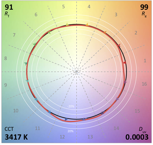
It’s entirely possible for a light source with a CRI 80 to render a set of colors more vividly than a CRI 90 light source if the color errors increase saturation and minimize hue shifts. It’s even possible for two light sources of the same CRI to render colors differently. Here’s an example. The first light source has a TM-30 Rf (fidelity) of 90 and an Rg (chroma) of 99, meaning that on average colors are rendered slightly less vividly than the reference light source. The TM-30 Color Vector Graphic shows us clearly that the rendering of red (Bin 1) is less saturated than the reference, and that the rendering of warm blue (Bin 12) is more saturated. The other colors are a nearly perfect match to the reference source.
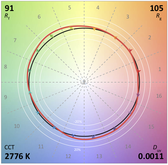
The second source also has an Rf 91. However, the green and purple hues are rendered with increased saturation so that it has an Rg 105. (Yes, the CCTs are different, but that doesn’t matter because in the calculation a light source is compared to a reference light source of the same CCT, cancelling out any color errors due to CCT.)
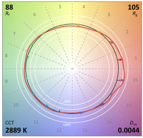
Understanding this information opens the door to considerations other than fidelity. The first is vividness. Are you lighting the M&M store in Times Square? If so, your design goal may be to increase saturation of the candy, not accurately render it. In that case you’re going to want a lower fidelity (Rf) so that you can get higher chroma (Rg). The light source shown below might be just the one for this application.
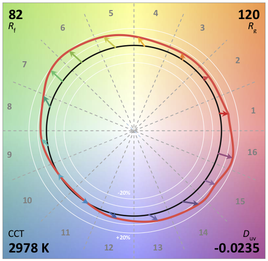
The second is preference. Studies have shown that in many applications people prefer slight increases in chroma, especially in the red range. Are you lighting a restaurant? If so, and if preference and increased red chroma are important, this might be the light source for your project:
The increased information TM-30 provides is both more accurate and more detailed than CRI. Not only that, it gives us a deeper understanding of the color rendering capability of a light source and allows us to consider design goals other than fidelity. Designers who care about these color considerations need to keep pushing manufacturers to provide TM-30 information and train their employees in its meaning and use.

