Last year the AMA issued Policy H-135.927 Human and Environmental Effects of Light Emitting Diode (LED) Community Lighting, which recommended, among other things, that LED outdoor lighting should have a CCT of 3000 K or below. The AMA made this recommendation thinking that lower correlated color temperatures contain less blue light, which can disrupt circadian rhythms.
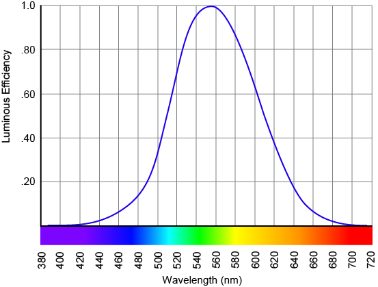
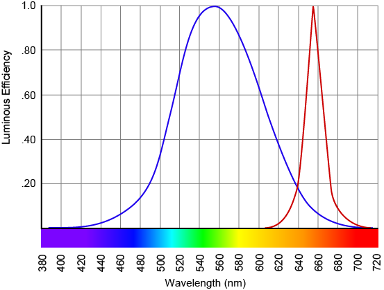
Today the IES issued a Position Statement disputing that recommendation, noting that CCT
is inadequate for the purpose of evaluating possible health outcomes; and that the recommendations target only one component of light exposure (spectral composition) of what are well known and established multi-variable inputs to light dosing that affect sleep disruption, including the quantity of light at the retina of the eye and the duration of exposure to that light. A more widely accepted input to the circadian system associated with higher risk for sleep disruption and associated health concerns is increased melanopic content, which is significantly different than CCT. LED light sources can vary widely in their melanopic content for any given CCT; 3000 K LED light sources could have higher relative melanopic content than 2800 K incandescent lighting or 4000 K LED light sources, for example.
Follow the link to read the entire Position Statement. Blue light hazard, light’s impact on circadian rhythms and overall health, and related topics are a hot area of research. We’re learning more all the time, but we don’t yet know enough to apply circadian lighting to every situation. Outdoor and street lighting are among the areas where research is not yet conclusive.