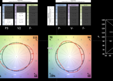
AI and the Internet Need to Learn Color Rendering

Recently a colleague of mine from the IES Color Committee asked of one of the new AIs “Tell me about color rendering.”  If we assume that the answer was formulated based on information about color rendering that is available on the internet we have a problem because the answer the AI returned was almost completely wrong.  That strongly suggests that most individuals and manufacturers posting information about color rendering don’t fully understand color rendering and are perpetuating outdated or incorrect information.  Here’s what the AI had to say, and what’s wrong with it’s response.

Color rendering is a measure of how well a light source reveals the true colors of objects. (1) A light source with a high CRI (Color Rendering Index) will show objects in their natural colors (2), while a light source with a low CRI will make objects look dull or washed out (3).  The CRI is a scale from 0 to 100 (4), with 100 being the perfect score (5).  A light source with a CRI of 100 will show objects in their true colors (1) while a light source with a CRI if 0 will make all objects look the same color (6).

The CRI (7) is important for applications where it is important to see objects in their true colors (1), such as art galleries, hospitals, and retail stores (8).  It is also important for applications where it is important to see subtle variations in color such as fashion design and photography (9).

There are a few things that can affect the CRI of a light source (10).  The type of light source (incandescent, fluorescent, LED, etc.) will affect the CRI (11).  The color temperature of the light source will also affect the CRI (12).  Light sources with a higher color temperature will have a higher CRI (12).

The CRI (7) is a valuable tool for choosing the right light source for your application.  By understanding the CRI, you can choose a light source that will show your objects in their true colors (1) and help you achiever the desired look and feel for your space.


  1. Objects don’t have “true” colors, they have apparent colors.  The color of an object is determined by the spectrum of light striking it, it’s reflective properties, and the resulting light directed toward the observer.  An object’s reflective properties don’t change, but the spectrum of light changes every time the light source changes.  Changing the spectrum may, therefore, change the color appearance of the object, hence apparent color.
  2. While there is a correlation between fidelity and naturalness, they are not the same thing.  CRI measures fidelity, i.e. how well a given light source matches the color rendering of a defined reference light source.
  3. One of the problems with single measure metrics like CRI is that there’s a lot of information that isn’t conveyed.  As CRI values drop, the only thing conveyed is that the match to the reference light source is worse.  A worse match, however, doesn’t mean colors are made dull. It could be they are increased in saturation since both deviations from the reference are equally penalized.  That’s the advantage of TM-30.  As Rf decreases we can see why by looking at Rg and some of the other 147 measures.
  4. CRI can have negative values.  TM-30 Rf is calculated so that 0 is the lowest value.
  5. 100 is the highest value.  It’s dangerous to call it “perfect” though as that implies that high fidelity is the only color rendering goal, which it isn’t.  TM-30 provides information for the color rendering goals of preference and vividness, and may include more in the future.
  6. A CRI of 0 will certainly make nearly all colors look terrible and very similar, but not all the same.
  7. CRI isn’t a proper noun, and shouldn’t be preceded by “the”.
  8. There are strong arguments for emphasizing preference over fidelity in many applications, including retail.  Again, fidelity isn’t the only color rendering goal, although it is the only one CRI measures.
  9. Research shows that high fidelity isn’t necessarily the best spectrum for detecting color difference.  Additional research is needed, but the IES may eventually add a color difference metric to TM-30.
  10. Only one thing affects CRI value – the spectrum of the light source.
  11. This is true because different light producing technologies have similar quirks in their spectra.  Those similarities can lead us to blanket statements such as “all fluorescents are green” which are not true for all products.  Again, the individual light source’s spectrum determines everything.
  12. A common misconception, but not true at all.  Not in the slightest. CCT and CRI are separate metrics.

Designing with TM-30

Tony Esposito and I gave four presentations of Designing with TM-30 at this year’s ArchLIGHT Summit.  It was video taped and is now available on Vimeo.  Watch it here.


Update:  One of the attendees sent the following feedback to ArchLIGHT Summit.  “The TM-30 presentation was phenomenal. One of the best lighting presentations that I’ve ever seen. Great work.”

ArchLIGHT Summit and Get A Grip On Lighting

Next month I’ll be at ArchLIGHT Summit in Dallas.  Together with my IES Color Committee co-chair Tony Esposito, we’ll be giving several presentations on how designers can make better use of TM-30 by integrating it into their workflow.  In anticipation of our ArchLIGHT Summit presentation we were interviewed on Get A Grip On Lighting, where we talked about TM-30, color perception, and color rendering, among other things.  You can watch the interview on their web site, or below.


Designers Thinking About Light – IES Vancouver Section

On February 24th I’m giving an online presentation called Designers Thinking About Light to the Vancouver section of the IES.  I’ll be talking about how lighting designers think about light as an artistic medium.  The presentation will include some ideas you probably know, as well as some approaches that will be new.  To register, visit the IES Vancouver Section web site.

The Limits of a ‘Standard’ Observer

I tell my students that we’re lighting designers not scientists, but that it’s good to understand some of the science that underpins our work.  This is especially true when the science is out of date and produces results that don’t necessarily agree with our vision and/or perception.  It’s frustrating and amazing to me that as individuals we’d never agree to use a broadcast only TV and give up our modern cable and internet channels. We’d never agree to use a flip phone and miss out on all of the upgrades and improvements that have been developed over the years. Yet as an industry we seem perfectly happy to continue to use 75+ year old technology with known flaws when we calculate color rendering, measure brightness, plot chromaticity in color spaces, etc.  Our industry doesn’t seem interested in “upgrading” to get the latest features like less metameric mismatch and measurements that better align with our vision and perception. But, I continue to shout into the void about these things.

One of these topics is the standard observer. This article, online and in the current issue of LD+A, looks at the problems that can arise from continuing to rely on the 1931 standard observer, and not “upgrading” to the 1964 or 2015 standard observers.

Tony and I Talk Color Rendering

Podcast Album Cover

In September at ArchLIGHT Summit, Tony Esposito and I gave a series of demonstrations on the spectral flexibility of LEDs and the possibilities they present with regard to color rendering.  While there we spoke to Sam Koerbel on his LytePod podcast about the basics of the new measures introduced in Annex E, and discuss why TM-30’s multi-dimensional approach to quantifying color preference is superior to the old-standby in the industry: CRI.  Our discussion is now available.  Give it a listen.

The Strength of TM-30

Last week Tony Esposito and I presented seminars at ArchLIGHT Summit in Dallas, TX. The topic was TM-30 and the deep information that it provides us about a light source’s spectrum and the resulting color rendering. CRI, of course, only evaluates fidelity – how close a light source matches its reference light source. But CRI penalizes all deviations and says nothing about the rendering of individual colors. Nor does it help us understand if the deviations from the reference are acceptable to viewers.

A small part of our demo is shown below. It illustrates how two light sources can have the same fidelity (in this case Rf of 70) but wildly different spectra that produce wildly different color rendering results. This is the great strength of TM-30, a deeper insight into the effect of a light source on illuminated objects and their color appearance – not just fidelity, but chroma shift, hue shift, and the perceptual implications of those shifts.

The video below shows the color appearance shifts. The graphic illustrates that even though the Rf is 70, the first light source renders objects in a preferred manner (Preference Priority Level of 3 or P3) and increases vividness (Vividness Priority Level of 2 or V2). At the same Rf the second source mutes colors and fails to achieve any of the Design Intents and Priority Levels specified in TM-30’s Annex E.

Alternating between light sources with Rf 70, Rg 94 and Rf 70 Rg 111