Today’s post was going to be a reminder to take manufacturer provided education with a grain of salt. Last week I sat through a manufacturer’s presentation on color. There were some big errors and some that’s-not-quite-right errors that angered me. The information presented wasn’t hard to confirm, but whoever created the presentation didn’t so some of it was wrong. However, before I could start writing I received an email about a new color quality metric that was developed by Bridgelux. Here’s the scoop.
Last Thursday, May 14th, Bridgelux announced a new metric, Average Spectral Difference (ASD), which they claim quantifies the naturalness of a light source. The announcement is based on this white paper by Bridgelux. The white paper asserts that since we evolved under fire light and day light, human-centric lighting should use spectra that mimic these “natural” sources. Bridgelux says that, “ASD provides an objective measurement of how closely a light source matches natural light over the visible spectrum, averaging the differences of the spectral peaks and valleys between a light source and a standardized natural light source of the same CCT.”
Basically, ASD is a measurement of the difference between a “natural” spectrum and that of an electric light source. It is expressed as a percentage, with lower percentages equaling a closer match to the reference source and higher percentages equaling a larger difference between the two.
My first thought was, “Oh, it’s CRI – Natural Edition” but in some ways it’s even worse. For starters, while Bridgelux presents a definition of “natural” light that is based on the illuminants we use as references for color fidelity calculations, there is no accepted definition of “naturalness” in the lighting industry, or most other industries for that matter. Obviously, a metric for something that has no industry-wide definition is of questionable value. The white paper says, “The reference source used by Bridgelux is the blackbody curve (BBC) for light sources of 4000K and below, and the daylight spectrum (i.e. standard illuminants such as D50, D57, and D65) for light sources of 5000K and above.” (Yes, there’s an obvious typo there because they’ve left a gap between 4000 K and 5000 K.) Second, like CRI it presents a single number with no additional information about where in the spectrum the differences occur, or if they are increases or decreases relative to the reference light source. Third, as a measurement of spectral difference alone, it disregards the fundamentals of human vision, including the principle of univariance and how perception changes with intensity, among other things.
I emailed a few colleagues on the IES Color Committee and found that they were already examining ASD. Some of the comments that came back were, “This is just a refresh of a spectral bands method. It says little about color rendering” and “This is very similar to the Film industry’s SSI developed by the Academy. It also suffers from the same problem. If the result isn’t 0% (or 100%) then it tells you nothing about where the differences are. Thus, it tells you nothing about whether two light sources will work together.”
Michael Royer at PNNL went further by looking at ASD with the sets of data in TM-30 Annex F that were used to develop the TM-30 Annex E recommendations. Here’s what he had to say. (You may have to right click and open the graphs in a new tab to see them clearly.)
First, spectral similarity metrics are not new at all—they predated CRI (e.g., Bouma spectral bands method from 1940s). For some reason they gained popularity again in the last decade or so. Here are some other examples:
B. H. Crawford. 1959. Measurement of Color Rendering Tolerances J. Opt. Soc. Am. 49, 1147-1156
Crawford, B. H. 1963. Colour-Rendering Tolerances and the Colour-Rendering Properties of Light Sources. Transactions of the Illuminating Engineering Society, 28: 50–65.
Kirkpatrick, D. 2004. Is solid state the future of lighting?” Proc. SPIE 5187, Third International Conference on Solid State Lighting.
J. Holm et al., “A Cinematographic Spectral Similarity Index,” SMPTE 2016 Annual Technical Conference and Exhibition, Los Angeles, CA, 2016, pp. 1-36, doi: 10.5594/M001680. Also: https://www.oscars.org/science-technology/projects/spectral-similarity-index-ssi
Acosta I, Leon J, Bustamante P. 2018. Daylight spectrum index: a new metric to assess the affinity of light sources with daylighting. Energies 11 2545
Spectral similarity measures, like ASD, don’t relate to perceived naturalness or preference at all. They’re more closely correlated with color fidelity (e.g., Rf) but perform even worse in terms of correlation with perceived qualities because they don’t account for how the visual system works (they might have more use for understanding cameras, as used by SMTPE with SSI, linked above). I guess people just assume that a Plankian/Daylight spectrum is ideal. While smooth SPDs have advantages, Planckian/Daylight SPDs aren’t perceived as more natural or more preferred in typical architectural lighting scenarios. This has been shown over and over in experiments, where it’s become quite evident that certain deviations from Planckian are preferred/viewed more natural than others.
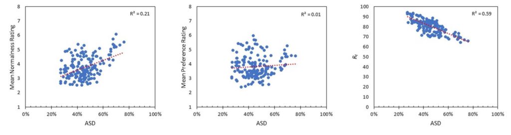
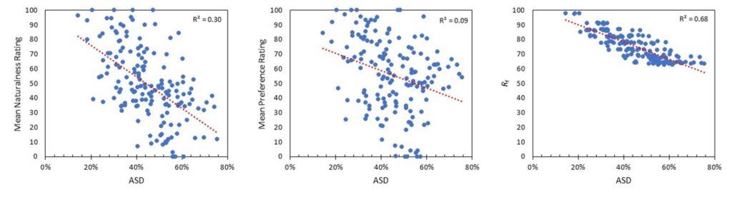
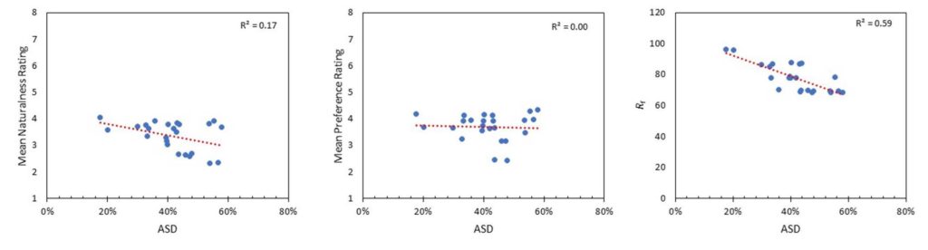
Here’s the correlation between ASD and rated naturalness/normalness, preference, and Rf for the three datasets used to develop TM-30 Annex E:
If you’re not up on your statistics, r2 is a measurement of how well data fits to a prediction or to the data average. 1.0 is a perfect fit. Generally, 0.7 or above indicate a strong statistical correlation, and values less than 0.3 indicate no relationship.
PNNL (combination of three studies):
Zhejiang:
Penn State:
Overall, it’s clear that ASD isn’t a tool for characterizing perceived naturalness (or preference) over a wide range of SPDs, and it probably has limited other uses. While spectral smoothness (as exemplified by the reference illuminants in ASD) is sometimes a useful goal, there are other metrics more rooted in human vision to better asses this characteristic. It’s a shame that ASD and the accompanying message will likely lead to confusion, especially when there’s enough to learn about color rendition already.
This is a good example of why it’s important to rely on metrics that have been vetted through a standardization process and to always be skeptical of marketing material.
So there you are. Take manufacturer’s education with a grain of salt. The same is true of their internally developed metrics. I’m not saying that they are intentionally deceiving anyone. but their goal is sales, not education. As Mike points out, this is why metrics need to go through a vetting process before we can use on them with confidence.
By the way, although I’ve mentioned the IES Color Committee and quoted a few of its members, this post doesn’t represent the opinions of the committee or of the IES.