We have been hearing from contractors that many fixture manufacturers, including Acuity Brands, Hubbell Lighting and Eaton, are being forced to raise prices because of the recent tariff increase on Chinese goods.
The tariff on lighting components and fixtures was 10%. However, on May 10th the tariff was raised to 25%. The 15% tariff increase is too much for manufacturers to absorb so they, and ECs, consider this a Force Majeure event (unforeseeable circumstances that prevent someone from fulfilling a contract). By invoking Force Majeure they are voiding previous pricing and are issuing new quotes showing the cost increases.
This doesn’t mean that all fixture prices are going to increase by 15%. The amount of Chinese made components varies by manufacturer and fixture line. More Chinese components will mean a higher cost increase. To us this means that until the tariff and trade situation with China settles down lighting designers would do well to keep their clients informed of the varying impact on fixture costs and therefore fixture budgets.
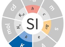
Science geeks everywhere are celebrating World Metrology Day today. Today has also been chosen by Bureau International des Poids et Mesures (International Bureau of Weights and Measures) to implement changes to the International System of Units or the SI. The changes are to the definitions of the kilogram, ampere, kelvin, and mole.
Of special interest to lighting designers, the Kelvin is now defined “by taking the fixed numerical value of the Boltzmann constant k to be 1.380 649 x 10–23 when expressed in the unit J K–1, which is equal to kg m2 s–2 K–1, where the kilogram, metre and second are defined in terms of h, c and Cs.”
Yeah, I don’t know what that means, either! Here’s a link to the full definition and formula.
On April 23rd the CIE (Commission Internationale de l´Eclairage) published a position statement on so-called Blue Light Hazard. Given the amount of press this phrase has received and the responses, such as the AMA Policy H-135.927 Human and Environmental Effects of Light Emitting Diode (LED) Community Lighting, which was refuted by the IES and the LRC, it’s a timely piece.
The position statement makes a couple of key points. The first is that the phrase itself “has been inaccurately used to represent the risk of actual eye damage and the influence on general well-being. The term ‘blue light hazard’ should only be used when considering the photochemical risk to the retinal tissues of the eye (technically referred to as “photomaculopathy”), usually associated with staring into bright sources, such as the sun or welding arcs”
The second point is that “There is no evidence in humans of any adverse health effects from occasional exposure to optical radiation at the exposure limits.” It’s an important position paper with links to research. Read it for yourself.
Soraa (the LED lamp and fixture manufacturer) has published a profile of me and Studio T+L as part of their “Masters of Light” series. You can read it here.
Last Friday I took my class on a visit to a fixture manufacturer’s showroom. The visit was pretty successful, but I had one issue with the information that was presented. This manufacturer’s rep presented their CRI 80 and CRI 90 products by saying that CRI 80 dulls colors and CRI 90 makes colors “pop”. I can’t blame him too much, after all it’s a common misconception that higher CRI is “better.” However, it’s not true so let’s take a look.
CRI (or more formally, CIE 13, Method of Measuring and Specifying Colour Rendering Properties of Light Sources, Ra) is a fidelity metric. That means it calculates the color rendering of a light source in comparison to the color rendering of a reference light source of the same color temperature or correlated color temperature (CCT). A light source with a CRI 80 renders colors with more color error (that is, a larger mismatch or a larger color appearance distortion) than a light source with a CRI 90. That’s all. One of the problems with CRI, which is addressed in TM-30, is that a single number value doesn’t tell us the hue(s) where there is a color rendering error compared to the reference light source, nor do we learn the direction or the degree of color rendering error(s). In other words:
What hues are not rendered accurately? CRI doesn’t tell us.
Are those hues made to appear more or less saturated? CRI doesn’t tell us.
Are those hues shifted toward an adjacent hue? CRI doesn’t tell us.
How big are the color distortions? CRI doesn’t tell us.
TM-30 (ANSI/IES TM-30-18 IES Method for Evaluating Light Source Color Rendition) does give us this information, which immediately puts to rest the notion that higher fidelity is “better” color rendering in all cases.
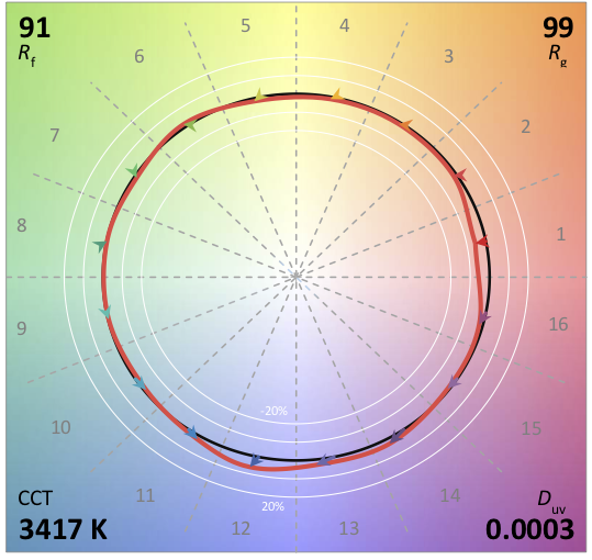
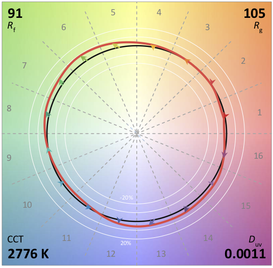
It’s entirely possible for a light source with a CRI 80 to render a set of colors more vividly than a CRI 90 light source if the color errors increase saturation and minimize hue shifts. It’s even possible for two light sources of the same CRI to render colors differently. Here’s an example. The first light source has a TM-30 Rf (fidelity) of 90 and an Rg (chroma) of 99, meaning that on average colors are rendered slightly less vividly than the reference light source. The TM-30 Color Vector Graphic shows us clearly that the rendering of red (Bin 1) is less saturated than the reference, and that the rendering of warm blue (Bin 12) is more saturated. The other colors are a nearly perfect match to the reference source.
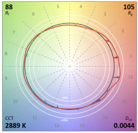
The second source also has an Rf 91. However, the green and purple hues are rendered with increased saturation so that it has an Rg 105. (Yes, the CCTs are different, but that doesn’t matter because in the calculation a light source is compared to a reference light source of the same CCT, cancelling out any color errors due to CCT.)
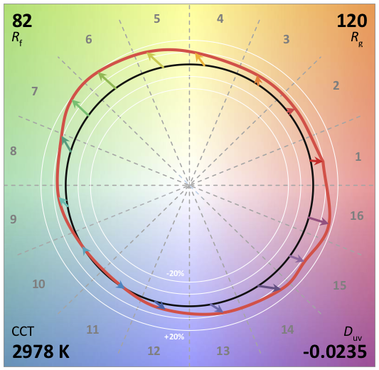
Understanding this information opens the door to considerations other than fidelity. The first is vividness. Are you lighting the M&M store in Times Square? If so, your design goal may be to increase saturation of the candy, not accurately render it. In that case you’re going to want a lower fidelity (Rf) so that you can get higher chroma (Rg). The light source shown below might be just the one for this application.
The second is preference. Studies have shown that in many applications people prefer slight increases in chroma, especially in the red range. Are you lighting a restaurant? If so, and if preference and increased red chroma are important, this might be the light source for your project:
The increased information TM-30 provides is both more accurate and more detailed than CRI. Not only that, it gives us a deeper understanding of the color rendering capability of a light source and allows us to consider design goals other than fidelity. Designers who care about these color considerations need to keep pushing manufacturers to provide TM-30 information and train their employees in its meaning and use.
I will be presenting Understanding and Applying TM-30 to the New Jersey section of the IES on Tuesday, March 19th. If you’re interested in attending you can register at http://www.iesofnj.org/TM3015.html.
On February 28th I’ll be one of the panelists at the annual DLFNY “Debate”. Here’s how they describe it:
Join us for a fun and educational evening of lively, sometimes absurd debate between members of the New York City lighting design community. Enjoy a verbal joust as the debaters take sides on some of the most pressing topics in the lighting industry, during a light-hearted evening of discussion mixed with humorous provocation and competition. The topics have been chosen to provoke a dialog, so the opinions expressed by our panel may not be their personal stance, but will surely be interesting to hear.
You can find more information and register at DLFNY.com
This is a lighting design blog, but many of my students are interior designers, so I’m going to speak to them for a moment with interesting news. The Council for Interior Design Qualification has updated the definition of Interior Design. The short definition is:
Interior design encompasses the analysis, planning, design, documentation, and management of interior non-structural/non-seismic construction and alteration projects in compliance with applicable building design and construction, fire, life-safety, and energy codes, standards, regulations, and guidelines for the purpose of obtaining a building permit, as allowed by law. Qualified by means of education, experience, and examination, interior designers have a moral and ethical responsibility to protect consumers and occupants through the design of code-compliant, accessible, and inclusive interior environments that address well-being, while considering the complex physical, mental, and emotional needs of people
A couple of weeks ago the Global Lighting Association (GLA) published Application of CIE 13.3-1995 with Associated CRI-based Color Rendition Properties. It proposes TM-30 like metrics to supplement CRI Ra. Specifically, it proposes a color gamut index, Ga, that is similar to TM-30’s Rg and a set of chroma indices, Ci, similar to TM-30’s Rch,hj. At first glance I can see some specifiers getting excited about this. Since it’s based on CRI it’s already somewhat familiar so it should be easier to learn. But…
The first part is the problem – it’s based on CRI, which has well known and well documented problems and shortcomings. As described in The Lighting Handbook, 10thEd.and IES DG-1 Color and Illumination, they include:
Averaging the Color Shifts. CRI is computed by averaging the color shifts of the eight color samples. A light source can render one sample very poorly and still achieve an acceptable score. The Chroma Indices attempt to resolve this, but there’s a problem with the eight color samples, which is next on our list.
Test Color Samples. The eight color samples are all of moderate saturation, so saturated colors can be rendered poorly even when CRI is high. More importantly, the eight color samples are A) not based on any real-world objects B) don’t adequately cover the visible spectrum. The latter is significant because it means that some wavelengths play an outsized role in determining CRI. Manufacturers can use this to optimize (or cheat) their spectrum to achieve a higher CRI than visual inspection would warrant. This is why TM-30 uses 99 color samples drawn from real world objects.
Color Space. CRI is calculated in the CIE 1964 color space, which is no longer recommended for any other use because it is outdated.
Penalties for all Chromaticity Shifts. As a fidelity metric, CRI penalizes all chromaticity shifts even though research has shown that certain increases in chroma are preferred. Again, it seems that Ci is intended to address this, but it doesn’t resolve the other problems with CRI.
Chromatic Adaptation. The chromatic adaptation transform used in CRI has been shown to perform poorly and is no longer recommended for any application.
CRI served the industry (relatively) well, but its time is over. Layering new calculations on top of CRI’s flawed foundation doesn’t make it better. I know TM-30 can be tough. But it works. It tells us what we want to know at the level of detail we need for a given project, and it’s accurate. The IES has moved on and the CIE seems to be leaning in that direction as well. So should you!