TM-30 Is Not Too Hard To Learn!

Recently, a well-known lighting designer gave a presentation at a well-known lighting conference. During the Q&A he was asked his opinion of TM-30 and replied that it was too hard so he just specified CRI>90. At the risk of sounding like a jerk I have to say that maybe it was too hard for him, but it’s not too hard for most of us. Here is a brief list of new things lighting designers have had to learn over the years.

  • The introduction and transition to electronic ballasts and transformers meant that we had to learn about reverse phase dimming and control protocols.
  • The T5 lamp meant we had to change our layout patterns to accommodate lamps that weren’t standard 2’, 4’, and 8’ lengths.
  • Metal Halide lamps, especially PARs, meant that in exchange for energy savings we had to learn about the color rendering of a new type of lamp, and give up dimming.
  • Daylight harvesting and daylight responsive designs meant we had to learn about daylight zones, photosensors, and daylight harvesting control systems.
  • White LEDs meant we had to learn about another light source and its specific pros and cons, including different color rendering properties due to its SPD.
  • Circadian lighting means we are all in the process of learning how and when to apply the most current scientific evidence to certain project types.  Since the science is constantly advancing on this topic, we must be aware and continue to educate ourselves.
  • Regularly updated energy conservation codes mean that as we begin to memorize the lower LPDs and changes to control and daylighting requirements, we have to relearn that information because it changes every three years.
  • Most recently, we’re supposed to enthusiastically embrace IoT, adding new hardware and controls to our lighting control systems.

There is a ton of TM-30 educational material available, including posts on this blog here, here, here, here, here, and here. There’s this article on the IES’s FIRES Forum, and this page on the Department of Energy web site. Manufacturers are also providing education including DMF Lighting, Soraa, Premier Lighting, Alphabet, and Lighting Services Inc. Then there are the articles in trade magazines and sites such as Lux Review and Architect Magazine, not to mention many articles in Lighting Design and Application and Leukos (no links because they’re behind the IES login). In addition, there have been presentations at other conferences (some given by me) at the IES Annual Conference, LightFair, and LEDucation.

If that’s not enough for you, let me know. I have a presentation approved for one AIA HSW LU, so if you’re architectural firm wants to learn more let’s set up a presentation. Ditto for lighting design firms and teachers of lighting. If I’m not available there are a half dozen others on the IES Color Committee who regularly give TM-30 presentations. You can learn TM-30. I’m here to help.

It’s Time for a Unified Chromaticity Diagram

The pandemic has certainly distracted me from regular posting here.  I’m probably not back to posting weekly, or even monthly, but I do have a new topic and a few things to say about it.  The topic is color science as it applies to lighting.

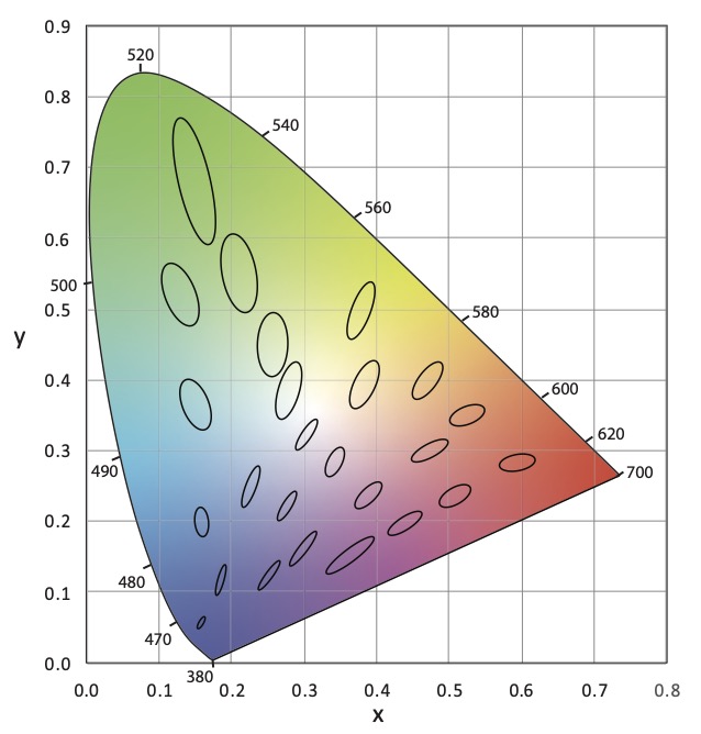
No doubt you’ve seen something like Figure 1 before.  It’s the CIE 1931 (x, y) chromaticity diagram and is the most common graphic for showing the range of tunable white luminaires and LED colors and their color mixing possibilities. 

CIE 1931 (x, y) Chromaticity Diagram
Figure 1 CIE 1931 (x, y) Chromaticity Diagram

The thing is, we keep using this diagram even though it has problems and has been replaced twice.  The problem is that it isn’t perceptually uniform, which means that the distance between any two color points doesn’t correspond to the perceptual difference between those two colors.  This was famously demonstrated in 1942 by David MacAdam. Using 25 chromaticities he had a trained observer, using a device that allowed for the color adjustment of light, attempt to create a side-by side match from different starting points – for example match a yellow sample starting from green, then match it again starting from red, etc.  When he plotted the results in CIE 1931 (x, y) the area where color differences could not be detected formed an ellipse as shown in Figure 2.  This demonstrated that the color space was not perceptually uniform.  If it was the ellipses would have been circles.

CIE 1931 (x, y) Chromaticity Diagram with MacAdam Ellipses
Figure 2 CIE 1931 (x, y) Chromaticity Diagram with MacAdam Ellipses (at 10x size)

These “MacAdam ellipses” have become the default way manufacturers talk about color consistency of their products.  You’ll often see statements on cut sheets saying that the LEDs for a particular product line all fall within an X-step MacAdam ellipse (2-step, 3-step, etc.).  Want to hear something crazy?  In 2014, the International Commission on Illumination (CIE), which sets the standards for most things related to color and light, recommended ending the use of MacAdam ellipses.  Why?  Look at Figure 2 again.  The size of MacAdam ellipses changes as we move around the chromaticity diagram. So does anything related to them, such as Standard Deviation Color Matching (SDCM) another, although less common, measure.

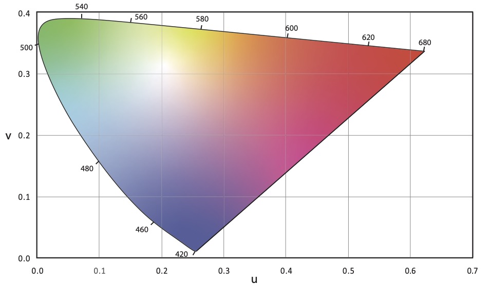
The first attempt to address the uniformity problem resulted in the CIE 1960 (u, v) uniform chromaticity scale (USC) diagram (Figure 3).  Correlated color temperature was originally calculated in the CIE 1960 (u, v) UCS.

CIE 1960 (u, v) Chromaticity Diagram
Figure 3 CIE 1960 (u, v) Chromaticity Diagram

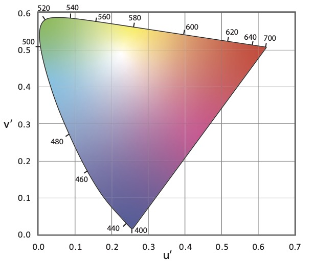
It was later discovered that the CIE 1960 (u, v) USC diagram also was not uniform.  To improve uniformity the v-axis was scaled by 1.5, resulting in the CIE 1976 (u’, v’) UCS diagram shown in Figure 4.  As the most uniform UCS diagram, CIE 1976 (u’, v’) is the one recommended for use when calculating or evaluating color differences, not CIE 1931 (x, y).

CIE 1976 (u', v') Chromaticity Diagram
Figure 4 CIE 1976 (u’, v’) Chromaticity Diagram

Correlated color temperature was originally calculated in CIE 1960 (u, v).  However, since that diagram is no longer recommended for any purpose by the CIE, we use CIE 1976 (u’, v’) but scale it back to CIE 1960 (u, v).  This is described as CIE 1976 (u’, 2/3 v’).

The CIE’s 2014 recommendation mentioned earlier replaced MacAdam ellipses with a circle in the CIE 1976 (u’, v’) UCS.  A rough rule of thumb is that one MacAdam ellipse corresponds to a circle with a radius of 0.0011. Unfortunately, it doesn’t seem that any manufacturers have made this transition.

So, our industry is in a situation where we commonly use a 90 year old first generation diagram that was replaced 61 years ago.  We calculate CCT in a third generation chromaticity diagram that is 45 years old but tweek the math to refer back to a second generation 61 year old diagram.  It’s crazy!  No other industry uses a system this convoluted.

Why am I mentioning this?  I was recently reminded of a paper that was presented at last August’s IES Annual Conference.  Presented by Michael Royer of Pacific Northwest National Laboratory, it proposed using the latest color science to make a fresh start with a single new chromaticity diagram that is very similar to CIE 1976 (u’, v’) where we would calculate CCT, the color temperature bins for LEDs, color differences and the rest.  IES members can access the archived presentation after logging in to the IES website.

Full disclosure, I’m on the IES Task Group that is developing this new system.  The Task Group is made up of people in academia, design, manufacturing and research from three countries.  We’ve refined our work since August and expect to publish these refinements soon.  I encourage all of you to look for and learn about this proposal, to attend seminars when available, and to weigh in on this topic.  Would our industry benefit from moving to a unified chromaticity system?  Is this the right one?  How do we educate specifiers and manufacturers?  How do we phase in a new system?  We can all have a voice in bringing the science we rely on into the 21st Century.

References

CIE. (2014). TN 001:2014 Chromaticity Difference Specification for Light Sources. Vienna: International Commission on Illumination.

CIE. (2018). CIE 015:2018 Colorimetry, 4th Edition. Vienna: International Commission on Illumination.

MacAdam, D. (1942). Visual Sensitivities to Color Differences in Daylight. Journal of the Optical Society of America, 32(5), 247-274.

Royer, M. et. al. (2020).  Improved System for Evaluating and Specifying the Chromaticity of Light Sources. In: Illuminating Engineering Society Annual Conference 2020.

IES RP-16 is Now IES LS-1

The Illuminating Engineering Society’s Recommended Practice 16 Nomenclature and Definitions for Illuminating Engineering (aka RP-16) has long been one of the two reference sources for the definition of lighting related words and phrases – the other being the CIE International Lighting Vocabulary (ILV).

As part of the IES converting all of their publications to an online library format, some publications have been given a new designation. RP-16 is now Lighting Science 1 (LS-1) and is at this link. Bookmark it now!

Standard 189.1 Now Includes TM-30 Requirements

Yesterday an addendum to ANSI/ASHRAE/ICC/USGBC/IES Standard 189.1-2017 Standard for the Design of High-Performance Green Buildings was published. The addendum makes changes to Section 8.3.5, which covers lighting. One of the biggest changes is to add TM-30 color rendition criteria to the section on Indoor Lighting Quality. Here’s the relevant text:

8.3.5.3 Color Rendition. At least 95% of lighting power of nominally white lighting within each enclosed space shall be provided by luminaires that meet the following criteria at full light output in accordance with IES-TM-30, Annex E, P2 and F3:
1. Rf of at least 85
2. Rf,h1 of at least 85
3. Rg of at least 92
4. Rcs,h1 of at least -7% but no greater than +19%

Nominally white lighting is lighting that has chromaticity within the basic or extended nominal color correlated temperature (CCT) specifications of ANSI C78.377.

Where a lighting system is capable of changing its spectrum, it shall be capable of meeting the color rendition requirements within each nominal CCT of 2700 K, 3500 K, 4000 K, and 5000 K, as defined in ANSI C78.377, that the system is capable of delivering.

I hope that this is going to put more pressure on manufacturers to improve the color rendering of their luminaires as measured by TM-30, not CRI, and to provide TM-30 information on their cut sheets. If not, they’ll risk not being considered on projects that have TM-30 requirements.

CIE Position Statement on the use of UV-C

As interest in using light disinfection continues to grow standard setting organizations and manufacturers are becoming more active in this area.  The International Commission on Illumination (CIE) has just released a position statement on the use of ultraviolet radiation to manage the risk of COVID-19 transmission.

Here are a few bullet points:

  • While ultraviolet light ranges from 400 nm to 100 nm, the most effective wavelengths are at around 254 nm and this is generally what is meant by germicidal ultraviolet or GUV.
  • UV-C has been successfully used for water disinfection and in air handling units for many years.  UV-C has also seen a resurgence for use in healthcare environments.
  • Direct exposure to UV-C can cause photokeratitis (similar to snow blindness) and erythema (skin reddening similar to sunburn) so carefully shielded luminaires are required when used in occupied spaces.
  • Consumers should be wary of products not approved by consumer safety organizations.  Such products could be hazardous to use or may not emit UV-C at all.

Read the full position statement.


A Look at Bridgelux’s Average Spectral Difference Metric

Today’s post was going to be a reminder to take manufacturer provided education with a grain of salt.  Last week I sat through a manufacturer’s presentation on color.  There were some big errors and some that’s-not-quite-right errors that angered me. The information presented wasn’t hard to confirm, but whoever created the presentation didn’t so some of it was wrong.  However, before I could start writing I received an email about a new color quality metric that was developed by Bridgelux.  Here’s the scoop.

Last Thursday, May 14th, Bridgelux announced a new metric, Average Spectral Difference (ASD), which they claim quantifies the naturalness of a light source.  The announcement is based on this white paper by Bridgelux.  The white paper asserts that since we evolved under fire light and day light, human-centric lighting should use spectra that mimic these “natural” sources.  Bridgelux says that, “ASD provides an objective measurement of how closely a light source matches natural light over the visible spectrum, averaging the differences of the spectral peaks and valleys between a light source and a standardized natural light source of the same CCT.”  

Basically, ASD is a measurement of the difference between a “natural” spectrum and that of an electric light source.  It is expressed as a percentage, with lower percentages equaling a closer match to the reference source and higher percentages equaling a larger difference between the two.

My first thought was, “Oh, it’s CRI – Natural Edition” but in some ways it’s even worse.  For starters, while Bridgelux presents a definition of “natural” light that is based on the illuminants we use as references for color fidelity calculations, there is no accepted definition of “naturalness” in the lighting industry, or most other industries for that matter. Obviously, a metric for something that has no industry-wide definition is of questionable value.  The white paper says, “The reference source used by Bridgelux is the blackbody curve (BBC) for light sources of 4000K and below, and the daylight spectrum (i.e. standard illuminants such as D50, D57, and D65) for light sources of 5000K and above.”  (Yes, there’s an obvious typo there because they’ve left a gap between 4000 K and 5000 K.)  Second, like CRI it presents a single number with no additional information about where in the spectrum the differences occur, or if they are increases or decreases relative to the reference light source.  Third, as a measurement of spectral difference alone, it disregards the fundamentals of human vision, including the principle of univariance and how perception changes with intensity, among other things.  

I emailed a few colleagues on the IES Color Committee and found that they were already examining ASD.  Some of the comments that came back were, “This is just a refresh of a spectral bands method. It says little about color rendering” and “This is very similar to the Film industry’s SSI developed by the Academy. It also suffers from the same problem. If the result isn’t 0% (or 100%) then it tells you nothing about where the differences are. Thus, it tells you nothing about whether two light sources will work together.”

Michael Royer at PNNL went further by looking at ASD with the sets of data in TM-30 Annex F that were used to develop the TM-30 Annex E recommendations.  Here’s what he had to say. (You may have to right click and open the graphs in a new tab to see them clearly.)

First, spectral similarity metrics are not new at all—they predated CRI (e.g., Bouma spectral bands method from 1940s). For some reason they gained popularity again in the last decade or so. Here are some other examples:

B. H. Crawford. 1959. Measurement of Color Rendering Tolerances J. Opt. Soc. Am. 49, 1147-1156

Crawford, B. H. 1963. Colour-Rendering Tolerances and the Colour-Rendering Properties of Light Sources. Transactions of the Illuminating Engineering Society, 28: 50–65.

Kirkpatrick, D. 2004. Is solid state the future of lighting?” Proc. SPIE 5187, Third International Conference on Solid State Lighting.

J. Holm et al., “A Cinematographic Spectral Similarity Index,” SMPTE 2016 Annual Technical Conference and Exhibition, Los Angeles, CA, 2016, pp. 1-36, doi: 10.5594/M001680. Also: https://www.oscars.org/science-technology/projects/spectral-similarity-index-ssi

Acosta I, Leon J, Bustamante P. 2018. Daylight spectrum index: a new metric to assess the affinity of light sources with daylighting. Energies 11 2545

Spectral similarity measures, like ASD, don’t relate to perceived naturalness or preference at all. They’re more closely correlated with color fidelity (e.g., Rf) but perform even worse in terms of correlation with perceived qualities because they don’t account for how the visual system works (they might have more use for understanding cameras, as used by SMTPE with SSI, linked above). I guess people just assume that a Plankian/Daylight spectrum is ideal.  While smooth SPDs have advantages, Planckian/Daylight SPDs aren’t perceived as more natural or more preferred in typical architectural lighting scenarios. This has been shown over and over in experiments, where it’s become quite evident that certain deviations from Planckian are preferred/viewed more natural than others.

Here’s the correlation between ASD and rated naturalness/normalness, preference, and Rf for the three datasets used to develop TM-30 Annex E:

 If you’re not up on your statistics, r2 is a measurement of how well data fits to a prediction or to the data average.  1.0 is a perfect fit.  Generally, 0.7 or above indicate a strong statistical correlation, and values less than 0.3 indicate no relationship.

PNNL (combination of three studies):

Zhejiang:

Penn State:

Overall, it’s clear that ASD isn’t a tool for characterizing perceived naturalness (or preference) over a wide range of SPDs, and it probably has limited other uses. While spectral smoothness (as exemplified by the reference illuminants in ASD) is sometimes a useful goal, there are other metrics more rooted in human vision to better asses this characteristic. It’s a shame that ASD and the accompanying message will likely lead to confusion, especially when there’s enough to learn about color rendition already.

This is a good example of why it’s important to rely on metrics that have been vetted through a standardization process and to always be skeptical of marketing material.

So there you are. Take manufacturer’s education with a grain of salt. The same is true of their internally developed metrics. I’m not saying that they are intentionally deceiving anyone. but their goal is sales, not education. As Mike points out, this is why metrics need to go through a vetting process before we can use on them with confidence.

By the way, although I’ve mentioned the IES Color Committee and quoted a few of its members, this post doesn’t represent the opinions of the committee or of the IES.

Celebrating International Day of Light

This Saturday, May 16th, is the International Day of Light, a UN backed global initiative that provides an annual focal point for the continued appreciation of light and the role it plays in science, culture and art, education, and sustainable development, and in fields as diverse as medicine, communications, and energy. May 16th was selected because it is the anniversary of the first successful operation of the laser in 1960 by physicist and engineer, Theodore Maiman.

Unfortunately, Day of Light activities around the world are few. One that begins today is the IES Virtual Research Symposium. Held bi-annually, this year the title is LIGHT+ QUALITY – Meaningful Metrics Beyond Energy. If you’re interested, you can register here.

LEDucation Postponed

Due to growing concerns of COVID-19 in the lighting industry and the New York community, the Designers Lighting Forum of New York is postponing the LEDucation 2020 Trade Show and Conference that had been scheduled for March 17 – 18.

LEDucation is being rescheduled to August 18 – 19, 2020. I expect that our TM-30 Annex E seminar and demonstration room will be part of the rescheduled event.