Designing Beyond Fidelity

I recently began a project that includes about 8,000 SF of office space that is completely without windows or skylights.  I’ve renovated spaces like this before, and the common complaint from occupants was a disconnect from daylight, weather, and the way they indicate the passage of time.  On this project, I determined that the most appropriate solution was to use a light source that rendered colors in a way that is highly preferred to make the spaces more pleasant to occupy and use.

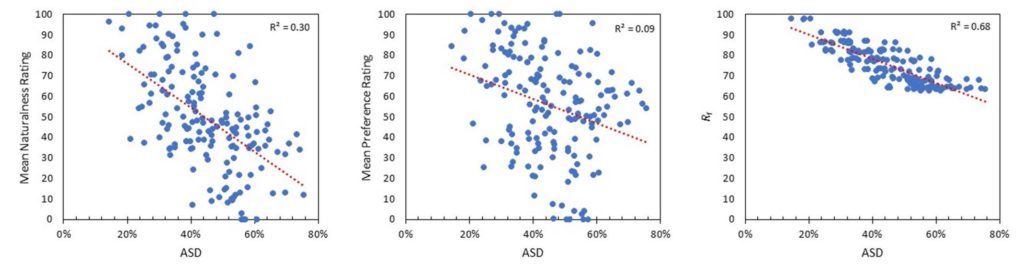
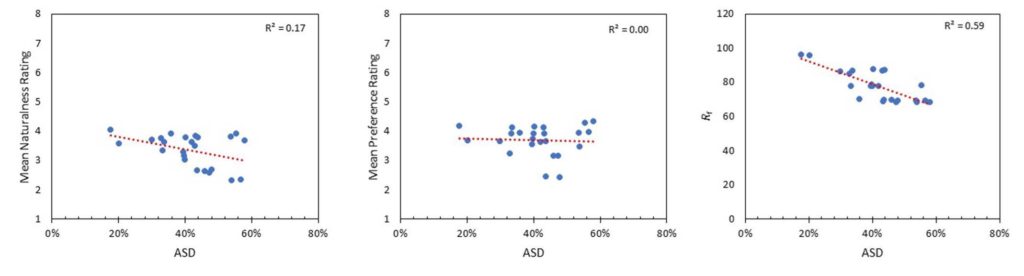
Of course, as a designer who is very knowledgable about color rendering issues and is a TM-30 advocate, I know two things.  First, highly preferred is not high fidelity.  People prefer a light source that slightly increases the saturation of object colors (especially reds) over a high fidelity source.  Second, TM-30’s Annex E provides specifiers with ranges for certain TM-30 measurements that allow us to accurately specify highly preferred light sources.

The task seemed simple enough.  Forget about fidelity and find a fixture/LED combination with a spectrum designed for preference, i.e. a light source that meets the TM-30 Annex E specification for a highly preferred (aka P1) light source.  After all, we’ve had TM-30 for seven years now, and Annex E for four years.  Surely, by now LED manufacturers have introduced products that meet color rendering goals other than fidelity, right?  Who wouldn’t see that as a huge marketing opportunity?  And surely fixture manufacturers would offer specifiers that LED, again to differentiate their products from the many, many, many similar products from other manufacturers…right?

Alas, the answer is, “No.”  One member of the IES Color Committee shared with me a database of over 1,000 LED products, their SPDs, and their various TM-30 measurements, including the Annex E Preference Design Intent.  Of those, there are a generous handful of retrofit lamps, most of them by Soraa and Cree, that meet the P1 specification, but only one LED in commercially available linear LED fixtures – Focal Point’s Preferred Light series.  That’s it!

Fortunately, this project is for a private firm so I don’t have to worry about developing a three-name or performance spec.  Otherwise, I would have to give up on a preferred spectrum and default to high fidelity not because it would be appropriate for the project but simply because there are more options.

I’ve mentioned fidelity and preference.  You might be asking if there are other color rendering goals.  The answer is, “Yes.”  Other color rendering design goals, with brief explanations, include:

Preference.  Light distorts object colors with slight increases in saturation, especially reds, in a way that is preferred over the reference light source (that is, preferred over high fidelity).   This might be the goal in an expensive restaurant where you want to emphasize the beautiful colors of the food, people, and interior design.

Vividness.  Light renders object colors as more or less vivid, or saturated, than the reference light source. Vividness is different from Preference in the degree of distorted saturation and the design intent – making colors pop, not making colors more attractive.  This might be the goal in the Skittles store in Times Square where you want the colors to leap out at people.  

Naturalness. Light renders object colors as expected, which, surprisingly, is usually not the same as fidelity.  This might be the color rendering goal in a grocery store where you want the food to look ripe and appetizing.

Discrimination.  Light renders object colors so they can be appropriately sorted. This might be the goal in a facility where even slight color variations must be detected.

Specifiers are captives of manufacturers.  We can have design goals oriented toward the needs of the users and the success of the project, but manufacturers only want to sell us fidelity, the same way they’ve been selling us fidelity since CRI was introduced in 1965.  For 50 years we only had a hammer (CRI) so all problems were nails (fidelity).  TM-30 changed that and it’s time for manufacturers to catch up.

Manufacturers Don’t Understand Color Rendering

I attended LEDucation in New York City this week.  While there I spoke to over two dozen manufacturers, none of whom understood color rendering beyond the (partially accurate) belief that higher CRI is better.  My conversations when like this.

Lighting Salesperson: “Our color rendering is great.  Our CRI is over 90 and our R9 is over 50.”

Me: “CRI measures color fidelity.  What if my goals are something else?”

Lighting Salesperson: “…”

or

Lighting Salesperson: “Our color rendering is great.  Our CRI is over 90 and our R9 is over 50.”

Me: “CRI has inaccuracies that have been known for decades while TM-30 is the most accurate and up to date system.  If color fidelity is important to you, why aren’t you using TM-30’s Rf?”

Lighting Salesperson: “Well, lighting designers don’t understand TM-30.”

Me: “Oh, I think many of them do.  But, even if they don’t, don’t you want to be sure that your color rendering claims are true?  Couldn’t you educate designers about TM-30?  The IES Color Committee will help.”

Lighting Salesperson: “…”

So, (big sigh, big eye roll) let’s go over this again.  If we think of CIE 13.3-1995 Method of Measuring and Specifying Colour Rendering Properties of Light Sources, aka CRI, as a technology, then it’s a technology from 1965 which is when the first version was published.  In 1965 Lyndon Johnson was president, Bonanza was the most popular TV show, Wooly Bully by Sam the Sham and The Pharaohs was the most popular song, and the Chevrolet Impala (Jet Smooth Ride!) was the most popular car.  CRI is O-L-D.

As with any other technology that is 57 years old,  the science has advanced.  Unfortunately, CRI has not. There were two minor corrections, the most recent in 1995, but they did little to fix at least a half dozen errors and inaccuracies that have been well documented for decades.  The CIE basically admitted that when, in 2017, they published CIE 224 Colour Fidelity Index for Accurate Scientific Use, which is TM-30’s Rf measure of fidelity.  Why publish 224 and not withdraw CRI?  Why have one measure for accurate scientific use and one for (inaccurate?) general use? The CIE requires unanimous votes for any action to be approved.  I’m told by reliable sources who were in the room that one global lamp manufacturer has been resisting updating or replacing CRI for decades, and that one manufacturer has held up progress or change.

So, CRI is has known inaccuracies resulting from a combination of outdated internal calculations along with other limitations.  Meanwhile, TM-30 is known to be the most accurate measure of fidelity.  If fidelity is your concern, Rf is the measurement you want to use.

What about concerns other than fidelity?  When TM-30 was published in 2015 there wasn’t evidence it could be used for purposes other than fidelity.  However, by 2018 studies provided ample evidence that TM-30 measures could also be used to evaluate light sources for preference and vividness.  The studies are summarized in TM-30’s Annex F, and recommendations based on those studies are in Annex E (yes, that seems backwards, sorry).  Here’s an explanation of all three color rendering goals. (Oh, and TM-30 is still a free download from the IES!)

I think preference is an incredibly interesting color rendering goal.  Color preference means that the light source in question renders colors differently than the reference light source (and therefore has a lower fidelity) but does so in a way that is preferred by most people (usually by slightly increasing the saturation of colors, especially red).  Color preference is usually my color rendering goals in spaces, such as hospitality, where aesthetics are the primary concern.

Manufacturers don’t get it. Designers do, and we have to demand that they educate themselves so they can provide us with the tools we need.

Designers Thinking About Light – IES Vancouver Section

On February 24th I’m giving an online presentation called Designers Thinking About Light to the Vancouver section of the IES.  I’ll be talking about how lighting designers think about light as an artistic medium.  The presentation will include some ideas you probably know, as well as some approaches that will be new.  To register, visit the IES Vancouver Section web site.

TM-30 at ArchLIGHT Summit 2021

My colleague Tony Esposito and I will be giving a new TM-30 seminar and demonstration at ArchLIGHT Summit 2021 in Dallas on September 21st and 22nd. We’re working on a new, and we hope more attendee friendly, presentation and an all new set of demonstrations to explain TM-30s Annex E specifications. The demo will include, for the first time, live models of different ethnicities so attendees can evaluate the impact of of the specifications on skin tone. I hope to see you there!

TM-30 Is Not Too Hard To Learn!

Recently, a well-known lighting designer gave a presentation at a well-known lighting conference. During the Q&A he was asked his opinion of TM-30 and replied that it was too hard so he just specified CRI>90. At the risk of sounding like a jerk I have to say that maybe it was too hard for him, but it’s not too hard for most of us. Here is a brief list of new things lighting designers have had to learn over the years.

  • The introduction and transition to electronic ballasts and transformers meant that we had to learn about reverse phase dimming and control protocols.
  • The T5 lamp meant we had to change our layout patterns to accommodate lamps that weren’t standard 2’, 4’, and 8’ lengths.
  • Metal Halide lamps, especially PARs, meant that in exchange for energy savings we had to learn about the color rendering of a new type of lamp, and give up dimming.
  • Daylight harvesting and daylight responsive designs meant we had to learn about daylight zones, photosensors, and daylight harvesting control systems.
  • White LEDs meant we had to learn about another light source and its specific pros and cons, including different color rendering properties due to its SPD.
  • Circadian lighting means we are all in the process of learning how and when to apply the most current scientific evidence to certain project types.  Since the science is constantly advancing on this topic, we must be aware and continue to educate ourselves.
  • Regularly updated energy conservation codes mean that as we begin to memorize the lower LPDs and changes to control and daylighting requirements, we have to relearn that information because it changes every three years.
  • Most recently, we’re supposed to enthusiastically embrace IoT, adding new hardware and controls to our lighting control systems.

There is a ton of TM-30 educational material available, including posts on this blog here, here, here, here, here, and here. There’s this article on the IES’s FIRES Forum, and this page on the Department of Energy web site. Manufacturers are also providing education including DMF Lighting, Soraa, Premier Lighting, Alphabet, and Lighting Services Inc. Then there are the articles in trade magazines and sites such as Lux Review and Architect Magazine, not to mention many articles in Lighting Design and Application and Leukos (no links because they’re behind the IES login). In addition, there have been presentations at other conferences (some given by me) at the IES Annual Conference, LightFair, and LEDucation.

If that’s not enough for you, let me know. I have a presentation approved for one AIA HSW LU, so if you’re architectural firm wants to learn more let’s set up a presentation. Ditto for lighting design firms and teachers of lighting. If I’m not available there are a half dozen others on the IES Color Committee who regularly give TM-30 presentations. You can learn TM-30. I’m here to help.

It’s Time for a Unified Chromaticity Diagram

The pandemic has certainly distracted me from regular posting here.  I’m probably not back to posting weekly, or even monthly, but I do have a new topic and a few things to say about it.  The topic is color science as it applies to lighting.

No doubt you’ve seen something like Figure 1 before.  It’s the CIE 1931 (x, y) chromaticity diagram and is the most common graphic for showing the range of tunable white luminaires and LED colors and their color mixing possibilities. 

CIE 1931 (x, y) Chromaticity Diagram
Figure 1 CIE 1931 (x, y) Chromaticity Diagram

The thing is, we keep using this diagram even though it has problems and has been replaced twice.  The problem is that it isn’t perceptually uniform, which means that the distance between any two color points doesn’t correspond to the perceptual difference between those two colors.  This was famously demonstrated in 1942 by David MacAdam. Using 25 chromaticities he had a trained observer, using a device that allowed for the color adjustment of light, attempt to create a side-by side match from different starting points – for example match a yellow sample starting from green, then match it again starting from red, etc.  When he plotted the results in CIE 1931 (x, y) the area where color differences could not be detected formed an ellipse as shown in Figure 2.  This demonstrated that the color space was not perceptually uniform.  If it was the ellipses would have been circles.

CIE 1931 (x, y) Chromaticity Diagram with MacAdam Ellipses
Figure 2 CIE 1931 (x, y) Chromaticity Diagram with MacAdam Ellipses (at 10x size)

These “MacAdam ellipses” have become the default way manufacturers talk about color consistency of their products.  You’ll often see statements on cut sheets saying that the LEDs for a particular product line all fall within an X-step MacAdam ellipse (2-step, 3-step, etc.).  Want to hear something crazy?  In 2014, the International Commission on Illumination (CIE), which sets the standards for most things related to color and light, recommended ending the use of MacAdam ellipses.  Why?  Look at Figure 2 again.  The size of MacAdam ellipses changes as we move around the chromaticity diagram. So does anything related to them, such as Standard Deviation Color Matching (SDCM) another, although less common, measure.

The first attempt to address the uniformity problem resulted in the CIE 1960 (u, v) uniform chromaticity scale (USC) diagram (Figure 3).  Correlated color temperature was originally calculated in the CIE 1960 (u, v) UCS.

CIE 1960 (u, v) Chromaticity Diagram
Figure 3 CIE 1960 (u, v) Chromaticity Diagram

It was later discovered that the CIE 1960 (u, v) USC diagram also was not uniform.  To improve uniformity the v-axis was scaled by 1.5, resulting in the CIE 1976 (u’, v’) UCS diagram shown in Figure 4.  As the most uniform UCS diagram, CIE 1976 (u’, v’) is the one recommended for use when calculating or evaluating color differences, not CIE 1931 (x, y).

CIE 1976 (u', v') Chromaticity Diagram
Figure 4 CIE 1976 (u’, v’) Chromaticity Diagram

Correlated color temperature was originally calculated in CIE 1960 (u, v).  However, since that diagram is no longer recommended for any purpose by the CIE, we use CIE 1976 (u’, v’) but scale it back to CIE 1960 (u, v).  This is described as CIE 1976 (u’, 2/3 v’).

The CIE’s 2014 recommendation mentioned earlier replaced MacAdam ellipses with a circle in the CIE 1976 (u’, v’) UCS.  A rough rule of thumb is that one MacAdam ellipse corresponds to a circle with a radius of 0.0011. Unfortunately, it doesn’t seem that any manufacturers have made this transition.

So, our industry is in a situation where we commonly use a 90 year old first generation diagram that was replaced 61 years ago.  We calculate CCT in a third generation chromaticity diagram that is 45 years old but tweek the math to refer back to a second generation 61 year old diagram.  It’s crazy!  No other industry uses a system this convoluted.

Why am I mentioning this?  I was recently reminded of a paper that was presented at last August’s IES Annual Conference.  Presented by Michael Royer of Pacific Northwest National Laboratory, it proposed using the latest color science to make a fresh start with a single new chromaticity diagram that is very similar to CIE 1976 (u’, v’) where we would calculate CCT, the color temperature bins for LEDs, color differences and the rest.  IES members can access the archived presentation after logging in to the IES website.

Full disclosure, I’m on the IES Task Group that is developing this new system.  The Task Group is made up of people in academia, design, manufacturing and research from three countries.  We’ve refined our work since August and expect to publish these refinements soon.  I encourage all of you to look for and learn about this proposal, to attend seminars when available, and to weigh in on this topic.  Would our industry benefit from moving to a unified chromaticity system?  Is this the right one?  How do we educate specifiers and manufacturers?  How do we phase in a new system?  We can all have a voice in bringing the science we rely on into the 21st Century.

References

CIE. (2014). TN 001:2014 Chromaticity Difference Specification for Light Sources. Vienna: International Commission on Illumination.

CIE. (2018). CIE 015:2018 Colorimetry, 4th Edition. Vienna: International Commission on Illumination.

MacAdam, D. (1942). Visual Sensitivities to Color Differences in Daylight. Journal of the Optical Society of America, 32(5), 247-274.

Royer, M. et. al. (2020).  Improved System for Evaluating and Specifying the Chromaticity of Light Sources. In: Illuminating Engineering Society Annual Conference 2020.

A Look at Bridgelux’s Average Spectral Difference Metric

Today’s post was going to be a reminder to take manufacturer provided education with a grain of salt.  Last week I sat through a manufacturer’s presentation on color.  There were some big errors and some that’s-not-quite-right errors that angered me. The information presented wasn’t hard to confirm, but whoever created the presentation didn’t so some of it was wrong.  However, before I could start writing I received an email about a new color quality metric that was developed by Bridgelux.  Here’s the scoop.

Last Thursday, May 14th, Bridgelux announced a new metric, Average Spectral Difference (ASD), which they claim quantifies the naturalness of a light source.  The announcement is based on this white paper by Bridgelux.  The white paper asserts that since we evolved under fire light and day light, human-centric lighting should use spectra that mimic these “natural” sources.  Bridgelux says that, “ASD provides an objective measurement of how closely a light source matches natural light over the visible spectrum, averaging the differences of the spectral peaks and valleys between a light source and a standardized natural light source of the same CCT.”  

Basically, ASD is a measurement of the difference between a “natural” spectrum and that of an electric light source.  It is expressed as a percentage, with lower percentages equaling a closer match to the reference source and higher percentages equaling a larger difference between the two.

My first thought was, “Oh, it’s CRI – Natural Edition” but in some ways it’s even worse.  For starters, while Bridgelux presents a definition of “natural” light that is based on the illuminants we use as references for color fidelity calculations, there is no accepted definition of “naturalness” in the lighting industry, or most other industries for that matter. Obviously, a metric for something that has no industry-wide definition is of questionable value.  The white paper says, “The reference source used by Bridgelux is the blackbody curve (BBC) for light sources of 4000K and below, and the daylight spectrum (i.e. standard illuminants such as D50, D57, and D65) for light sources of 5000K and above.”  (Yes, there’s an obvious typo there because they’ve left a gap between 4000 K and 5000 K.)  Second, like CRI it presents a single number with no additional information about where in the spectrum the differences occur, or if they are increases or decreases relative to the reference light source.  Third, as a measurement of spectral difference alone, it disregards the fundamentals of human vision, including the principle of univariance and how perception changes with intensity, among other things.  

I emailed a few colleagues on the IES Color Committee and found that they were already examining ASD.  Some of the comments that came back were, “This is just a refresh of a spectral bands method. It says little about color rendering” and “This is very similar to the Film industry’s SSI developed by the Academy. It also suffers from the same problem. If the result isn’t 0% (or 100%) then it tells you nothing about where the differences are. Thus, it tells you nothing about whether two light sources will work together.”

Michael Royer at PNNL went further by looking at ASD with the sets of data in TM-30 Annex F that were used to develop the TM-30 Annex E recommendations.  Here’s what he had to say. (You may have to right click and open the graphs in a new tab to see them clearly.)

First, spectral similarity metrics are not new at all—they predated CRI (e.g., Bouma spectral bands method from 1940s). For some reason they gained popularity again in the last decade or so. Here are some other examples:

B. H. Crawford. 1959. Measurement of Color Rendering Tolerances J. Opt. Soc. Am. 49, 1147-1156

Crawford, B. H. 1963. Colour-Rendering Tolerances and the Colour-Rendering Properties of Light Sources. Transactions of the Illuminating Engineering Society, 28: 50–65.

Kirkpatrick, D. 2004. Is solid state the future of lighting?” Proc. SPIE 5187, Third International Conference on Solid State Lighting.

J. Holm et al., “A Cinematographic Spectral Similarity Index,” SMPTE 2016 Annual Technical Conference and Exhibition, Los Angeles, CA, 2016, pp. 1-36, doi: 10.5594/M001680. Also: https://www.oscars.org/science-technology/projects/spectral-similarity-index-ssi

Acosta I, Leon J, Bustamante P. 2018. Daylight spectrum index: a new metric to assess the affinity of light sources with daylighting. Energies 11 2545

Spectral similarity measures, like ASD, don’t relate to perceived naturalness or preference at all. They’re more closely correlated with color fidelity (e.g., Rf) but perform even worse in terms of correlation with perceived qualities because they don’t account for how the visual system works (they might have more use for understanding cameras, as used by SMTPE with SSI, linked above). I guess people just assume that a Plankian/Daylight spectrum is ideal.  While smooth SPDs have advantages, Planckian/Daylight SPDs aren’t perceived as more natural or more preferred in typical architectural lighting scenarios. This has been shown over and over in experiments, where it’s become quite evident that certain deviations from Planckian are preferred/viewed more natural than others.

Here’s the correlation between ASD and rated naturalness/normalness, preference, and Rf for the three datasets used to develop TM-30 Annex E:

 If you’re not up on your statistics, r2 is a measurement of how well data fits to a prediction or to the data average.  1.0 is a perfect fit.  Generally, 0.7 or above indicate a strong statistical correlation, and values less than 0.3 indicate no relationship.

PNNL (combination of three studies):

Zhejiang:

Penn State:

Overall, it’s clear that ASD isn’t a tool for characterizing perceived naturalness (or preference) over a wide range of SPDs, and it probably has limited other uses. While spectral smoothness (as exemplified by the reference illuminants in ASD) is sometimes a useful goal, there are other metrics more rooted in human vision to better asses this characteristic. It’s a shame that ASD and the accompanying message will likely lead to confusion, especially when there’s enough to learn about color rendition already.

This is a good example of why it’s important to rely on metrics that have been vetted through a standardization process and to always be skeptical of marketing material.

So there you are. Take manufacturer’s education with a grain of salt. The same is true of their internally developed metrics. I’m not saying that they are intentionally deceiving anyone. but their goal is sales, not education. As Mike points out, this is why metrics need to go through a vetting process before we can use on them with confidence.

By the way, although I’ve mentioned the IES Color Committee and quoted a few of its members, this post doesn’t represent the opinions of the committee or of the IES.

LEDucation Postponed

Due to growing concerns of COVID-19 in the lighting industry and the New York community, the Designers Lighting Forum of New York is postponing the LEDucation 2020 Trade Show and Conference that had been scheduled for March 17 – 18.

LEDucation is being rescheduled to August 18 – 19, 2020. I expect that our TM-30 Annex E seminar and demonstration room will be part of the rescheduled event.

LEDucation Update

LEDucation this year is on March 17 and 18 at the New York Hilton Midtown where I’ll be part of two presentations.  The first, at 9 am on Tuesday morning with Wendy Luedtke of ETC, is a seminar called Specifying Color Rendering with TM-30’s New Annex E.  The session presents the new ANSI/IES TM-30 Annexes E and F, which apply recent research to identify three color rendering design intents (Fidelity, Preference, and Vividness) and provides specifiers with TM-30 values to achieve them alone or in combination. Our goal is to increase awareness of Annexes E and F and to help attendees better understand their contents and use. The seminar is most appropriate for people with some prior knowledge of TM-30, although there will be a brief TM-30 overview for those who are new to the topic.

Then, on Wednesday, we’ll be joined by Jess Baker of Schuler Shook for a daylong demonstration of Annex E.  In the TM-30 Demo Room visitors will experience an immersive mockup illuminated with a variety of light sources illustrating the Annex E design intents. The lighting demonstrations will be paired with TM-30 values to show how TM-30 can be used to select light sources for each intent. Visitors will experience sources that meet different levels of the IES TM-30 specification guidelines outlined in IES TM-30-18 Annex E.  We’ll be presenting the demonstration on the hour and half hour from 9 am to 2 pm.

You can register to attend LEDucation here.

Using TM-30 to Improve Your Lighting Designs

Recently, ANSI/IES TM-30 was improved with the addition of Annexes E and F.  Annex F reviews and summarized five studies that explored using TM-30 metrics to predict subjective visual outcomes.  Annex E uses that research to establish recommended specification criteria when the designer’s color rendering goals are Preference, Vividness and/or Fidelity.

The IES Forum for Illumination Research, Engineering, and Science (FIRES) has an article I wrote with Michael Royer and Tony Esposito explaining the Annexes and how to use the information in Annex E.  Here’s the link: Using TM-30 to Improve Your Lighting Design – Illuminating Engineering Society

I’ve been using Annex E on projects and have spoken to other designers who have begun to use it.  It provides useful, accurate information that allows me to evaluate the color rendering results of light sources in a way that hasn’t been possible until now.  It lets me make informed decisions about my projects, and explain those decisions to colleagues and stakeholders in (relatively) easy to understand terms.

TM-30 and the TM-30 calculators continue to be a free download from the IES here.  Annexes E and F are also free on the Errata and Addenda page here and here.